Contact:- 8860008073 Call Girls in Karnal Escort Service Available at Afforda...
Magazine overview
1. Magazine Overview
By: Miriana Younan
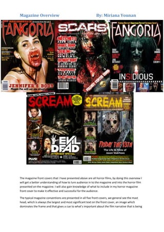
The magazine front covers that I have presented above are all horror films, by doing this overview I
will get a better understanding of how to lure audience in to the magazine and into the horror film
presented on the magazine. I will also gain knowledge of what to include in my horror magazine
front cover to make it effective and successful for the audience.
The typical magazine conventions are presented in all five front covers, we general see the mast
head, which is always the largest and most significant text on the front cover, an image which
dominates the frame and that gives a cue to what’s important about the film narrative that is being
2. Magazine Overview
By: Miriana Younan
presented on the front cover and sell lines to show the audience what to expect in the magazine and
helps lure them in.
We are also presented with repeated patterns throughout the magazine front covers; almost all of
the film magazines feature a main horrific female character except for one of the Scream magazines
which feature a male. In Scream front cover the horror film featured is the Evil Dead, the mise en
scene we are presented with a image of a female who is smirking in a twisted way with direct
address to the audience. This makes the audience feel uncomfortable and as if she might be coming
after them. She is also covered in dirt and dry blood which suggest to the audience she has been
killing people and getting herself into messy situations. Meanwhile in the other Scream addition it
features Friday the 13th, the front cover presents with a killer who is masked and holding a weapon
and he is also making direct address to the audience, the mask on the killer makes the audience
think about who the killer is and they don’t know what to expect since they can’t see his face. Also
the killer is holding a weapon which suggests to the audience that the movie is a slasher film. In the
background you can tell he is standing in the woods/forest which tells the audience that the movie
takes place in the wood/forest and they know what to expect.
All five images are taken from an actual scene within the film. This reinforces that horror magazine
audience is niche therefore and prefer what the content within the magazine features rather than
the actual image, although the image does attract the audience. The images used makes the
audience feel drawn in and wanted to see the film or even read in more detail about the narrative of
the film through the magazine. In Fangoria’s front cover, Megan Fox appears in a horrific way; this
grabs the audience attention because Megan Fox stars in many popular movies and is a beautiful
way and by the way she is portrayed within the image is in a very different light. This lures the
audience in to see what’s making her look like this and is she killing people because of the blood
around her mouth.
The images presented are horrific and designed to scare. In Fangoria that features Insidious we see
the female character on a black background wearing a black costume which includes a black veil with
a creepy smile on her face and her blacked out eyes suggest she has no soul. With only candle as a
light source, this signifies to the audience this character is evil and even love is not enough to stop
her from killing innocent people. The candle signifies that darkness follows this character but there is
only one source of light that can save the people or kill her. The image of Scars we are presented
with a female character covered in blood, this signifies that this film narrative is gore and violent. In
all five film magazine covers there all sell lines feature around the image, which are specifically used
to connote the horror genre. For example on Scars cover we see “To hell with you”, which is in bold
bloody red, this connote the gore of magazine and red connotes blood and death.
The same colours crop up on the magazines, deep yet cold colours and mainly black and red with
white cropping up at times of importance are common and help create a dark and sinister and
unwelcoming mood. In both Fangoria and Scream film magazine featuring Evil Dead have a dark
background, which shows that black is such an important colour in the horror genre, grabbing the
audience attention to the cold and dark world of horror. In Scream magazine featuring Rec 3, they
use different shades of red to maintain the theme of blood; this suggests that this issue is gory
almost like a kill.
3. Magazine Overview
By: Miriana Younan
In every film magazine the masthead is placed at the top and is the largest text on the page. Also the
film name is positioned at the bottom of the magazine beneath the image because the audience are
lured in by the image and then they will see the title of the film. Most of the film magazines have this
placement suggest this layout is a convention. Each film title is presented in uppercase in a font that
compliments the layout of the magazine. The titles are highly visible and simple using simple colours
of white and red. Text effects, used on the title of the magazine such as in the scream magazine
there are drops of blood hanging down, which makes the title look for horrific. The title for Fangoria
is sharper almost emphasizing fangs, with the sharpness of the ‘F’ and ‘A’ highlighting this.
In three of the five magazines there are other images on the front cover, the images keep to the
horror genre. This suggests to the audience that there are other interesting articles within the
magazine. The layout a film magazine is very simple really focusing more on the image. They use
taglines to anchor the readership such as ‘Megan Fox will eat you alive’ this relates to the image and
reveals more to the narrative.
All the film magazine presented are effective, they have a lot of common conventions and have
horrific imagery which lures the audience in. The text is minimal and the image is most dominant
and bold which is what the readership wants to focus on.