
Recommended
More Related Content
What's hot
What's hot (20)
Similar to MAGAZINE FRONT COVER OVERVIEW
Similar to MAGAZINE FRONT COVER OVERVIEW (20)
Recently uploaded
Recently uploaded (20)
MAGAZINE FRONT COVER OVERVIEW
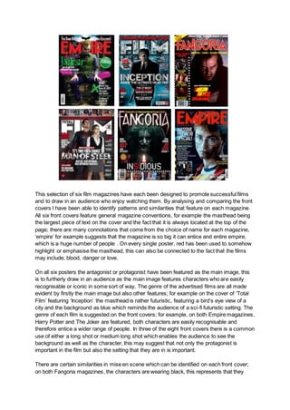
- 1. This selection of six film magazines have each been designed to promote successful films and to draw in an audience who enjoy watching them. By analysing and comparing the front covers I have been able to identify patterns and similarities that feature on each magazine. All six front covers feature general magazine conventions, for example the masthead being the largest piece of text on the cover and the fact that it is always located at the top of the page; there are many connotations that come from the choice of name for each magazine, ‘empire’ for example suggests that the magazine is so big it can entice and entire empire, which is a huge number of people . On every single poster, red has been used to somehow highlight or emphasise the masthead, this can also be connected to the fact that the films may include, blood, danger or love. On all six posters the antagonist or protagonist have been featured as the main image, this is to furtherly draw in an audience as the main image features characters who are easily recognisable or iconic in some sort of way. The genre of the advertised films are all made evident by firstly the main image but also other features; for example on the cover of ‘Total Film’ featuring ‘Inception’ the masthead is rather futuristic, featuring a bird’s eye view of a city and the background as blue which reminds the audience of a sci-fi futuristic setting. The genre of each film is suggested on the front covers; for example, on both Empire magazines, Harry Potter and The Joker are featured, both characters are easily recognisable and therefore entice a wider range of people. In three of the eight front covers there is a common use of either a long shot or medium long shot which enables the audience to see the background as well as the character, this may suggest that not only the protagonist is important in the film but also the setting that they are in is important. There are certain similarities in mise en scene which can be identified on each front cover; on both Fangoria magazines, the characters are wearing black, this represents that they
- 2. have a dark personality and a darker past, this is an enigma code for the audience as they want to find out who this character is and the reason behind their mysterious manner. Direct address is heavily used on 5 of the 6 magazines, this makes it more personal for the audience and makes it feel as if the characters are staring directly at you. Facial expressions are just as important as they provide the audience with the characters emotions, for example, the Fangoria magazine featuring ‘The Shining’ has the antagonist staring into the camera with a lot of low key lighting and dark clothing, this portrays that he is an evil character. There is a consistent pattern in the way sell lines are used on the front covers, each magazine features the names of other successful movies. This draws in a wider audience as if they are not enticed by the featured film, the sell lines may catch their eye making them want to read about the other films promoted. Statements in the skylines such as ‘THE MIND BLOWING ISSUE’ are bold pieces of text in order to excite the audience and possibly persuade them to purchase it. Not only does this particular skyline entice the audience but it relates to the featured film ‘Inception’; this film is well known to be confusing and rather mind blowing, therefore the skyline perfectly relates to the film. Sometimes when promoting a big movie, magazines will not use a main sell line as the image can speak for itself. Mode of address is majorly important as the audience determine whether or not they want purchase the magazine based on language used to attract them. Words such as ‘you’ help to maintain customer loyalty by making individuals feel as if they are being directly spoken to. It is easy to see recurring patterns in the layout of the film magazine front covers as in half of them, the actual name of the film advertised underneath the main image which could represent that the main focus of the film is in the main image so they have to next to each other. These similarities convey that it is conventional for the title of the film to be placed here. In two of the six magazine front covers, feature article photographs are laid out on the cover on the side. These are used to show pictures of other films that will be featured inside the magazine which is effective because the audience can see what other films they could read about and convince them to buy the magazine. In conclusion, all of the film magazine front covers I have chosen are effective in promoting the films on their front covers as many aspects will draw in a wider audience who will want to find out more about the movie. When generating ideas and starting my practical i will take inspiration from existing film magazines and emulate certain features in order to create a conventional and successful front cover.