
Recommended
More Related Content
What's hot
What's hot (20)
Viewers also liked
Similar to Poster Analysis Three
Similar to Poster Analysis Three (20)
More from kirstyharragan2
More from kirstyharragan2 (18)
Recently uploaded
Recently uploaded (20)
Poster Analysis Three
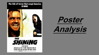
- 2. Introduction This poster promotes ‘The Shining’, a psychological horror in which the Torrance family move into a new hotel, when Jack discovers dark secrets and begins to unravel into a homicidal maniac, hell-bent on terrorizing his family. This film belongs to the psychological sub-genre as Jack becomes mentally sick and ends up insane. I chose to analyse this poster because it features a different layout to the other two posters I analysed; this is because the film is a lot older than the other two. Also different from the other two posters, this features a male antagonist. This film is also similar to the plot of our film, with the antagonist going crazy and killing the one they love. I also liked the idea that this poster features both the antagonist and the victim, rather than just the antagonist; making the poster different from other films, and successful in attracting the target audience. Poster Conventions Content-wise, this poster features the main conventions of a horror movie poster; the image dominates the frame, and gives the audience a visual clue as to the narrative of the film. The main characters are also presented to the audience, and we are immediately told that Jack is the antagonist, and Wendy is the victim. Following more conventions, the title is placed at the bottom of the frame in the biggest font, attracting the audience and telling them the name of the film immediately. The institutional information is also placed at the bottom of the page; another convention of psychological horror posters. This is to ensure that no attention is taken away from the visual on the page.
- 3. As most posters, this poster is image dominated. However, it is conventional for the image to take up the whole page, with the text placed on the top of the image, but with this poster, the image only takes up the middle of the poster, with a white block at the bottom of the page. This could be a layout technique used to differentiate it from other posters, and make the audience more interested in watching it. The image on this poster is set in their house, although we can only see Jack’s head through a broken door, and Wendy leaning against a wall screaming. This is a conventional setting for a horror movie, and scares the audience by telling them that they’re not safe, even in their own home. This also allows the audience to form expectations about the narrative; from this image they’ll understand that Jack goes crazy and tries to attack Wendy. The fact that the door is broken tells the audience of his strength, and because his head fills the door, it creates a sense of claustrophobia. Lighting has been used effectively on this image; a red tinted light has been used on the left side of the poster to emphasise that Jack’s evil, and this makes him contrast with the white used throughout the rest of the poster. Key lighting has been used on Wendy in order to make her seem more pale and innocent, reminding the audience that she’s the victim. In this poster, we’re presented with a close-up of Jack, allowing us to see his anger and emotions. Breaking poster conventions, he’s not making eye contact with the audience; this tells us that his main focus is attacking Wendy, and we can see this determination in his eyes. Jack’s manic face is one of the first things noticed, and we see his eyes, that can be described as hunter eyes, fitting with the idea that he has an animalistic facial expression, with bared teeth. Wendy on the other hand shows signs of being the typical victim; she’s making eye contact with the audience as if she’s asking for help, and her face shows her screaming, telling the audience that she’s scared. Horror iconography is present in this image, as we see Wendy holding a knife, this shows that she’s trying to defend herself, although still scared. This hints to the audience that she could survive, as these are representations linked to the final girl. Wendy is cowering into the wall of the room, linking to typical ideas of the woman being weak and vulnerable. However, the two weapons juxtapose, with Jack having a large axe, insinuating his superiority, compared to Wendy's knife which was unplanned. Wendy is wearing a dressing gown, representing the idea that she's comfortable in her own house, but she's still being attacked; this creates fear for the audience because they think this could happen to them, even in the comfort of their own homes. Jack is in the left hand third, so the audience’s eyes will go to him first, suggesting that he’s the antagonist. We can see that Jack’s hair is messy, suggesting that he doesn’t care about anything except killing Wendy. He is also closest to the camera, showing his dominance over Wendy who is hiding at the back. Image
- 4. Title The title of this film is ‘The Shining’, representing the power that Jack and Danny had in the film. This is a typical name for a horror film because its short and simple, not revealing too much to the audience. A sans-serif font is used, showing this film is for entertainment purposes, and allowing the font to give a scarier effect. The title is written in capital letters, in order to attract the audience to it, telling them that it’s the most important piece of text on the page. The title is also the biggest piece of text on the page, reminding the audience of it’s importance, and ensuring that it’ll be remembered. The title is written in black, on a white background, following the simple colour scheme and reminding the audience of the good versus evil theme. Black also has connotations of power, linking to the powers that Jack has in the film. Black also has negative connotations, reminding the audience that it’s a horror movie, creating tension for them. Positioned at the bottom, the title follows conventions by having the image above. The title is placed here because the audience would look from the top to the bottom, leaving the name of the film in their heads, ensuring that they’d watch it.
- 5. Other Text Breaking conventions, this poster doesn’t have a tagline. This could be due to the fact that they didn’t want to give any more information away, or overcrowd the poster. However, placed at the top of the poster where the tagline would be is another piece of promotional text. This text uses alliteration to attract the audience, by saying ‘the tide of terror that swept America IS HERE’. Personification is also used, as terror cant really sweep America, but this is a good promotional method as the audience will know that the film is terrifying, and all of America will be talking about it. This also links to the film and the trailer itself, when we see the tide of blood filling up the room. This also suggests genre, by reminding the audience how scary the film is. The words ‘is here’ are capitalised, telling the audience that the film is now available, making them want to go home and find out about watching it. Following conventions, the institutional information is placed at the bottom of the poster in a smaller font, in order to not distract the audience's attention. At the beginning of the institutional information, on it’s own line, we’re told that Stanley Kubrick is the director of the film. This would attract Kubrick fans to watching the film, and because he’s popular in the movie industry, people would know that this is a high quality film, worth watching. We can also see the actor’s names written at the bottom, again, attracting fans of these actors, making the film more attractive to the audience.
- 6. Colour Black, white and orange/red are the dominating colours of this poster, sticking to conventions of using no more than three main colours. Black and white are used to represent good and evil, showing the transformation of Jack turning from a normal, good man, into a psychologically damaged murderer. Orange is used rather than red, to represent the sub-genre not being focused on blood and gore, but focusing on the mind of the antagonist. Jack’s face is also seen to be red, showing his anger and strength, linking to the fact that he’s the antagonist. Conclusion Overall, this poster is effective in promoting ‘The Shining’, by having a different image layout of other posters, attracting the audience to it. In terms of luring in the target audience, I think this poster will be successful because of Wendy’s eye contact, calling out to the audience for help. The poster is successful in suggesting the film’s narrative without giving too much of it away, because it includes the image that reveals that Jack’s trying to hurt Wendy, but we don’t know whether he’s successful or not, and we don’t know why he wants to do this. These points would attract the audience because they’d want to find these things out, and this would pull them towards watching the film.