
Recommended
More Related Content
What's hot
What's hot (19)
Viewers also liked
Similar to Poster Overview
Similar to Poster Overview (20)
More from kirstyharragan2
More from kirstyharragan2 (18)
Recently uploaded
Recently uploaded (20)
Poster Overview
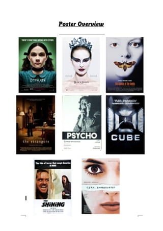
- 2. The eight posters I have chosen have been created to successfully promote films within the psychological horror sub-genre. By carrying out an investigation of them and by comparing them to each other, it is possible to identify shared features within them and establish repeated patterns. This will help me when I am creating my own psychological film poster, as I will have a better insight into what should be included. All eight posters feature typical film poster conventions; expected general conventions are seen in all, such as the title being the biggest and standing out the most. Also, they’re dominated by the image which signals something important about the narrative of the film. A slogan features on most of the posters, excluding ‘Black Swan’, ‘The Silence of the Lambs’, and ‘Psycho’. In addition to these common film poster conventions, we see other repeated patterns. Most of these posters feature a main female character, making eye contact with the audience and looking blank. The protagonist is usually female to represent stereotypical ideas of females being insecure and submissive, linking to them being more likely to have mental problems. The main character is usually featured on the poster, with exception for ‘Cube’. With regards to background, most of these film posters don’t have the location of the film included; they have a plain coloured background. This is with the exception of ‘The Shining’, ‘Cube’, and ‘The Strangers’, which show the audience the location. In the posters for ‘Psycho’ and ‘The Shining’, we’re shown a woman screaming, as if she is about to be killed by the antagonist; this reveals to us that woman can still be the victims in these films. Genre is also shown through these images because of the dark lighting, as seen in most of these film posters. Colour and iconography is also used to give away genre; in the poster for ‘The Shining’, an axe is featured on the front cover. This immediately tells the audience who the antagonist is, and what his aim is, while automatically revealing that it is a horror film. Blacks and whites are predominantly used for these posters, again revealing that they’re horror films. Because they lack the use of red, which symbols blood and gore, the audience know that these aren’t horrors that involve frequent and gruesome deaths, such as slasher films. These posters don’t reveal too much of the film to
- 3. the audience; this keeps it a surprise, making them more interested in watching it. Excluding ‘Girl, Interrupted’, all of these psychological film posters have the name of the film placed in the bottom centre of the poster. This is an effective place to put it because audience’s would be drawn in by the images before there eyes goes down to the title. Capital letters are used for the majority of these posters, along with a bold font; this makes the name stand out, and attracts the attention of the target audience. White or black is used for the name of the film, apart from in ‘the Silence of the Lambs’ - this keeps the posters simple, and ensures that it doesn’t look to overcrowded with colours. Each of the film posters has an individual font for their title, reminding audiences that just because they belong to the same sub-genre, they’re completely different films. For example, ‘Orphans’ film title is made to look like she has written it herself, whereas the title for ‘Cube’ has been made 3D, linking to the cube itself. Apart from ‘Black Swan’, ‘The Silence of the Lambs’, and ‘Psycho’, all of these posters include a tagline. The tagline is usually placed at the top of the poster, in a bold font, although it’s smaller than the title to ensure that attention isn’t taken away. On each of the posters, the tagline reveals to us more about the film, but doesn’t give any crucial information away, ensuring that audience’s are still going to be interested in the film. Apart from ‘Cube’, all of these posters include institutional information/names of important people in the film (actors or producers). This information is positioned at the very bottom of the poster, below the title; this ensures that no attention is taken away from the actual poster, because this information is less important. It is also at the base of the poster in order for it to blend into the background. Layout is kept the same throughout all of these film posters, apart form ‘Girl, Interrupted’ which has the name of the film in the centre of the poster, covering some of the girl’s face, perhaps suggesting that she has a secret that is hidden from the audience. Other text, like ‘based on a true story’ is used to draw in audiences. The idea that a film has been inspired by a real story makes the film so much scarier for audiences, as they feel that the same thing could really happen to them.
- 4. The lighting in the posters for ‘Silence of the Lambs’, ‘Orphan’ and ‘Psycho’ leaves some of their faces covered; this suggests to the audience that they have a secret, something that can’t be physically seen. All of these posters that I have selected are effective; they’re all simple, with minimal text, leaving the bold image to dominate the page. By completing this overview, I have learnt more about the conventions of psychological horror film posters. When completing my practical work, this will help me in deciding the general layout and colours that I should be working with.