Separation of Lanthanides/ Lanthanides and Actinides
Double page spread analysis 1
1. Headline
White space captionfull quote bodytextdropcap
Headline
‘FromHot Chipto The 2 Bearsviahis ownsolomaterial,nowonderJoe Goddardis
knackered.Mixmagstole aslice of hishecticschedule toask:are you human,or a
musical machine?’The headline featuresafamousartistwhois widelyknownforhis
electronicmusic.The massaudience are likelytobe interestedinthisartistashe is
relevanttothe typical audience of thismagazine;the headline isaquestionwhichwill
encourage the audience tocontinue reading,inordertodiscoverthe answer. ‘HotChip’
and ‘The 2 Bears’are widelyknown,sothismaybe useful forpeakingthe interestof a
wideraudience.
Guttenbergdesign
principle
In the primaryoptical
area there isthe name of
the magazine andpart of
the headline.Inthe
strongfallow areathere is
justa bitof the headline.
Withinthe weakfallow
area there isa little bitof
textfromthe article and
some blankspace.Inthe
terminal areathere is
some more text.
Designbalance
The magazine is
informallybalanced.
Althoughithas an
overall fairlytidy
appearance,itisnot
symmetrical.The
genre of music
featuredinthis
magazine isclearly
establishedbythe
photosof famous
electronicdance and
clubbingmusicians.
Main image/images
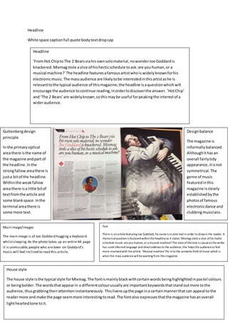
The main image is of Joe Goddard hugging a keyboard
whilstsleeping.As the photo takes up an entire A4 page
it is unmissable,people who are keen on Goddard’s
music will feel inclined to read this article.
Text
There is anarticlefeaturing Joe Goddard, his nameis in pink textin order to drawin the reader. A
rhetoricalquestionis featuredwithintheheadlineas it states ‘Mixmag stolea slice ofhis hectic
schedule toask: areyou human, or a musical machine? The toneofthetext is casualas thewriter
has used informallanguage and directaddress to the audience,this helps theaudienceto feel
more involvedwith thearticle. ‘Musical machine’ fits into the semanticfield ofmusic which is
what the mass audiencewill bewanting from this magazine.
House style
The house style isthe typical style forMixmag.The fontismainlyblackwithcertainwordsbeinghighlightedinpastel colours
or beingbolder. The wordsthatappearin a differentcolourusuallyare importantkeywordsthatstandoutmore tothe
audience,thusgrabbingtheirattentioninstantaneously. Thislivensupthe page ina certainmannerthat can appeal to the
readermore and make the page seemmore interestingtoread.The fontalso expressesthatthe magazine hasanoverall
lightheartedtone toit.
2. Headline
‘Where didyousleepthatnight?’ Thisisan unusual title,the readerwill be confusedastowhat this
meansand will wanttocontinue reading.The brightfontisverylarge andboldso thatit standsout
and can’t be ignored. There isanarrow pointingfromthe headline tothe mainphoto,whichcould
insinuate thatsomebodyfromthe photomayhave sleptinthatroom – it definitelyraisesquestions
that will make the readerviewthe entirearticle.
Guttenberg design
principle
In the primaryoptical
area there is part of
the headline whichis
extremelybold. As this
is the first part of the
page that the viewer
will notice, it will gain
their attention
successfully. Within
the strongfallow area
there is some text
saying ‘Nirvana’ with a
photo of Kurt Cobain.
Nirvana still remains as
an extremelyiconic
band, it is likelythat
the majorityof the
audience will like
Nirvana andmiss
Cobain. A lot of the
audience mayfeel
intriguedandinclined
to continue reading. In
the weak fallowarea
there is a photofrom
Nirvana onUnplugged
with a bit of insight to
the event. This will be
especiallyrelevant to
the people that were
there at the event. In
the terminalarea
there is the endpart of
the article which
simplyjust fillsup the
white space.
Designbalance
Thisis informally
balanced.NME isa
magazine aimed
towardspeople who
are interestedinrock
music.The informal
balance hasa sense
of rebellion,opposed
to the typicallyneat
and formal balance
oftenseenwithin
magazines.
Main image/images
The main imageis ofNirvana playing on Unplugged. Theoriginalaudience
that wereatthat concert willfeelobliged toreadthis dueto thenostalgia
and fond memories ofthebelovedKurtCobain andhis band, Nirvana. The
messy black scribblearound the photofits in withNirvana’s grungystyle,
which is likely tobe similar toa lot oftheaudience’s style.
Text
The headlinestates ‘Where did you sleep
that night?’ which is a rhetorical question
that creates an element of curiosity for the
audience, which will encouragethem to read
the article.The articleis aboutan event
when Nirvana played on Unplugged. A quote
is in the weak fallowarea,which says ‘itwill
always beremembered as the gig of the
90’s’. This will undoubtedly drawin the
reader by intriguingthem as to what made
that event so great. The languageis formal
which is more appropriateas NME has such a
varied target audienceand mass audience.
House style
The house style is easily recognisableas NME due to the ongoing same design throughout all of their ma gazines.The red, black and yellow
colours aretypically associated with rock, alternativerock and indiegenres, which arethe main focuses for NME. The font i s a mixtureof
sophisticated and loud,which is relevant to such a varied audience. Neither of the photos in this magazine areplaced straightwith tidy
borders, they’re quite rough which connote that rock and alternativerock music are2 main features of the magazine.
3. Both of these magazinesare quite different.Mixmag isaimedtowardsmaleswhoare interestedin
house andelectronicmusic,whereasNMEisaimedtowardsrock and indie fans.Mixmagfeatures
coloursthat are more suitedtothe clubbingscene,conversely,NMEusesreds,blacksandyellows
whichare typicallyseenwithinmostrockmusicmagazines.Mixmagusesmore informal language as
it hasa youngertargetaudience.Bothmagazineshave aninformalbalancesasthe targetaudiences
are maleswholinkinwiththe ideaof rebellion.