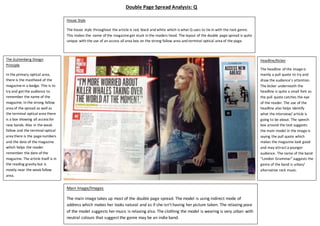
Science 7 - LAND and SEA BREEZE and its Characteristics
Double page spread 2
1. The Guttenberg Design
Principle
In the primary optical area,
there is the masthead of the
magazinein a badge. This is to
try and get the audience to
remember the name of the
magazine. In the strong fallow
area of the spread as well as
the terminal optical area there
is a box showing all access for
new bands. Also in the weak
fallow and the terminal optical
area there is the pagenumbers
and the date of the magazine
which helps the reader
remember the date of the
magazine. The article itself is in
the reading gravity but is
mostly near the weak fallow
area.
Main Image/Images
The main image takes up most of the double page spread. The model is using indirect mode of
address which makes her looks natural and as if she isn’t having her picture taken. The relaxing pose
of the model suggests her music is relaxing also. The clothing the model is wearing is very urban with
neutral colours that suggest the genre may be an indie band.
Headline/Kicker
The headline of the imageis
mainly a pull quote to try and
draw the audience’s attention.
The kicker underneath the
headline is quite a small font as
the pull quote catches the eye
of the reader. The use of the
headline also helps identify
what the interview/ article is
going to be about. The speech
box around the text suggests
the main model in the image is
saying the pull quote which
makes the magazine look good
and may attract a younger
audience. The name of the band
“London Grammar” suggests the
genre of the band is urban/
alternative rock music.
House Style
The house style throughout the article is red, black and white which is what Q uses to tie in with the rock genre.
This makes the name of the magazineget stuck in the readers head. The layout of the double page spread is quite
unique with the use of an access all area box on the strong fallow area and terminal optical area of the page.
Double Page Spread Analysis: Q