1. House Style Design Balance
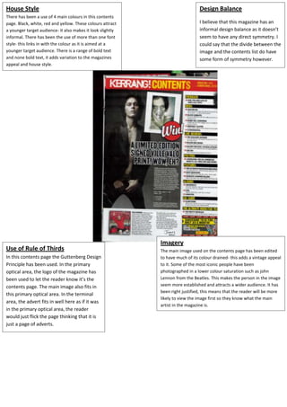
There has been a use of 4 main colours in this contents
page. Black, white, red and yellow. These colours attract I believe that this magazine has an
a younger target audience- it also makes it look slightly informal design balance as it doesn’t
informal. There has been the use of more than one font seem to have any direct symmetry. I
style- this links in with the colour as it is aimed at a could say that the divide between the
younger target audience. There is a range of bold text image and the contents list do have
and none bold text, it adds variation to the magazines some form of symmetry however.
appeal and house style.
Imagery
Use of Rule of Thirds The main image used on the contents page has been edited
In this contents page the Guttenberg Design to have much of its colour drained- this adds a vintage appeal
Principle has been used. In the primary to it. Some of the most iconic people have been
optical area, the logo of the magazine has photographed in a lower colour saturation such as john
been used to let the reader know it’s the Lennon from the Beatles. This makes the person in the image
contents page. The main image also fits in seem more established and attracts a wider audience. It has
been right justified, this means that the reader will be more
this primary optical area. In the terminal
likely to view the image first so they know what the main
area, the advert fits in well here as if it was
artist in the magazine is.
in the primary optical area, the reader
would just flick the page thinking that it is
just a page of adverts.