1. Target Audience and genre
The target audience for Kerrang is males
aged 15-34 who are heavily influenced by
rock or heavy metal music.
Main Image
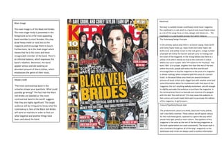
The main image is of the Black Veil Brides.
The main singer Andy is presented in the
foreground as he is the most appealing
band member to most females; this may
draw heavy metal or rock fans to the
magazine and encourage them to buy it.
Furthermore, he is the main singer which
means that he is the iconic and most
recognizable member of the band. There’s
an informal balance, which expresses the
band’s rebellion. Moreover, the band
appear serious and are wearing an
abundant amount of black clothes, which
emphasises the genre of their music.
Model credit
‘The most controversial band in the
universe answer your questions. What could
possibly go wrong?’ The fact that the Black
Veil Brides are labelled as ‘the most
controversial band in the world’ suggests
that they are highly significant. The target
audience will be intrigued to know what the
controversy is; fans of the Black Veil Brides
will want to read this in order to find out
what negative and positive things have
been said about the band.
Colours/Typefaces/House style
The predominant colours are white, black and murky yellow;
red is also fairly common. These colours are all typical colours
for the rock/metal genre, opposed to a genre like pop which
would have light pastel or neon colours. The typeface of this
magazine is the same as the rest of the Kerrang magazines as
the bold capital letters are used consistently. The house style is
also consistent throughout all of Kerrang’s magazines as the
bold boxes and circles are always used to outline information.
Masthead
‘Kerrang’ is a widely known rock/heavy metal music magazine.
The masthead is in red which is a typical rock music/metal colour
as a lot of the songs focus on love, danger and blood, etc… The
masthead is in a particularly grungy font which helps to
emphasise the genre of the music magazine that Kerrang is. Part
of the masthead is not visible as it is behind the band; this is due
to the fact that Kerrang is so enormously known worldwide, that
people will recognise the magazine due to the overall style and
part of the masthead. Even people who don’t read the magazine
will recognise the masthead.
The Gutenberg Design Principle
In the primary optical area there is a banner saying ‘Dave Grohl
and Corey Taylor team up’, Dave Grohl and Corey Taylor are
both iconic and widely known to the rock genre, a large number
of people will notice the banner and will carry on looking over
the cover of the magazine. In the strong fallow area there is a
yellow circle which stands out due to the contrasts in colour.
Within the circle it states ‘Win! VIP tickets to Hit The Deck’. The
word ‘Win’ is in a larger, brighter font than the rest of the text
within the circle, people will notice this first and this will
encourage them to buy the magazine as the price of a magazine
is almost nothing, when compared with the price of a concert
ticket. In the weak fallow area there are several miniature
pictures of music artists and a bigger box with another artist and
some information about his involvement with that issue of the
magazine; this isn’t anything awfully excitement, yet still enough
to slightly persuade the audience to purchase the magazine. In
the terminal area there is a barcode and a picture of a penguin
with the text ‘You melt at six!’ this may cause the audience to
feel curious and could make them want to purchase this edition
of the magazine, to get answers.
2. Main Cover Line
‘Black Veil Brides’, the majority of this band’s fans
will want to purchase this if they see it as they
will want to find out more information about the
band. The yellow writing contrasts against the
rest of the dull colours, so that the audience’s
attention will be captured as well as their
curiosity that may lead them to purchase the
magazine.
Coverlines
‘Some people want us to die...’ will cause the viewer to feel curious as to who wants the Black Veil
Brides to die, and why.
‘Asking Alexandria are on fire! Literally!’ is an extremely unusual and rare type of coverline to read,
the audience will notice this and want to know what context that statement is in, whether it’s true or
metaphorical and how it happened; regardless of whether they’re fans of Asking Alexandria or not,
however, fans will be much more intrigued.
‘You melt at six!’ The audience will be rather confused as to what this means and may be questioning
a lot after reading the coverlines, which will encourage them to buy the magazine in order to get
questions answered.
Banners/Flashes/badges
There’s a banner at the top of the magazine which states ‘Dave
Grohl and Corey Taylor team up’ this is effectual marketing as
this will draw in two particular fan groups, which will most likely
be tempted to buy this magazine to understand what drastic
changes have occurred in their beloved artist’s lives.