1. Case Study 2
Masthead that stands
out, bright colour
scheme and font
Large background
picture covering
most of cover page
Smaller pictures to
show other articles
in the magazine
Headings that stand
out
Buzz words to make
the reader want to
find out what they Pull quotes used to
can get engage the audience
Puffs used to catch
readers eye
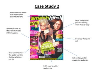
2. • Detailed analysis of cover page
The masthead of the cover page is very big and bold font, and bright colours such as green and
white, this catches the readers eye and tells us it is probably for a teenager audience as it uses
bright colours and stands out a lot. This colour is repeated on some other things on the cover
page, such as the text box for the puff that is used. This puff draws the audience’s attention as it
has a big heading that stands out a lot saying ‘AAHH CRINGE’ which will make the reader want to
find out what they are going to find out when they read the article. A big cover picture is used
showing two very popular pop artists, both being female which tells us it is more for a female
audience, and again that the magazine is mainly for teenagers as both of the artists are popular in
the charts. Their are buzz words used on the cover page such as ‘FREE!’ which will grab the
readers attention and make them want to buy the magazine as they get something they might
like for free inside it. An effective pull quote is used on the cover page saying ‘Snogging Madonna
was cool’, which will intrigue the reader to read the whole article as it is quite a bizzare quote
used. Also, there are smaller pictures of other articles throughout the magazine, giving the reader
a preview of what is inside to make them more likely to buy it as they make it seem like lots of
interesting things are going on.
3. Contents page of magazine
Smaller
pictures
showing other
articles in the Other headings
magazine
Heading of page contents Buzz words ‘Win!’
Headings of page
information
Medium sized
picture covering
some of the page
Editors letter
Issue information
4. • Detailed analysis of contents page
The contents page of the magazine uses lots of different smaller pictures other than the cover
page picture, to show the audience what other things are in the magazine making them want to
read it as they look interesting. It uses continuous colour scheme throughout, being pink white
and black, showing it is mainly for teenage girls because the colour pink has connotations of girls.
Their is an editors letter on the contents page which makes the magazine more official for the
reader. The bigger picture used intrigues the audience as it has a big heading which makes the
reader want to know what information is being told about the band ‘Blue’ in the picture.
5. Double page spread of magazine
Repeated colour
scheme, yellow
white and pink
Big picture
covering all of one
page
Bold title that stands out
Quiz for reader on the
person featured in the
article
Buzz word ‘Win!’
6. • Detailed analysis of double page spread
The double page spread of the magazine shows a repeated colour scheme of pinks, yellow and
white. Although it also has a red title which stands out a lot to grab the readers attention. The
title is also pull quote which makes it more intriguing for the reader. There is a big picture
covering the whole of one of the pages, which would draw people in to buy it that are fans of the
person in the picture. As the person is also very famous and popular, this will help the magazine
get a wider audience. The buzz word ‘Win!’ is used to grab the readers attention and make them
want to buy the magazine to get have a chance of winning whatever they are giving away.
7. Conclusion
• For my pop magazine I am going to keep the colour scheme the same like this one is
throughout the magazine, as it keeps consistent. I may also have a big picture of the person
featured in my magazine covering one whole of the pages on the double page spread.