1. Content Page Analysis
House style
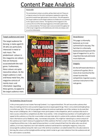
The predominant colours are white, yellow, black and red. These are
all typical colours for the rock/ metal genre, opposedto a genre like
pop which would have light pastelor neoncolours. This willappeal to
the target audience as the target audience are likelyto be accustomed
to this typical colour scheme. The typeface of thismagazine is the
same as the rest ofthe Kerrang magazinesas the boldcapital letters
are usedconsistently. The house style is alsoconsistent throughout all
of Kerrang’s magazines as the boldboxesand circles are always used
to outline information.
Imagery
On the lefthandside there is
a picture of a guitar,thisis
more of an incentive forthe
viewertoenterthe
competition.A guitarisa very
commoninstrumentinthe
rock genre.
Design Balance
Thispage isinformally
balanced,asit isnot
symmetrical inanyway.The
fact that itis informally
balancedcouldrepresentthe
type of magazine itis,as it is
imperfectlikerockandmetal
musicstylesare.
Target audience and need
The target audience for
Kerrang is males aged 15-
34 who are particularly
interested in metal or
rock music. The
predominant colours in
this magazine are colours
that are famously
associated with the rock
genre. Furthermore,
these colours are quite
masculine colours. As the
target audience is rock
and heavy metal fans, the
magazine consists of
mainly music and
information regarding
these genres, to appeal to
the target audience more.
The Guttenberg Design Principle
In the primary optical area itstates ‘Kerrang!Contents’ in a largeand bold font. This will ensurethe audience that
they are readinga familiar and successful magazineand can expect good things.There is also a bold and brightyellow
circlethatsays ‘Win!’.This will encouragethe audience to continue readingthe rest of the sentence to discover that
they can win a £600 guitar, this is likely to gain more participators in thecompetition, which could possibly resultin
more success and profitas competitions do often have catches. In the strongfallowarea there isn’tanythingthat will
appeal to the audience, as ithas the issuenumber and cover date which is useless to the audience. Below this is some
more information such as feedback, news, livereviews and posters.This might be interesting to a certain amount of
the audience, but it won’t necessarily appeal to all of the audience; The font is small in this area,which highlights the
insignificanceof that area. In the weak fallowarea there is a small amountof text from the editor who uses direct
address,itisn’tvery important, but it will makethe audience look forward to readingthe magazine, it may also
encourage the audience to buy the next issue.In the terminal area there is an advertisement for a £5 subscription to
Kerrang, the colours arefairly brightand the writingis bold in order to gain more attention from the audienceand sell
the subscriptions successfully.
2. House style
The main colourisblack whichisa masculine colourthat’s
associatedwithclubbingasclubsare oftenpitchblack.The
neoncoloursonthe photoare clublights,combinedwiththe
blackbackgroundthiswill make the readerfeel hypedandina
clubbingmood. The audience willbe drawntothiscolour
scheme more thanbrightcolours,as theywill be usedtothese
kindsof colours.
Designbalance
Thisphotois informally
balanced.The mass
audience isyoungmales,
so theyare most likely
usedto unorganisation
and ‘chaos’. Thiswill make
the magazine more
appealingtothe reader.
Imagery
There isa photographof a
youngwomanwho
appearsto be dancingin a
club.She is dressed
appropriatelyforthe
clubbingtype of scene. The
image isquite large and
takesup a lotof the space,
so that the viewernotices
it straightaway.She is
exposingherselfalittle bit
and the mass audience will
be drawn to herand will
probablyfindher
attractive.Thisisappealing
for mostof the audience
and will therefore make
the viewerwantto
continue reading.
Target audience andneed
I wouldsaythat the
target audience ismales
aged18 – 30. Research
showsthat the median
age of a Mixmag readeris
24, 72% male and28%
female;theytendtobe
urban andsingle.
The GuttenbergDesignPrinciple
The primary optical area containsthe magazine name and
date.The name mayremindthe audience thattheyare
readinga highlysuccessfulandfamousmagazine.Inthe
strongfallowareathere isthe title of the page,whichis
simply‘contents’. Inthe weakfallow areaitstates‘Yourfree
CD: Sub Focus’.Thiswill encourage the viewertocontinue
readinginorderto claim the free CD. SubFocus isan
electronicmusicproducer,sothisisfittingtothe mass
audience andtargetaudience astheirpsychographicsheavily
involve electronicmusic,aswell ashouse andpop.The
terminal areahasa listof songsand the date,thisarea
probablywon’tbe muchuse to the audience,unlesstheyare
interestedinthose songs.
3. Evaluation(Comparison of 2)
Both of these magazinesare quite different,butfollow the same rulesandprinciples.Firstof all,
Kerranghas much strongercolourswitha distinctivelyboldhousestyle,whereasMixmaghasa
darkercolourscheme withmore tranquil feel.Thisisdue to the difference ingenres,Kerrang
specialisesinmainlyrockmusic,whichiswhythe page is‘louder,opposedtoMixmagwhich mainly
revolvesaroundhouse music;hence the reasonthe layoutiscalmer,withmore of a partyvibe.
Similarly,bothcontentpagesare informallybalancedasbothmagazinesare aimedtowardsyoung
men,whowon’tcare fororganisation.