SlideShare a Scribd company logo
1 of 1
Masthead –The masthead is situated across the top of      Comment on how the design of the magazine cover attracts the target audience:   Coverlines –The coverlines are fairly small and don‟t
the cover, straight away attracting the audience. The                                                                                     really attract a reader that much. However, because
style of the letters in the masthead looks smashed                                                                                        the coverlines are bright colours and fairly bold they
and broken, creating the impression that they have                                                                                        stand out a fair amount on a plain background. This
been hit by something. This relates to the genre of the                                                                                   will attract the reader but not as much as they would
magazine, rock, as the genre could be described as                                                                                        if they were bigger in size.
different to people who listen to other genres like pop
music. The masthead is very attractive to the target                                                                                      Colour –The main colours used are white, red, yellow
audience and is one of the first things that the reader                                                                                   and black. The colours stand out greatly within the
may see at first glance of the cover. The way that the                                                                                    cover and relate to the target audience and the
masthead is white contrasts against the bright red                                                                                        genre. This is because the colours are loud and
hair of the person in the main image, making the                                                                                          noticeable and the rock genre could be described as
masthead stand out and grab the audiences, and                                                                                            loud and noticeable also.
maybe even just somebody passing by attention.
                                                                                                                                          Photography Lighting –The lighting on the cover is
Main image –The main image on the cover is a well-                                                                                        fairly light and bright, making the main image stand
known rock artist from a popular rock group. This                                                                                         out on the cover. It informs the reader that the
straight away attracts to the target audience as they                                                                                     person on the image is the main story as the light
will probably known him already. His pose in the                                                                                          seems to focus on him in comparison to the other
image may attract the audience as he looks fairly                                                                                         images.
shocked about something. This may make any
                                                                                                                                          Typefaces –The text throughout the cover is mainly
audience wonder what he is shocked about and make
                                                                                                                                          block, sans serif text. This represents the harshness
them want to buy the magazine. In the image, the man
                                                                                                                                          and sharpness of the genre, relating to the target
has a direct mode of address. This helps the reader
                                                                                                                                          audience. The text that is used to present
connect with the audience. But, the way that the
                                                                                                                                          „KERRANG!‟ is a broken and smashed style. This
masthead overlaps the main image makes the main
                                                                                                                                          represents the rocky style and genre of the
image seem a lot less dominant on the cover as the
                                                                                                                                          magazine, again relating to the target audience.
reader will be attracted to the masthead first.

Model credit –The models actual name is not                                                                                               House Style –In the cover there is a lot going on and
presented on the cover, just the name of the group he                                                                                     generally the reader may not know where to look as
is from „My Chemical Romance‟. Although somebody                                                                                          things look cramped into the cover. The cover is very
in the target audience may recognise the person in                                                                                        loud and although some people may find it difficult
the main image, somebody who doesn‟t won‟t know                                                                                           to read and process, it reflects the genre of the
who the person is so this may not make them want to                                                                                       magazine which attracts the target audience.
buy the magazine whereas if the name was there, the                                                                                       However, people who aren‟t in the target audience
model is made more familiar with the public who see                                                                                       and people passing by may find the cover far too
the magazine.                                                                                                                             overwhelming and in their faces.

Main cover line –The main cover line takes up a large
amount of the page and attracts people passing by as
well as the target audience. It reads “THIS IS REALLY
SCARY!” This makes the reader suspicious of what is
in the magazine and has them wondering what is
scary and why it is scary. This will make the reader
want to read more and find out what it is.

More Related Content

What's hot

Magazine Front Cover Analysis
Magazine Front Cover AnalysisMagazine Front Cover Analysis
Magazine Front Cover AnalysisLouis1995
 
Florence and the machine q
Florence and the machine qFlorence and the machine q
Florence and the machine qasmediaf12
 
Movie Magazine Cover & Poster analysis
Movie Magazine Cover & Poster analysis Movie Magazine Cover & Poster analysis
Movie Magazine Cover & Poster analysis Naomi Collins
 
Magazine Analysis
Magazine AnalysisMagazine Analysis
Magazine Analysis_megkiely
 
Analysing magazine features and connotations
Analysing magazine features and connotationsAnalysing magazine features and connotations
Analysing magazine features and connotationsJoshWilliamson14
 
Magazine Photography Analysis and Research
Magazine Photography Analysis and Research Magazine Photography Analysis and Research
Magazine Photography Analysis and Research selinargyrou
 
Magazine Cover Analysis
Magazine Cover AnalysisMagazine Cover Analysis
Magazine Cover Analysisemilygrimshaw
 
Magazine cover analysis of q by dominic hayes
Magazine cover analysis of q by dominic hayesMagazine cover analysis of q by dominic hayes
Magazine cover analysis of q by dominic hayesdomhayes03
 
Magazine cover reviews
Magazine cover reviewsMagazine cover reviews
Magazine cover reviewsToddwhitsey
 
Deconstructing magazines
Deconstructing magazinesDeconstructing magazines
Deconstructing magazinesLauracharlotte
 
M magazines analysis
M magazines analysisM magazines analysis
M magazines analysisLouisha26
 
Magazine cover analysis 1,2,3
Magazine cover analysis 1,2,3Magazine cover analysis 1,2,3
Magazine cover analysis 1,2,3JosetteHo
 

What's hot (20)

Rock Magazine Analysis
Rock Magazine AnalysisRock Magazine Analysis
Rock Magazine Analysis
 
Magazine Front Cover Analysis
Magazine Front Cover AnalysisMagazine Front Cover Analysis
Magazine Front Cover Analysis
 
Florence and the machine q
Florence and the machine qFlorence and the machine q
Florence and the machine q
 
Evaluation part1
Evaluation part1Evaluation part1
Evaluation part1
 
My evaluation
My evaluationMy evaluation
My evaluation
 
Movie Magazine Cover & Poster analysis
Movie Magazine Cover & Poster analysis Movie Magazine Cover & Poster analysis
Movie Magazine Cover & Poster analysis
 
Magazine anaysis1
Magazine anaysis1Magazine anaysis1
Magazine anaysis1
 
Magazine Analysis
Magazine AnalysisMagazine Analysis
Magazine Analysis
 
Front cover analysis
Front cover analysisFront cover analysis
Front cover analysis
 
Magazine comparision
Magazine comparisionMagazine comparision
Magazine comparision
 
Analysing magazine features and connotations
Analysing magazine features and connotationsAnalysing magazine features and connotations
Analysing magazine features and connotations
 
Magazine Photography Analysis and Research
Magazine Photography Analysis and Research Magazine Photography Analysis and Research
Magazine Photography Analysis and Research
 
NME
NMENME
NME
 
Magazine Cover Analysis
Magazine Cover AnalysisMagazine Cover Analysis
Magazine Cover Analysis
 
Magazine cover analysis of q by dominic hayes
Magazine cover analysis of q by dominic hayesMagazine cover analysis of q by dominic hayes
Magazine cover analysis of q by dominic hayes
 
Magazine cover reviews
Magazine cover reviewsMagazine cover reviews
Magazine cover reviews
 
Magazine anaysis2
Magazine anaysis2Magazine anaysis2
Magazine anaysis2
 
Deconstructing magazines
Deconstructing magazinesDeconstructing magazines
Deconstructing magazines
 
M magazines analysis
M magazines analysisM magazines analysis
M magazines analysis
 
Magazine cover analysis 1,2,3
Magazine cover analysis 1,2,3Magazine cover analysis 1,2,3
Magazine cover analysis 1,2,3
 

Viewers also liked

Shooting rehersal
Shooting rehersal Shooting rehersal
Shooting rehersal claire96
 
Respuesta al ruego sobre la lentitud del Registro Civil
Respuesta al ruego sobre la lentitud del Registro CivilRespuesta al ruego sobre la lentitud del Registro Civil
Respuesta al ruego sobre la lentitud del Registro CivilUPyD Getafe
 
Spotlight on rapid response to acute stroke
Spotlight on rapid response to acute strokeSpotlight on rapid response to acute stroke
Spotlight on rapid response to acute strokeNHS Improvement
 
Magazine cover analysis_kasabian
Magazine cover analysis_kasabianMagazine cover analysis_kasabian
Magazine cover analysis_kasabianRyanDenner
 
プラダレディースシューズに移行することでシックになります
プラダレディースシューズに移行することでシックになりますプラダレディースシューズに移行することでシックになります
プラダレディースシューズに移行することでシックになりますboxian181
 
An12 g formation-power-systems-pour-aix-administration-systeme-ii-installatio...
An12 g formation-power-systems-pour-aix-administration-systeme-ii-installatio...An12 g formation-power-systems-pour-aix-administration-systeme-ii-installatio...
An12 g formation-power-systems-pour-aix-administration-systeme-ii-installatio...CERTyou Formation
 
Datasheet(1)
Datasheet(1)Datasheet(1)
Datasheet(1)sumitamax
 

Viewers also liked (12)

Shooting rehersal
Shooting rehersal Shooting rehersal
Shooting rehersal
 
Respuesta al ruego sobre la lentitud del Registro Civil
Respuesta al ruego sobre la lentitud del Registro CivilRespuesta al ruego sobre la lentitud del Registro Civil
Respuesta al ruego sobre la lentitud del Registro Civil
 
Circuit
CircuitCircuit
Circuit
 
Ept1906p0002
Ept1906p0002Ept1906p0002
Ept1906p0002
 
Spotlight on rapid response to acute stroke
Spotlight on rapid response to acute strokeSpotlight on rapid response to acute stroke
Spotlight on rapid response to acute stroke
 
Abstract
AbstractAbstract
Abstract
 
Ept1806p0003
Ept1806p0003Ept1806p0003
Ept1806p0003
 
Modernism recap quiz
Modernism recap quizModernism recap quiz
Modernism recap quiz
 
Magazine cover analysis_kasabian
Magazine cover analysis_kasabianMagazine cover analysis_kasabian
Magazine cover analysis_kasabian
 
プラダレディースシューズに移行することでシックになります
プラダレディースシューズに移行することでシックになりますプラダレディースシューズに移行することでシックになります
プラダレディースシューズに移行することでシックになります
 
An12 g formation-power-systems-pour-aix-administration-systeme-ii-installatio...
An12 g formation-power-systems-pour-aix-administration-systeme-ii-installatio...An12 g formation-power-systems-pour-aix-administration-systeme-ii-installatio...
An12 g formation-power-systems-pour-aix-administration-systeme-ii-installatio...
 
Datasheet(1)
Datasheet(1)Datasheet(1)
Datasheet(1)
 

Similar to Front Cover Research

Textual Analysis 1
Textual Analysis 1Textual Analysis 1
Textual Analysis 1mnoficzer
 
Analysis of music magazines front covers
Analysis of music magazines front coversAnalysis of music magazines front covers
Analysis of music magazines front coversmarwasaroya
 
Magazine cover analysis q magazine
Magazine cover analysis  q magazineMagazine cover analysis  q magazine
Magazine cover analysis q magazineadamtimms22
 
Music magazine comparison
Music magazine comparisonMusic magazine comparison
Music magazine comparisonasiyam
 
Magazine deconstruction
Magazine deconstructionMagazine deconstruction
Magazine deconstructionaq111082
 
Magazine cover analysis nme
Magazine cover analysis   nmeMagazine cover analysis   nme
Magazine cover analysis nmeamybrackenridge
 
Magazine cover analysis nme
Magazine cover analysis   nmeMagazine cover analysis   nme
Magazine cover analysis nmeamybrackenridge
 
Magazine cover analysis NME magazine
Magazine cover analysis NME magazineMagazine cover analysis NME magazine
Magazine cover analysis NME magazinegemma-louise
 
Media deconstruction presentation
Media deconstruction presentation Media deconstruction presentation
Media deconstruction presentation charlottecanning
 

Similar to Front Cover Research (20)

Front page analysis
Front page analysisFront page analysis
Front page analysis
 
Front page analysis
Front page analysisFront page analysis
Front page analysis
 
Front page analysis
Front page analysisFront page analysis
Front page analysis
 
Cover magazine
Cover magazineCover magazine
Cover magazine
 
Textual Analysis 1
Textual Analysis 1Textual Analysis 1
Textual Analysis 1
 
Cover magazine
Cover magazineCover magazine
Cover magazine
 
Analysis of music magazines front covers
Analysis of music magazines front coversAnalysis of music magazines front covers
Analysis of music magazines front covers
 
Media mags
Media magsMedia mags
Media mags
 
Magazine cover analysis q magazine
Magazine cover analysis  q magazineMagazine cover analysis  q magazine
Magazine cover analysis q magazine
 
Magazine Analysis
Magazine AnalysisMagazine Analysis
Magazine Analysis
 
Magazine Analysis
Magazine AnalysisMagazine Analysis
Magazine Analysis
 
Magazine Analysis
Magazine AnalysisMagazine Analysis
Magazine Analysis
 
Music magazine comparison
Music magazine comparisonMusic magazine comparison
Music magazine comparison
 
Magazine deconstruction
Magazine deconstructionMagazine deconstruction
Magazine deconstruction
 
Magazine cover analysis nme
Magazine cover analysis   nmeMagazine cover analysis   nme
Magazine cover analysis nme
 
Magazine cover analysis nme
Magazine cover analysis   nmeMagazine cover analysis   nme
Magazine cover analysis nme
 
Magazine Analysis
Magazine AnalysisMagazine Analysis
Magazine Analysis
 
Magazine cover analysis NME magazine
Magazine cover analysis NME magazineMagazine cover analysis NME magazine
Magazine cover analysis NME magazine
 
Media deconstruction presentation
Media deconstruction presentation Media deconstruction presentation
Media deconstruction presentation
 
Front page analysis
Front page analysisFront page analysis
Front page analysis
 

More from jessheap

Production Diary
Production DiaryProduction Diary
Production Diaryjessheap
 
Production Diary
Production DiaryProduction Diary
Production Diaryjessheap
 
Question 4
Question 4Question 4
Question 4jessheap
 
Question 2
Question 2Question 2
Question 2jessheap
 
Question 2 word document
Question 2 word documentQuestion 2 word document
Question 2 word documentjessheap
 
Question 2 word document
Question 2 word documentQuestion 2 word document
Question 2 word documentjessheap
 
Evaluation - Question 2
Evaluation - Question 2Evaluation - Question 2
Evaluation - Question 2jessheap
 
Question 2 Evaluation
Question 2 EvaluationQuestion 2 Evaluation
Question 2 Evaluationjessheap
 
Production Diary
Production DiaryProduction Diary
Production Diaryjessheap
 
Focus Group Summary
Focus Group SummaryFocus Group Summary
Focus Group Summaryjessheap
 
Plan B Magazine Ad
Plan B Magazine AdPlan B Magazine Ad
Plan B Magazine Adjessheap
 
Jessie J Magazine Ad
Jessie J Magazine Ad Jessie J Magazine Ad
Jessie J Magazine Ad jessheap
 
Music Video Script
Music Video ScriptMusic Video Script
Music Video Scriptjessheap
 
Written summary of ideas generation
Written summary of ideas generationWritten summary of ideas generation
Written summary of ideas generationjessheap
 
Adele full digipak
Adele full digipakAdele full digipak
Adele full digipakjessheap
 
The killers full digipak
The killers full digipakThe killers full digipak
The killers full digipakjessheap
 
Band image manipulation
Band image manipulationBand image manipulation
Band image manipulationjessheap
 
Question 6
Question 6Question 6
Question 6jessheap
 
Question 2
Question 2Question 2
Question 2jessheap
 
Question 2
Question 2Question 2
Question 2jessheap
 

More from jessheap (20)

Production Diary
Production DiaryProduction Diary
Production Diary
 
Production Diary
Production DiaryProduction Diary
Production Diary
 
Question 4
Question 4Question 4
Question 4
 
Question 2
Question 2Question 2
Question 2
 
Question 2 word document
Question 2 word documentQuestion 2 word document
Question 2 word document
 
Question 2 word document
Question 2 word documentQuestion 2 word document
Question 2 word document
 
Evaluation - Question 2
Evaluation - Question 2Evaluation - Question 2
Evaluation - Question 2
 
Question 2 Evaluation
Question 2 EvaluationQuestion 2 Evaluation
Question 2 Evaluation
 
Production Diary
Production DiaryProduction Diary
Production Diary
 
Focus Group Summary
Focus Group SummaryFocus Group Summary
Focus Group Summary
 
Plan B Magazine Ad
Plan B Magazine AdPlan B Magazine Ad
Plan B Magazine Ad
 
Jessie J Magazine Ad
Jessie J Magazine Ad Jessie J Magazine Ad
Jessie J Magazine Ad
 
Music Video Script
Music Video ScriptMusic Video Script
Music Video Script
 
Written summary of ideas generation
Written summary of ideas generationWritten summary of ideas generation
Written summary of ideas generation
 
Adele full digipak
Adele full digipakAdele full digipak
Adele full digipak
 
The killers full digipak
The killers full digipakThe killers full digipak
The killers full digipak
 
Band image manipulation
Band image manipulationBand image manipulation
Band image manipulation
 
Question 6
Question 6Question 6
Question 6
 
Question 2
Question 2Question 2
Question 2
 
Question 2
Question 2Question 2
Question 2
 

Front Cover Research

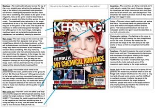
  • 1. Masthead –The masthead is situated across the top of Comment on how the design of the magazine cover attracts the target audience: Coverlines –The coverlines are fairly small and don‟t the cover, straight away attracting the audience. The really attract a reader that much. However, because style of the letters in the masthead looks smashed the coverlines are bright colours and fairly bold they and broken, creating the impression that they have stand out a fair amount on a plain background. This been hit by something. This relates to the genre of the will attract the reader but not as much as they would magazine, rock, as the genre could be described as if they were bigger in size. different to people who listen to other genres like pop music. The masthead is very attractive to the target Colour –The main colours used are white, red, yellow audience and is one of the first things that the reader and black. The colours stand out greatly within the may see at first glance of the cover. The way that the cover and relate to the target audience and the masthead is white contrasts against the bright red genre. This is because the colours are loud and hair of the person in the main image, making the noticeable and the rock genre could be described as masthead stand out and grab the audiences, and loud and noticeable also. maybe even just somebody passing by attention. Photography Lighting –The lighting on the cover is Main image –The main image on the cover is a well- fairly light and bright, making the main image stand known rock artist from a popular rock group. This out on the cover. It informs the reader that the straight away attracts to the target audience as they person on the image is the main story as the light will probably known him already. His pose in the seems to focus on him in comparison to the other image may attract the audience as he looks fairly images. shocked about something. This may make any Typefaces –The text throughout the cover is mainly audience wonder what he is shocked about and make block, sans serif text. This represents the harshness them want to buy the magazine. In the image, the man and sharpness of the genre, relating to the target has a direct mode of address. This helps the reader audience. The text that is used to present connect with the audience. But, the way that the „KERRANG!‟ is a broken and smashed style. This masthead overlaps the main image makes the main represents the rocky style and genre of the image seem a lot less dominant on the cover as the magazine, again relating to the target audience. reader will be attracted to the masthead first. Model credit –The models actual name is not House Style –In the cover there is a lot going on and presented on the cover, just the name of the group he generally the reader may not know where to look as is from „My Chemical Romance‟. Although somebody things look cramped into the cover. The cover is very in the target audience may recognise the person in loud and although some people may find it difficult the main image, somebody who doesn‟t won‟t know to read and process, it reflects the genre of the who the person is so this may not make them want to magazine which attracts the target audience. buy the magazine whereas if the name was there, the However, people who aren‟t in the target audience model is made more familiar with the public who see and people passing by may find the cover far too the magazine. overwhelming and in their faces. Main cover line –The main cover line takes up a large amount of the page and attracts people passing by as well as the target audience. It reads “THIS IS REALLY SCARY!” This makes the reader suspicious of what is in the magazine and has them wondering what is scary and why it is scary. This will make the reader want to read more and find out what it is.