1. House Style
The style ofthis spreadis veryminimalistic. The backgrounds of the pages
are grey, withblackaccents to the headings and text. This couldpossiblybe
to attract the eye to the colourful images used withinthe article, which
juxtapose the monochromatic house style ofthe magazine.
The Guttenberg DesignPrinciple
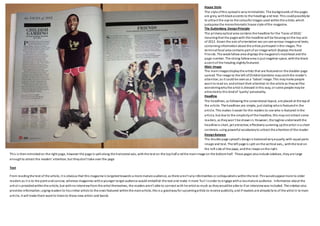
The primaryoptical area contains the headline for the ‘Faces of2010,’
meaningthat the pageswith this headline will be focusing onthe top acts
of 2012. Down the axis oforientation we cansee various imagesand texts,
containinginformationabout the artists portrayedinthe images. The
terminalfocal area contains part of animage which displays the band
Friends. The weakfallow area displays the magazine’s masthead and the
page number. The strong fallowarea is just negative space, withthe black
accent of the heading slightlyfeatured.
Main Image
The mainimagesdisplaythe artists that are featuredon the doubler page
spread. The image to the left ofChildishGambino maycatchthe reader’s
attention, as it could be seenas a ‘taboo’ image. This maymake people
want to read on, andattract their attention to the article as theywillbe
wonderingwhythe artist is dressed inthis way, or some people maybe
attractedto this kindof ‘quirky’ personality.
Headline
The headlines, as following the conventional layout, are placed at the topof
the article. The headlines are simple, just stating whois featuredin the
article. This makes it easier for the readers to see who is featured inthe
article, but due to the simplicityof the headline, this maynot attract some
readers, as theywon’t be drawnin. However, the tagline underneaththe
headline is short, yet attractive; effectively summing upthe artist ina short
sentence, using powerful vocabularyto attract the attentionof the reader.
DesignBalance
The double page spread’s designis balancedveryequally;with equal parts
image and text. The left page is split onthe vertical axis,, withthe text on
the left side of the page, andthe image onthe right.
This is thenmimickedon the right page, however the page is split along the horizontal axis, withthe text on the tophalf a ndthe mainimage on the bottomhalf. These pages alsoinclude sidebars, they are large
enoughto attract the readers’ attention, but theydon’t take over the page
Text
From readingthe text of the article, it is obvious that this magazine is targetedtowards a more mature audience, as there aren’t anyinformalities or colloquialisms withinthe text. Thiswouldappeal more to older
readers as it is to the point andconcise, whereas magazines witha younger target audience would embellish the text and make it more ‘fun’ inorder to engage witha lessmature audience. Information about the
artist is providedwithinthe article, but withno interviewfrom the artist themselves, the readers aren’t able to connect with he artist as much as theywouldbe able to if an interviewwas included. The sidebar also
provides information;urgingreaders to trysimilar artists to the ones featured withinthe mainarticle, this is a goodwayfor upcomingartists to receive publicity, and if readers are alreadyfans of the artist in te main
article, it will make them want to listento these new artists and bands.