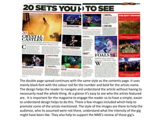
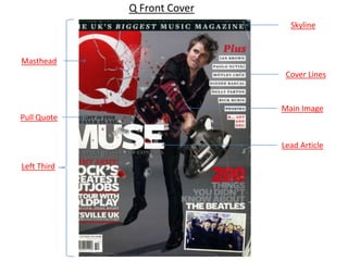
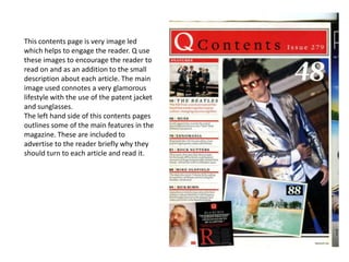
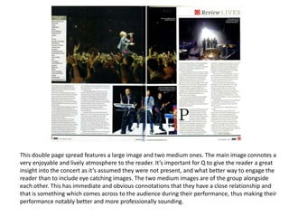
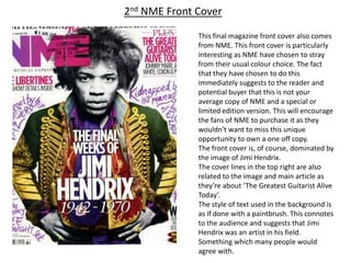
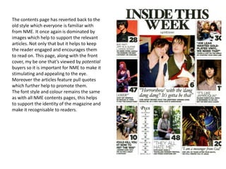
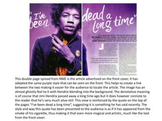
Music Magazine Analysis

       Aidan Jervis
NME Front Cover
                                  Skyline


Masthead


  Flash


                                Main Image

Left Third

                                Lead Article


Cover Lines
The masthead for this magazine is consistent with all NME magazines. The
masthead with its striking red, bold, uppercase font is an assertive message to their readers
to buy it. This continued style throughout all of NME’s literature reinforces their brand
identity, making them immediately recognisable to the readers and potential buyers. The
masthead is also in keeping with the conventions of magazines by being located in the left
third.
            The left third is key as it is the part of the magazine visible to customers when
placed on a newsagent’s shelf. The left third also contains a flash. The flash works much like
the skyline, giving the reader of view of what’s inside. However the flash is located in the left
third and just below the masthead. This suggests that it has real importance and therefore
carries an interesting story or feature, one which would appeal to potential readers.
            The skyline of this front cover gives the reader a brief view of what the issues
main feature is. In this case it is reviews for the Reading and Leeds festivals, something which
NME strongly support, therefore assuming their readers will to. It is used to attract the
potential readers and words like “exclusive” are often used to entice them further.
            The main image and lead article relate. The image connotes a ‘rock star’ lifestyle ;
drunken nights out and expensive champagne. This is something which many of the NME
readers would aspire to become thus making the image attractive to them. It also suggests
to the audience that The Libertines are successful. As well as the success the image
connotes a friendship between the two of them (something which previously may have not
been so strong), this is reinforced by the inclusion of the lexis “united” in the article title.
            Some magazine front covers feature cover lines. Cover lines are just another way
of advertising some of the features in the magazine. It may be important to include cover
lines as they help to promote the lead article or main features.
The image led contents page gives the
reader a brief overview on what each
feature is about. It of course includes the
page number making it easier for the
reader to navigate through the magazine.
The images included are ones which are
relevant to the article. This makes it even
clearer to the reader what each article is
about, if it wasn’t already. The main
image in the middle connotes a very
lively, fun and intense
atmosphere, something which NME know
will excite their audience. There is also
different font styles in use, this helps to
distinguish between each article and
make it clearer to the audience. NME
have also included a small advert which
they have put in a red box. This helps it to
stand out thus making it easier to
advertise. Lastly they have chosen to
include a ‘Plus’ section. This gives the
audience a very brief view of some of the
lesser articles in the issue.
The double page spread continues with the same style as the contents page. It uses
mainly black font with the colour red for the number and bold for the artists name.
The design helps the reader to navigate and understand the article without having to
necessarily read the whole thing. At a glance it’s easy to see who the artists featured
are. It is important for the magazine to engage the reader so to have a simple, easier
to understand design helps to do this. There a few images included which help to
promote some of the artists mentioned. The style of the images are there to help the
audience, who its assumed were not there, understand what the intensity of the gig
might have been like. They also help to support the NME’s review of those gig’s.
Q Front Cover
                               Skyline


Masthead
                              Cover Lines


                             Main Image
Pull Quote


                             Lead Article

Left Third
As with the majority of magazines the masthead for Q is prominently
featured. Also, like the NME masthead, Q has a very distinctive design, in keeping with
their brand identity, something which I feel they are very proud of, and the status they
have built up as the number one music magazine. At a glance this logo immediately
connotes to the potential buyer exactly what it is i.e. most people would know what to
expect from this magazine without having to pick it up and read it.
            The main image is of the lead artist from Muse, he’s holding a guitar and has
appeared to have cracked the Q masthead. This connotes to the reader that he is
‘smashing it’, in the sense that they are doing particularly well at this time. I don’t believe
there is much anger or aggression present, if any at all, as his face appears to be relatively
calm. The artists dress is in keeping with the overall style of the front cover with the use
of black and red.
            The colours used for this front cover are relatively simple. They have used a
main background colour of grey which allows them to then have white text over that. The
dark background colour also allows for the red to stand out becoming even more
obvious. This helps to highlight specific areas and make them aware to the audience,
such as parts of the cover lines but mainly the masthead.
            The left third of this front cover contains the masthead and the lead article
along with other features with this edition. The lead article is in large capitals highlighting
the importance of it.
This contents page is very image led
which helps to engage the reader. Q use
these images to encourage the reader to
read on and as an addition to the small
description about each article. The main
image used connotes a very glamorous
lifestyle with the use of the patent jacket
and sunglasses.
The left hand side of this contents pages
outlines some of the main features in the
magazine. These are included to
advertise to the reader briefly why they
should turn to each article and read it.
This double page spread features a large image and two medium ones. The main image connotes a
very enjoyable and lively atmosphere to the reader. It’s important for Q to give the reader a great
insight into the concert as it’s assumed they were not present, and what better way to engage the
reader than to include eye catching images. The two medium images are of the group alongside
each other. This has immediate and obvious connotations that they have a close relationship and
that is something which comes across to the audience during their performance, thus making their
performance notably better and more professionally sounding.
2nd NME Front Cover

              This final magazine front cover also comes
              from NME. This front cover is particularly
              interesting as NME have chosen to stray
              from their usual colour choice. The fact
              that they have chosen to do this
              immediately suggests to the reader and
              potential buyer that this is not your
              average copy of NME and a special or
              limited edition version. This will encourage
              the fans of NME to purchase it as they
              wouldn’t want to miss this unique
              opportunity to own a one off copy.
              The front cover is, of course, dominated by
              the image of Jimi Hendrix.
              The cover lines in the top right are also
              related to the image and main article as
              they’re about ‘The Greatest Guitarist Alive
              Today’.
              The style of text used in the background is
              as if done with a paintbrush. This connotes
              to the audience and suggests that Jimi
              Hendrix was an artist in his field.
              Something which many people would
              agree with.
The contents page has reverted back to the
old style which everyone is familiar with
from NME. It once again is dominated by
images which help to support the relevant
articles. Not only that but it helps to keep
the reader engaged and encourages them
to read on. This page, along with the front
cover, my be one that’s viewed by potential
buyers so it is important for NME to make it
stimulating and appealing to the eye.
Moreover the articles feature pull quotes
which further help to promote them.
The font style and colour remains the same
as with all NME contents pages, this helps
to support the identity of the magazine and
make it recognisable to readers.
This double page spread from NME is the article advertised on the front cover. It has
adopted the same purple style that can be seen on the front. This helps to create a link
between the two making it easier for the audience to locate the article. The image has an
almost ghostly feel to it with Hendrix blending into the background. The denotative meaning
is of course that Jimi Hendrix passed away a long time ago but it does however connote to
the reader that he’s very much alive still. This view is reinforced by the quote on the top of
the pages “I’ve been dead a long time”, suggesting it is something he has said recently. The
style and way this quote has been presented to the audience is as if it has appeared from the
smoke of his cigarette, thus making it that even more magical and artistic, much like the text
from the front cover.

Music magazine analysis

  • 1.
  • 2.
    NME Front Cover Skyline Masthead Flash Main Image Left Third Lead Article Cover Lines
  • 3.
    The masthead forthis magazine is consistent with all NME magazines. The masthead with its striking red, bold, uppercase font is an assertive message to their readers to buy it. This continued style throughout all of NME’s literature reinforces their brand identity, making them immediately recognisable to the readers and potential buyers. The masthead is also in keeping with the conventions of magazines by being located in the left third. The left third is key as it is the part of the magazine visible to customers when placed on a newsagent’s shelf. The left third also contains a flash. The flash works much like the skyline, giving the reader of view of what’s inside. However the flash is located in the left third and just below the masthead. This suggests that it has real importance and therefore carries an interesting story or feature, one which would appeal to potential readers. The skyline of this front cover gives the reader a brief view of what the issues main feature is. In this case it is reviews for the Reading and Leeds festivals, something which NME strongly support, therefore assuming their readers will to. It is used to attract the potential readers and words like “exclusive” are often used to entice them further. The main image and lead article relate. The image connotes a ‘rock star’ lifestyle ; drunken nights out and expensive champagne. This is something which many of the NME readers would aspire to become thus making the image attractive to them. It also suggests to the audience that The Libertines are successful. As well as the success the image connotes a friendship between the two of them (something which previously may have not been so strong), this is reinforced by the inclusion of the lexis “united” in the article title. Some magazine front covers feature cover lines. Cover lines are just another way of advertising some of the features in the magazine. It may be important to include cover lines as they help to promote the lead article or main features.
  • 4.
    The image ledcontents page gives the reader a brief overview on what each feature is about. It of course includes the page number making it easier for the reader to navigate through the magazine. The images included are ones which are relevant to the article. This makes it even clearer to the reader what each article is about, if it wasn’t already. The main image in the middle connotes a very lively, fun and intense atmosphere, something which NME know will excite their audience. There is also different font styles in use, this helps to distinguish between each article and make it clearer to the audience. NME have also included a small advert which they have put in a red box. This helps it to stand out thus making it easier to advertise. Lastly they have chosen to include a ‘Plus’ section. This gives the audience a very brief view of some of the lesser articles in the issue.
  • 5.
    The double pagespread continues with the same style as the contents page. It uses mainly black font with the colour red for the number and bold for the artists name. The design helps the reader to navigate and understand the article without having to necessarily read the whole thing. At a glance it’s easy to see who the artists featured are. It is important for the magazine to engage the reader so to have a simple, easier to understand design helps to do this. There a few images included which help to promote some of the artists mentioned. The style of the images are there to help the audience, who its assumed were not there, understand what the intensity of the gig might have been like. They also help to support the NME’s review of those gig’s.
  • 6.
    Q Front Cover Skyline Masthead Cover Lines Main Image Pull Quote Lead Article Left Third
  • 7.
    As with themajority of magazines the masthead for Q is prominently featured. Also, like the NME masthead, Q has a very distinctive design, in keeping with their brand identity, something which I feel they are very proud of, and the status they have built up as the number one music magazine. At a glance this logo immediately connotes to the potential buyer exactly what it is i.e. most people would know what to expect from this magazine without having to pick it up and read it. The main image is of the lead artist from Muse, he’s holding a guitar and has appeared to have cracked the Q masthead. This connotes to the reader that he is ‘smashing it’, in the sense that they are doing particularly well at this time. I don’t believe there is much anger or aggression present, if any at all, as his face appears to be relatively calm. The artists dress is in keeping with the overall style of the front cover with the use of black and red. The colours used for this front cover are relatively simple. They have used a main background colour of grey which allows them to then have white text over that. The dark background colour also allows for the red to stand out becoming even more obvious. This helps to highlight specific areas and make them aware to the audience, such as parts of the cover lines but mainly the masthead. The left third of this front cover contains the masthead and the lead article along with other features with this edition. The lead article is in large capitals highlighting the importance of it.
  • 8.
    This contents pageis very image led which helps to engage the reader. Q use these images to encourage the reader to read on and as an addition to the small description about each article. The main image used connotes a very glamorous lifestyle with the use of the patent jacket and sunglasses. The left hand side of this contents pages outlines some of the main features in the magazine. These are included to advertise to the reader briefly why they should turn to each article and read it.
  • 9.
    This double pagespread features a large image and two medium ones. The main image connotes a very enjoyable and lively atmosphere to the reader. It’s important for Q to give the reader a great insight into the concert as it’s assumed they were not present, and what better way to engage the reader than to include eye catching images. The two medium images are of the group alongside each other. This has immediate and obvious connotations that they have a close relationship and that is something which comes across to the audience during their performance, thus making their performance notably better and more professionally sounding.
  • 10.
    2nd NME FrontCover This final magazine front cover also comes from NME. This front cover is particularly interesting as NME have chosen to stray from their usual colour choice. The fact that they have chosen to do this immediately suggests to the reader and potential buyer that this is not your average copy of NME and a special or limited edition version. This will encourage the fans of NME to purchase it as they wouldn’t want to miss this unique opportunity to own a one off copy. The front cover is, of course, dominated by the image of Jimi Hendrix. The cover lines in the top right are also related to the image and main article as they’re about ‘The Greatest Guitarist Alive Today’. The style of text used in the background is as if done with a paintbrush. This connotes to the audience and suggests that Jimi Hendrix was an artist in his field. Something which many people would agree with.
  • 11.
    The contents pagehas reverted back to the old style which everyone is familiar with from NME. It once again is dominated by images which help to support the relevant articles. Not only that but it helps to keep the reader engaged and encourages them to read on. This page, along with the front cover, my be one that’s viewed by potential buyers so it is important for NME to make it stimulating and appealing to the eye. Moreover the articles feature pull quotes which further help to promote them. The font style and colour remains the same as with all NME contents pages, this helps to support the identity of the magazine and make it recognisable to readers.
  • 12.
    This double pagespread from NME is the article advertised on the front cover. It has adopted the same purple style that can be seen on the front. This helps to create a link between the two making it easier for the audience to locate the article. The image has an almost ghostly feel to it with Hendrix blending into the background. The denotative meaning is of course that Jimi Hendrix passed away a long time ago but it does however connote to the reader that he’s very much alive still. This view is reinforced by the quote on the top of the pages “I’ve been dead a long time”, suggesting it is something he has said recently. The style and way this quote has been presented to the audience is as if it has appeared from the smoke of his cigarette, thus making it that even more magical and artistic, much like the text from the front cover.