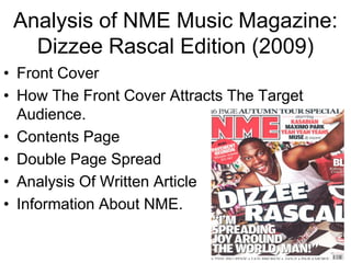
1. Analysis of NME Music Magazine:
Dizzee Rascal Edition (2009)
• Front Cover
• How The Front Cover Attracts The Target
Audience.
• Contents Page
• Double Page Spread
• Analysis Of Written Article
• Information About NME.
2. Analysis of magazine pages: Front Page
NME Sept 2009 - Dizzee Rascal Edition
Masthead: the masthead instantly grabs the
Main image: Featured artist is Dizzee Rascal, a long shot is used to express his readers attention, placed in the top left third of
full positive body language and show to the reader his facial expressions, the cover using a big bold font and generic
which are cheerful and happy, welcoming the reader. He presents himself colours like red, white and black. NME shows
well, his clothing looks clean cut, wearing gold jewellery, this and also the importance and readers genuinely read the left
graffiti is representative of his genre and background of being an urban artist. third first. NME also sets the colour scheme for
the front cover, the colours red white and black
being displayed in various ways such as his red,
Flash: this adds something extra and
white and black trainers.
more appealing for the target
audience, the word ‘news’ connotes to Header: as the masthead does not take up the
the information inside the magazine whole top third, the header acts as a extension of
being brand new. this. ‘starring’ is usually used for movie stars
names and music, so this implies that the guests
‘starring’ in this issue are of an interesting good
Rule of thirds: the rule of thirds is used quality.
effectively on this cover, placing
Sell lines: used to interest the reader into buying
important coverlines down the left
the magazine.
third following the traditional ‘C’
reading curve that most readers do Footer: gives the reader an insight into who is
subconsciously. The masthead placed featuring in this magazine ‘Jay-Z, Paramore.’
in the top thirds The main image is the
biggest convention, so they have Date/barcode/price: normal conventions of a
spread it across the three thirds. magazine.
Pull quote: “I'm spreading joy around
the world, man” this pull quote will Coverline: the main cover line ‘DIZZEE RASCAL’ links to the main image of the featured
attract the attention of NME target artists, being made to look 3D with a shadow effect creates the feel of it popping out of the
audience, the use of informal language cover engaging the reader. The text is off centre reflecting the artists personality, not
appealing to their stated TA. It may following the conventions of normal magazine kind of like breaking the rules. A simple colour
trigger the thought of ‘what is inside scheme is used relating to the mastheads colours, the text is mainly son serif and uppercase
the magazine’ or ‘how is he spreading with the colour white having connotations of being new. The language shows informality
joy’ which will bring the reader closer to words such as ‘man’ and sensationalising the magazine through words ‘wowee and zowee’.
purchasing the magazine.
3. Analysis of magazine pages: How it attracts the Target Audience?
NME Sept 2009 - Dizzee Rascal Edition
How does it attract its target audience?
NME proposes an interesting variety through conventions
on the front cover, such as; coverlines, header and the
main image. The artist is possibly a role model to some, the
artists arms are spread wide and almost coming out of the
page inviting the reader to take a wider interest in the
magazine. Followed by the coverline that
links to the main image, ‘I'm spreading joy around the world,
man!’ the use of informal language and the layout of text
challenges the conventions of magazines, this method is
quite common amongst music magazine.
So who are NMEs target audience?
After research and a small discussion I discovered that NMEs
target audience are; Males between the ages of 15-34 but it
mainly attracts those aged between 16- 25. So they are
mature teens/young adults who will share similar interests.
They will be lovers of music and share similar interests such
as Indie and Rock n Roll, but serious fans so the quality of
information they are receiving will still have to be of a good
quality. We discussed the social class of majority of readers
and come to the conclusion that they may be working class
students, but with disposable income from part time jobs.
4. Analysis of magazine pages: Contents
Masthead: the masthead on the contents page is the same as the
NME Sept 2009 - Dizzee Rascal Edition
front cover, the layout looking simple but at the same time
professional. This time the page title ‘contents’ is used as an
extension of the masthead across the top third of the page.
Date: lets the reader know what
date the issue was published. Also
found on the front covert
Band Index: The page numbers
are listed in black and the Subheadings/Brief Summary: the
various artists names are listed subheading is blackout with the text left
in red, the colour scheme looks white, the bold capitalised font stands out
tidy and professional, also the clearly against a black background, making
colours matching that of the it easier to read for the reader. A brief
tour bus in the main image. summary of the content and a page
number also in red, once again going back
to the colour scheme set by the masthead
of red, white and black.
Main image/Copy: this is of a women inviting readers to start Subscription Box this will keep a subscriber up
touring, the image has been manipulated appropriately suiting the to date with future editions published by NME,
topic . Editing it to look like a photographs compliments the feel of possibly competition as well. It is show with
a tour well, looking like a kind of holiday snap. The copy under the details of the website, a phone number. It just
image is the editors introduction telling the reader the contents of allows the magazine to interact more with its
magazine. The box around this resembles a kind of chest that fans.
instruments can be carried in emphasis of the ‘touring special.’
5. Analysis of magazine pages: Analysis of contents layout/design features.
NME Sept 2009 - Dizzee Rascal Edition
Masthead from the front cover is used on the Contents page.
Page numbers are listed along with the names of all bands and artists that are
The word contents are shown in a bold font also across the
top third, which also features the issue date.
featured in the magazine. Image has been placed in the left third.
Main image shows a women
inviting readers to tour, with a Subheadings and brief
manipulated image to give it a summary allows for a
holiday/day trip feel. Also the image more convenient
has been placed in the middle third. experience of the
magazine, as it will be
easier tor easier to
read for the reader.
They can skip to the
main articles, for
example Dizzee Rascal
under the bold font of
the word ‘FEATURE’.
An introduction to the magazine
from the editor also placed down
the middle third with a solid bold
title font ‘TOURING SPECIAL.’
A box placed in the
bottom right third of
the magazine,
following the natural
‘C’ this will be the last
thing a read see’s.
6. Analysis of magazine pages: Double Page Spread Caption: The artists name, conventional of NME, allows the reader
NME Sept 2009 - Dizzee Rascal Edition to know who the information is about.
Byline: this shows acknowledgement of the
writer and the photographer.
Headline/Subheading: the words ‘from tags
to riches’ similar to the more popular phrase
of ‘from rags to riches.’ The headline is
dramatic, already proposing the idea of
where Dizzee was before (tags) and where
he is now (riches). The words have been
manipulated to suit the target audience. The
headline is the biggest text on the page,
completely overpowering the textual page,
the headline stands out enhancing the main
image. The subheading uses chatty language
to inform the reader of Dizzee’s successful
year.
Smaller image: the small image of empty
beer bottles and radio allows the reader to
create a sense of the lifestyle that Dizzee
Rascal lives/lived. How he enjoys himself and
likes to have a good time, small portrayals
like these give an insight into what the
article may be about before even reading it.
Date/Title/Page Number: A normal Copy: The written article under the headline
convention of magazine pages found is introduced using ‘Drop Caps’ approximately 6 lines long. Drop Caps are a popular way of
across a wide range of magazines. starting a article within a music magazine. The article was wrote in 4 columns and when looking
at the layout we see how the columns size is small and the text wraps around the image.
Main Image/ Mise en Scene: Main image shows the feature artist with a spray can looking as if he is about to Graffiti. The
background plays a role in emphasising Dizzee Rascals image. The background relating to his past but also his successful
career producing music like, rap, garage and hip hop creating an urban image for himself. The background image also
linking to the headline on the other page ‘From Tags To Riches.’ He is once again very well dressed and clean cut which
creates a sense of wealth and success. In the image his body language is quite suspicious, as if he knows graffiti could get
him into trouble which adds to his rebellious individual image of where he has come from to where he is now. The colour of
clothing he is wearing is red and white, which continues on from the masthead’s colours linking all pages to one another.
7. Analysis of magazine pages: Analysis of written Article
NME Sept 2009 - Dizzee Rascal Edition
The article is about how Dizzee Rascal has turned his
life around, NME referring to Dizzee as „Britain's Biggest
Pop Star 2009.‟ The main headline sums up what is
written underneath how Dizzee has literally gone from
an average artists who used to graffiti to one of the
biggest stars in the country.
The headline is the biggest textual thing on the page,
the capitalised bold black font makes it stand out
against the smaller sized font catching the readers
attention, similar to that of Dizzee Rascal. The words
„from tags to riches‟ are quite cheesy but work due to the
target audience of young adults.
Text like “as Dizzee Jumps around the place he owns it”
and “Kids are congregating trying to peer in” really
shows to the reader the impact he is having in the UK
right now. Adding the kids to the article gives us an
insight into the Target audience that Dizzee attracts.
The article is wrote in 4 short columns with each column
containing approximately 75-100 words each. The style
of the article is quite chatty and very informal. A clear
example of the informality of the article is at the begging
of the second paragraph in the first column.
8. NME.
Launched in 1952, the New Musical Express is the worlds greatest and more influential weekly music magazine, known globally as the NME.
They are the ones responsible for creating the first UK singles chart and breaking through many individual acts themselves such as Jimi
Hendrix, The Stone Roses, Blur, Oasis and the Arctic Monkeys. The information a reader will find within the magazine will be funny at times,
but be very critical and truth telling so the readers get the information they really want to know about, kind of journalistic.
http://www.nme.com/
NME was is currently published weekly by IPC media with their wide range of readers being between 15 – 34, but there marketed audience
are males between the age of 16-25.
Readership: 289,000 (Jul 11 – Jun 12) Male: 66% Female: 34%
Sale Figures: In 2011 weekly sale figures decreased and fell below 30,000 sales per week.
Price: £2.40