
Recommended
More Related Content
What's hot
What's hot (16)
Viewers also liked
Viewers also liked (14)
Similar to Research Task 3c: Double Page Spread Kerrang Analysis
Similar to Research Task 3c: Double Page Spread Kerrang Analysis (20)
Recently uploaded
Recently uploaded (20)
Research Task 3c: Double Page Spread Kerrang Analysis
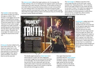
- 1. The main image is a Medium Long Shot of the same model that was on the front cover; a band member from ‘Asking Alexandria’. This is a familiar face for the target audience so the reader will stop to see what it’s about. The model has sunglasses on so we can’t see his eyes or whether he’s giving direct address. His facial expression is quite serious because he has a straight face, which could be because the article is quite serious too. The mise-en-scene reflects the target audience a lot. For example, the models clothing is the sort of clothing that the targeted readers would wear mainly because its dark coloured. Furthermore, he has tattoos all over his arms which reflects young males because tattoos are seen to be youthful. He’s also holding a beer in his hand which is the kind of thing the target audience would be associated with at their age. The model himself is young which helps the target audience relate to him because they are of similar age and have a similar lifestyle and hobbies. A drop-cap has been added to the start of the articles text. This shows the reader that it is the start of a new article. It also helps draw attention to it because of it being the biggest letter against really small letters. They put it there to set the scene too. This double paged spread has a basic layout to it and its laid out in a grid. The main image goes across both 2 pages but the actual article text stays on the left page. This has the headline across the top and then the text underneath split into two combs which makes it look neat and professional. This enables the reader to find it easier to read the text and look at the page as a whole. The headline is the main thing that stands out when you look at the page as a whole. This is because t’s the biggest text on the page in a bold white font resting against a black background making it catch the viewers eye. It is called ‘Moment of Truth’ which straight away gives the reader questions wondering what its about because the title doesn’t give away exactly what it’s about. Therefore, this encourages the reader to carry on reading the actual article to find out. A pull quote is added next to the model. This piece of text is stranded from the rest of the text on the opposite page which really bring attention to it. This is effective because the quote anchors the main image and text and encourages the viewer into reading it. By giving the reader an insight into what a snippet of the text is saying, it can make them want to find out more because it draws them in. What helps this is the fact that it is in white font placed against a black background which contrasts helping it stand out again. Once again they have been consistent with the colour scheme being plain colours; mainly black and white. However, this double page spread has bits of purple. The keeps a theme to the whole magazine and makes it seem very professional and neat.