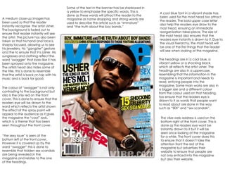
1. A medium close-up images has been used so that the reader instantly recognise the artist Usher. The background is faded out to ensure that reader instantly will see the artist. The picture has also been taken so that his hand and face is sharply focused, allowing us to see his jewellery, his “gangster” gesture and the to ensure that it is Usher. His sunglasses and clothing reflect the word ‘swagger’ that looks like it has been sprayed onto the magazine. The artists head also hides some of the title, this is done to resemble that the artist is back on top with his music and is back for good. A cool blue font in a vibrant shade has been used for the mast head too attract the reader. The bold upper case letter also help the readers eye draw to the mast head, ensuring an immediate reorganisation takes place. The size of the mast head also ensures that the readers eye instantly is drawn to it. Due to the visual hierarchy, the mast head will be one of the first things that the reader will see when looking at the magazine. Some of the text in the banner has be shadowed in a yellow to emphasise the specific words. This is done as these words will attract the reader to the magazine as name dropping and strong words are used to describe the article such as “immature” and “the truth about the boy bands.” The headings are in a cool blue, a vibrant yellow or a shocking black which all reflects the artist usher. The headings are also in a uppercase, resembling that the information in the magazine is important and needs to read, enticing people into the magazine. Some main works are also in a bigger size and a different colour from the colour used on that heading, too ensure that the readers eye is drawn to it as words that people want to read about are done in the way such as “SEX” and “sex scandals”. The vibe web address is used on the bottom right of the front cover. This is done as the readers eye wont be instantly drawn to it but it will be seen once looking at the magazine for a while. The front cover does this to ensure that it doesn’t take the attention front the rest of the magazine but advertises their website to ensure that people are not only enticed into the magazine but also their website. The colour of “swagger” is not only contrasting to the background but also is the only red on the front cover. This is done to ensure that the readers eye will be drawn to the word which reflects the artist shown The effect of the spray paint will appeal to the audience as it gives the magazine the “cool” look, which is a theme that has been seen throughout the front cover. “ the sexy issue” is seen at the bottom left of the front cover. However it is covered up by the word “swagger” this is done to resemble that hidden sex scandals are being revealed in the magazine and relates to the one of the headings.
2. The mast head is portrayed in a vibrant, passionate colour to ensure that it catches the attention of the reader, but also reflect in the model Beyonce. The mast head is also in uppercase to reflect that this magazine is important and needs to be read by the reader. The position of the text is also essential due to the visual hierarchy, as it will instantly catch the attention of the reader and is easily recognisable. The model used on this front cover is instantly recognised as Beyonce. The way that he back is arched her hand against what seems to be a wall is a passionate position , which relates to the article within and advertised on the front cover. It also gives Beyonce the “sexy” look which she is known for in her music videos. The use of the hand against a wall also helps the reader see the bracelet that she is wearing . The artist is also covering the masthead this therefore shows that the article on the artist within the magazine is a big storey and the main attraction as she is even more important then the masthead. Name dropping has been used on the banner of the magazine to persuade people into the magazine as the reader will want to read about their life and scandals they may of created. They are in a bold black colour to contrast from the background and stand out on the page. The three main colours used on the front cover are red black and white. These colours are used to represent the artist shown on the front cover. The red is to portray the passion shown through the image and through the article within the magazine. The white and black are even shown in what the artist is wearing and keeps the magazine simple but effective. The colour scheme is also seen through the headings. The colour red is seen to emphasise certain word that will instantly catch the eye of the reader and entice them into the magazine like “10 pages like you have never seen her before.” The headings are also all in uppercase which represents that the articles are important and much be read, therefore persuading the reader into the magazine. The front cover unlike a lot of magazines doesn’t give other companies places to advertise their products. However the front cover does advertise two specific things. The website of the magazine which is seen on the bottom left hand corner, it is placed here as the reader will not instantly see it but after a long glace it is visible. This is done to ensure the web address doesn't take the attention from the main articles, image etc. The other advertisement is the downloading advert. This is done as the download will probably link to the magazine, making people want to look read or listen to a similar thing. As seen in the bottom right hand corner there is a symbol or picture of some sort, however it is not very clear and the reader may not understand why it is there. There I suggest the this is removed from the front cover to prevent this confusion.
3. A bold black title has been used to ensure that it is instantly recognisable as the title of vibe may change every issue but the font and the style never change. The faded out effect types it in with the rest of the front cover as a spot light effect has been used, I like this as it creates a flow on the front cover and it looks like all the front cover work well together and all links in to one another. The position of the mast head on the front cover ensures that the reader instantly can see it. The background is a bright grey, which on its own could look dull and boring however, the front cover has added effect in it which is used very cleverly as it instantly brings the eye of the reader to the model in the middle of the page. The model in the middle of the page is instantly recognisable as Ciara. This is a good aspect of the cover as this will immediately draw in readers as they will want to read about and see pictures of a singer that most probably follow. The pose and look she is giving is “sexy” and “sassy”, which the artist is well known for and ties in with the headlines of “ I’m not gonna hold back too much”, which reflect that there may be images in the magazine that would appeal more to the male reader. This is not a good thing to the magazine due to the models pose and the lack of clothing it discourages female readers, decreasing there potential readers. Banner at the top of the page name drops to ensure that they reader will be enticed into the magazine due to favourite articles having article about them. Contrast in colours used to emphasis certain word that will appeal more to the reader. I like this as it isn't obvious that the front cover is trying to boast about them being in the magazine but hint that they will be in and what sort of article will be writing without it being in a heading. The use of heading surrounding the model ensures that the eye is instantly drawn into the magazine. I think this is a brilliant idea as draws the reader eye exactly where the front cover wants the eye to fall. The use of article chosen for the front cover engages the reader instantly to the magazine as they want to read about sex scandals that might not of been published before. The use of the red on black ties everything of the magazine together and is the colour scheme throughout the magazine linking everything. It keeps the magazine simple but effective with just the right colours used. The colour scheme is also seen through the model who has the bold black hair and shoes to carry the theme throughout the front cover. The article used by Ciara links in with the picture but also catches the eye so the reader due to the quote by the artist about the article in which she appeals. The headline is also arranged so that it is on top of the model legs but her arms are on top of it. This resembles that she may have been put down but she's know back on top and nothing going put her down not even her name. The use of the bright bold red, ensures that the readers eye instantly is drawn to the name encouraging people to pick up the magazine due to the recognition of the name. I think that that is a brilliant way to represent something but to also draw the reader into the magazine.