1. Textual Analysis
NME
NME magazine is a pop music magazine that features many different music genres. It’s
circulation is 33,875, and it’s readership is 411,000. IT’s average reader is a male in
their mid twenties that regularly attends concerts since 2007, thinks music is an
important part of their life, and likes to listen to new bands.
It is published by IPC Media, which covers a wide range of different magazines, such as
Television Magazines, gossip magazines, sport magazines, cooking magazines,
decorating magazines, and much more. They are one of the UK’s most successful
publishers in the UK, with over 350 million sales each annually.
Front Cover
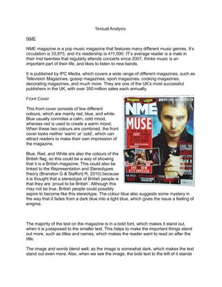
This front cover consists of few different
colours, which are mainly red, blue, and white.
Blue usually connotes a calm, cold mood,
whereas red is used to create a warm mood.
When these two colours are combined, the front
cover looks neither ‘warm’ or ‘cold’, which can
attract readers to make their own impression of
the magazine.
Blue, Red, and White are also the colours of the
British flag, so this could be a way of showing
that it is a British magazine. This could also be
linked to the Representation and Stereotypes
theory (Branston G & Stafford R, 2010) because
it is thought that a stereotype of British people is
that they are ‘proud to be British’. Although this
may not be true, British people could possibly
aspire to become like this stereotype. The colour blue also suggests some mystery in
the way that it fades from a dark blue into a light blue, which gives the issue a feeling of
enigma.
The majority of the text on the magazine is in a bold font, which makes it stand out,
when it is juxtaposed to the smaller text. This helps to make the important things stand
out more, such as titles and names, which makes the reader want to read on after the
title.
The image and words blend well, as the image is somewhat dark, which makes the text
stand out even more. Also, when we see the image, the bold text to the left of it stands
2. out which helps to make somebody who has just seen the image possibly read the
actual words and titles. The house style consists of mainly red, white and black text,
with the titles being white. The colour red is also used to make certain words and
sentences stand out, such as where it says “51 new acts unveiled”, because they may
not have stood out as well without the background which makes the colours look
brighter.
The font that is used is quite simple, rather than elaborate. This shows how the ‘attitude’
of the magazine is serious. This also reflects it’s target audience; people who are
seriously interested in music.
The main image is a photograph of a well known British band member. This could link
with the colours that represent the British flag. The large image links with the text, and
informs the reader that he is the main subject of this particular issue. There are also
three smaller images beneath the main text, which informs the reader visually of what is
also going to be featured in the magazine. These images link with the text beneath,
which let the reader know that they are new artists that they might like.
The positioning of the images alongside the main image helps to make them stand out,
this suggests to the reader that the three smaller images are connected to the main
one. This could also persuade the reader to buy the magazine in order to read about the
three newer artists (who might be as good as the main artist).
The artist in the main image is standing with his hands clenched, while looking forwards
seriously, which make it feel like he is staring directly at the reader. This, again, links to
the text, because of the seriousness of the message that is being conveyed. This
message is also conveyed through the use of colours, as it shows a blue background
behind the artist (and blue has a connotation with the emotion of sadness), which
makes the reader feel as if they should relate to the message.
The camera angle in the image is a mid close-up, which only shows his chest upwards.
This makes the reader mainly focus on his face and hands, as you can’t see his clothes
which would probably stand out too. Most readers will probably focus on the face first,
and then move down to the hands, before moving across to the smaller images. This
could have been done intentionally, because, as said earlier, the smaller images may
have been harder to see when compared to the main image, so by putting them next to
the main image, they are much easier to see.
Contents Page
3. The colours used on this contents page are different to that used on the front cover,
which shows how there is no immediate house style used within these two pages, which
results in a different overall look of the magazine. The main colours that we can see are
white, as well as the black text. The black font against the white background stands out
a lot as the colours are reversed. The colours used are somewhat basic and do not
seem very appealing, however they do connote the colours of a newspaper, which could
suggest that the magazine considers itself to be the closest thing to showing the news
that fans want to hear rather than showing gossip.
The layout of the contents page also connotes the theme of the newspaper. This can be
seen through the way that it has various images placed around the page with text
beneath it, like how newspapers will have an image to support the article. Each image
on the page is different in size when compared to each other, which could be to show
how some articles are expected to be more popular than other, so the bigger the
picture, the more likely the article is to stand out. The images also show what the
feature they are representing, which could be to catch the eye of readers when they
look at the contents page.
Below each image, the name of the article is present along with a quote from each
article. Some of these articles are written in a bold, regular-looking font whilst the others
are written in a font that looks more ‘fancy’ as if it has been written with handwriting.
Most of these fonts, similarly to the images of the page, differentiate in size. This could
make some articles seem more personal to the artist they are featuring, as it would look
like the title of the article has actually been written, whereas the bolder font looks bold
and more important.
The language used on the contents page is somewhat informal and different to other
magazines, as it shows a quote from an article that it is representing, followed by a
description of the actual article. For example, one strapline says “I hired a live wolf and
covered myself in pythons”. Not only does this make the magazine seem more
personal, as if the artist or magazine is speaking to the readers, but it can also make the
readers curious, because it does not tell the reader the whole story and just tells them a
somewhat strange line, which will make the reader want to read more. The language
used in the contents page also shows how the magazine relates to the readers,
because it uses words that the target audience would probably use, such as ‘fancying’,
as well as cruder words.
Overall, I feel that this page is more of an informal page when compared to the front
cover, because it shows everything it is supposed to and does it very well. However, I
feel that this does not stand out as much as it could, because everything is somewhat
plain. I really like the way that it talks to the readers by using informal language and
using the different fonts to make it seem more personal, but I think there could be some
small changes to make it better, such as some added colour.
Double Page Spread
4. The double page spread stands out very well, as it focuses on one main image as
opposed to the writing. The colours used are still somewhat simple, as it uses mainly
whites, greys and browns, which are all part of the image. Where the text is concerned
on the page, it only uses black and white, which is similar to the contents page, as it
uses a plain white background behind the black text, which makes the text stand out
and easier for the reader to read. All of the colours that have been used on the page are
somewhat calming and lets the reader observe the page naturally.
The layout of the double page spread is very spacious with the text on one side and the
image all over the background, with the ‘main’ part of the image on one side so that it is
able to see clearer. This makes the double page spread seem more visually attractive to
the reader, as they are able to differentiate between the two separate parts of the page
which also makes it easier for the readers to read.
The fonts that are used are called Serif. It is a very clear font which makes the text
seem more professional and smart which could suggest that the article is somewhat
serious or intelligent for the reader. The heading is rather different to other headings of
articles, because it interacts with the background as it is placed on the blinds of the
image and looks as if it is light breaking through the window, which, again, makes the
page seem more visually attractive for the reader.
Rather than use many images on the double page, this article uses one large image as
the background, which can make it seem more simple, but will make it stand out more.
The rule of thirds is used, and this attracts the readers’ eyes to the title of the article and
the image. The main image on the left side of the page could be representing the target
audience because it is a young adult man who looks like he is wearing clothes that the
target audience could wear. The Male Gaze Theory (Mulvey, 1975) can also be applied
here, because female readers could find the man attractive, or male readers could
aspire to be like him, as his article talks about how the man is looking forwards to a
brighter future. The pose looks like it could have been staged, as the way that the light
reflects on the sunglasses looks like it could have been difficult to achieve without
staging it.
If the title was looked at from a distance, I feel like it would stand out because it looks
like it could have been written on the blinds, but also looks like it could be something
important when paired up with the image and the simplicity of the pages, but I also think
that people would not be able to read it as the font used it somewhat small. The
language that is used is somewhat formal as the article is serious, so it has to come
across more seriously. The text is also very informative, but also tries to promote the
artist, as it tells the reader about the artists future concerts and albums.
Overall, I think that this page is a big success, as it’s simplicity makes it seem much
more important than a page full of writing, but also makes it stand out. I think that this
page matches up with the contents page, almost creating a simplistic house style.
Evaluation