
Recommended
More Related Content
What's hot
What's hot (16)
Viewers also liked
Viewers also liked (14)
Similar to Research task 10 Contents Page Drawn Draft
Similar to Research task 10 Contents Page Drawn Draft (20)
Recently uploaded
Recently uploaded (20)
Research task 10 Contents Page Drawn Draft
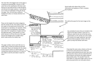
- 1. Social media sites where they can find information and updates on ‘Slam’ on places like Facebook. This will be the space for the main image on the page. The main title is the biggest text on the page so it stands out automatically. I’ve put it in the same font as the masthead on the front cover because its very bold and fits in with the genre and attracts the target audience. I have placed it in a circle so it separates it from the rest of the page. Then, this will have a different background colour so it draws attention to it even more. Any artist/band names that are included in the titles for the page numbers I have put in a different colour to the rest of the text and in capital letters so this stands out to the reader. This catches the target audiences' eye more because they’re popular names in the rock genre so they’ll be familiar with them. I have kept the same colour scheme as the one on the front cover because this makes the magazine look professional and neat. Also, they are masculine colours and I’ve made them fit in with the genre and attract the target audience being mostly males. This wouldn’t have the same effect if I used more bright colours such as pink and purple which are more girly colours. The page numbers next to each title are in a bright colour so they just stand out and look more bold. They’re an indication for the reader to know which article is on which page. By making them bold and stand out, it is clear for the reader to do this and makes it easier for them. These are the headers for certain categories that the articles fit into. This makes it easier for the reader to find what kind of article they would want to read about. For example, if they wanted to look at competitions, they would look under the ‘competitions’ header and find the page they want. I have placed it in a box which sections it off from the rest of the page and put the background as a bright colour which really catches the readers eye.