
Recommended
More Related Content
What's hot
What's hot (20)
Viewers also liked
Similar to Own magazine analysis
Similar to Own magazine analysis (20)
Recently uploaded
Recently uploaded (20)
Own magazine analysis
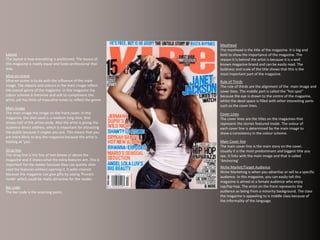
- 1. Masthead The masthead is the title of the magazine. It is big and bold to show the importance of the magazine. The reason it is behind the artist is because it is a well known magazine brand and can be easily read. The boldness and scale of the title shows that this is the most important part of the magazine. Rule of Thirds The rule of thirds are the alignment of the main image and cover lines. The middle part is called the “hot spot” because the eye is drawn to the centre of the magazine, whilst the dead space is filled with other interesting parts such as the cover lines. Cover Lines The cover lines are the titles on the magazines that represent the stories featured inside. The colour of each cover line is determined by the main image to show a consistency in the colour scheme. Main Cover line The main cover line is the main story on the cover. Usually it is the most predominant and biggest title you see. It links with the main image and that is called ‘Anchoring’ Bar code The bar code is the scanning point. Layout The layout is how everything is positioned. The layout of this magazine is neatly equal and looks professional that way. Mise-en-scene Mise-en-scene is to do with the influence of the main image. The objects and colours in the main image reflect the overall genre of the magazine. In this magazine the colour scheme is feminine and soft to compliment the artist, yet has hints of masculine tones to reflect the genre. Main Image The main image the image on the front cover. In this magazine, the shot used is a medium long shot, that shows half of the artists body. Also the artist is giving the audience direct address, which is important for attracting the public because it singles you out. This means that you are more likely to buy the magazine because the artist is looking at ‘you’. Strap line The strap line is the line of text below or above the magazine and it shows what the extra features are. This is important for the reader because they can quickly skim read the features without opening it. It adds interest because the magazine can give gifts by saying ‘Posters inside’ which could be really attractive for the reader. Niche Market/Target Audience Niche Marketing is when you advertise or sell to a specific audience. In this magazine, you can easily tell this magazine is aimed at a female audience who enjoy rap/hip-hop. The artist on the front represents the audience as being from a minority background. The class the magazine is appealing to is middle class because of the informality of the language.
- 2. Layout The layout is the way how things are positioned. In this magazine, the layout is very basic but it makes things look minimalistic and interesting as it doesn’t look like an average contents page. The way the artist is posing is around the text and makes the reader look at what is being featured. The features are together and not spread out to show the full image of the artist. Fonts The fonts are the different styles of the text. The features and the fashion are both in various fonts to show the differentiation of each subject. The effect this gives is it makes it look separate from the rest of the text and easier to read. Mode of Address/Language used The mode of language is how the text is written. This means that the text could either be formal or informal. Here it is informal due to the relaxed language used ‘The white boy who turned you out’. This is important as it relates to the genre and target audience. Article Titles/Content The article titles show you what is inside the magazine. In ‘Vibe’ the titles are simple titles in black fancy font to attract the reader on what Is being featured. This is effective because it makes the reader want to look inside the magazine. Main Heading/Title The main heading is the main title of the page. The title here is scaled to be really big and not evenly centred. But this is to show off the artist in the background. The fact that it looks unusual makes the reader want to dwell on this page to see what else is being promoted. Page Numbers The page umbers are usually in the bottom right hand corner, they show you what page you are in. The reason they are so small is because they aren’t so importance and shouldn’t take as much space as something else should. Brand Identity The brand identity is usually a logo to show you what brand you are seeing. In this magazine, the bottom of the magazine includes the name of the brand ‘Vibe’ to show the significance of the magazine itself. Issue Number The issue number shows you what issue of the magazine it is. In ‘Vibe’ it is presented at the bottom as it is not the most important part. Main Image The main image is the main picture in the background. Here the main image is the artist from the front cover. This links the magazine together. Also magazines do not usually have the image this big because the content are the not important part of this page but in this scenario, the artist has a special feature.
- 3. By line This shows who the article is written by. This is also printed really small because it doesn’t really matter to the reader as such. Quotations and grab quotes These are enlarged quotes fitted inside the text to show what is in the article. These are effective because they give you a a taste of what is in the article. Usually the grab quotes are really interesting and evoke some mystery to why the artist says the quote. Mode of address The mode of address is the tone of the article. It is usually informal. In this article it says ‘Indulging in a shit talking game of spades’ This is informal because it includes a swear word that could describe the life of the artist and how informal his lifestyle is Overall Impression To be honest, I don’t think the style of the article suits the artist. The artist is known for rap and hip-hop but the article looks too basic for his type of music and his style. I think the features were used well because you can clearly see the artist and the article as separate. The thing I found was that there was no mise en scene in the background which could of helped the overall impression. Design The design is the setting and colour of the article. The design is basic and straight to the point. Personally I do not find this attractive or appealing because it looks too minimalistic. Although, the colour scheme does actually match which make it look consistent Basic Layout The basic layout is how it is positioned. The article is split into two parts, the image and the article. This looks straightforward and easy for the reader to locate. I can not actually see a grid when viewing this double page spread because the article is not centred properly Column width and positioning The column width is the spacing between the text. This is important because the alignment shows the paragraphs that are featured. For the reader this looks really good because they can distinguish each paragraph bit by bit. Use of images The use of images establishes the link between the text and the photos. This is effective because the text and the images are as one. It is important for a magazine to do this correctly otherwise the reader would be confused. In this magazine, the artist is mentioned in the text frequently and the image links to the text because of that. Font and type size Font and type size are the style and scale of the text. These are important in presenting the article because they add some informality and creativeness to the article overall. They also tell the reader where the article begins and ends.