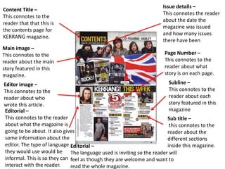
This document analyzes the design and layout of a music magazine contents page and double page spread (DPS). It identifies several conventions used, including main images, headlines, pull quotes, columns, page numbers, and facing pages. These conventions are meant to attract readers, guide them through articles, and provide key information in an accessible way. The conclusion notes that large spanning images, drop caps, columns, and educational information about artists should be repeated in the student's own magazine spread.