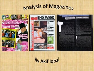
2. Header This is one of the selling lines which is acting as a header as it’s at the top of the cover, the reason why this selling line is there might be because it’s an important factor of the magazine and is used to attract readers to read on. Masthead The big broad orange font that states the Masthead takes over most of the top half of the page. Its to clearly state the name of the magazine and normally relates to what the magazine will be about. The artists head is in front of the masthead because even without us clearly seeing what the title is, it’ll still be recognised by its target audience. Sell line Readers interested in video games might see this and automatically take interest in the article containing the information about video games. Even if they didn’t want to read the whole article, they’d still buy it just to read what they’re interested in. Barcode It’s sometimes used to find out the price of the magazine. Barcodes are also essential for scanning merchandise which will make identification quick and reliable. Main image/ central image The main image is a picture of famous Janet Jackson, sister of Michael Jackson who the media is always talking about so having her on the front page might interest a few people and drive them to buy the magazine. She takes up most of the page and doing a kind of sexual pose which might attract male audiences who might find her attractive then therefore would want to know more and buy the magazine. “ Janet Jackson likes to watch” this selling line might have something to do with Janet holding a camera, it just shows that she takes interest in other people which some readers might find interesting. Sell line This selling line promotes the content of the magazines, it gives us a preview of what some of the things included in the magazine. The colours coordinate well together. The orange and blue colours of the texts connate coolness, calmness which might attract readers and make them feel at ease.
3. Masthead, Gives the name of the publication, in this case the masthead has the “NME” on it, the title has been written in red to make it not only noticeable but the connotation of the colour red is that its a sign of power. Header It has a professional design, the blue background brings the white text out, and it’s easily noticeable. Also this header notifies that the magazine is a specific issue “GLASTO 2008 SPECIAL ISSUE ” . Date line The dateline tells the audience/ shops/ magazine company what date the issue is out on and till when it is on the tills for. Main selling line. The main selling line is bigger than any other selling lines, it differentiates from the others as the red background and white text makes it more visible and bright to catch the target audience’s attention. Main image/ central image A very popular singer is on the front page of the magazine. It automatically attracts the audience. Jay-Z is the central image on this magazine; he is famous therefore the magazine will be recognisable and more people would want to buy it. The fact that he’s wearing a scarf (which is mostly worn in cold weather) and the sunglasses shows that he is his own person and has his own style... the target audience of NME might see themselves in him which will drive them to buy. Footer, the footer in this particular magazine informs the audience of what is included in the magazine; the names of a few artists are shown because if they had a fan reading the cover of this magazine, they would more than likely want to buy it to see what is said by/ of their favourite artists.
4. Editor’s letter It’s an informal letter addressed to the reader, which basically just inform them about the issues in the magazine on a more basic/detailed level The Highlighted names are linked to the front cover images; the magazine does that to show to the readers that the images on the front page actually have a purpose and a reason to be there. Image page with page numbers on it The page numbers are shown on the images so that the readers know exactly what page they can turn to read a particular article. It’s just to make it easier for the reader to locate certain things they’re interested in so that they can go straight to it if they don’t want to read something else. The magazine used bold colours to make sure the texts are clear and can easily attract the reader’s attention. Dominant main image… The boys on the main image are wearing pink which is really stylish and brave as the stereotypical men doesn’t wear that colour but it’s been done to attract and appeal to the target audience, as they’re females teenagers, they might find it attractive therefore will instantly take interest in the magazine Their stylish hairstyles will also appeal to the Younger audience especially girls who might admire them therefore be interested in what the magazine has to say about them. This shows who’s who and who does what in the smash hit team, it makes the readers feel included ands part of something… learning more about the magazine makes it more enjoyable. Feeling like that will attract more readers. This is the content part of the magazine, it just basically say what article there is and on what page readers can find them. The colours are really bright, very attractive and feminine which is what their target audience may be after so maybe they used these colours to make sure it appeals to the target audience who might find it more enjoyable to read these colours than if they used a black or brown font. The columns (layout) are well organised. Edition/ date The edition role in the content is that it’ll be Easier to come back to/ find it in the long run if the company ever needed it for some research etc...
5. The red, black and white are really strong, contrasting colours, it’s also been used to create formality, the colours are used to attract the reader’s attention. They have a house style which is spread across the page, the colours used are the same and it’s visually attractive, it stands out more. The names of the artists are in bold, this has been done to attract the readers and keep them interested. The page numbers and a small summary of what it’s about give the audience a quick knowledge of what the article is about. A medium shot of a woman. We can clearly see how she feels; she’s posing, with her mouth slightly opened which male readers might find appealing. She’s wearing all black which might indicate that she’s both sophisticated but mysterious, the magazine may of used this image for the content because, they wanted to interest the readers who might feel tempted to read the whole magazine. She’s holding an umbrella inside but she is shown as being her own persona and having her own identity just like the magazine’s target audience. The readers might see themselves in her. There is the use of mass media, the magazine tries to use different medias to advertise itself, it uses the internet, more importantly on MySpace which is targeted to teenagers from 16 to 25 years of age. The reason why the editors chose to use MySpace might be because they are guessing most of their target audience has an account on it or at least knows how to go on it. This puff suggests that the magazine thinks its better and stronger than any other magazine, having such confidence might reflect on the readers who might trust it more therefore maybe recommend it to other people, the magazine’s sales level and reader’s level will increase. This is the content part of the magazine, it just basically say what article there is and on what page readers can find them. The colours are really bright, very attractive and feminine which is what their target audience may be after so maybe they used these colours to make sure it appeals to the target audience who might find it more enjoyable to read these colours than if they used a black or brown font. The columns (layout) are well organised.
6. Most of the time, double page spreads have only one picture but this particular article is different, it had one main image and three other ones. The pictures cover about three quarters of the page. It shows the warm passionate moment of this family. An introduction to the new family members, they are now part of the magazine which means part of the target audience, the magazine is introducing them to the readers, letting them know what’s going on without them reading he article. It’s very clear just by looking at the pictures. The colour blue makes the title stand out; the same colour is consistent throughout the whole page perhaps to tell the readers that it’s all connected and part of the same thing. The page numbers, magazine title and the date aren’t really significant but it’s still there to remind/ inform the audience of what’s going on. There isn’t much text. It’s just a brief story on the photographed people. The target audience might not be that interested in the texts but might enjoy the pictures. For the magazine it’s About showing off the “people” than writing about them, the clue is in the magazine title. Black and white, very homely, sophisticated and stylish, it’s got a certain old, passionate atmosphere about it It’s a Medium shot, It shows us their emotions. They’re concentrating on each other and not looking straight at the camera, it suggests that nothing else matters except their family. Some of the readers might feel connected to it as they might have a family of their own therefore will know that what the picture is showing is real and believable.
7. The title takes up to three quarters of the page designed for the article. It’s written in capital and has a quite scary design; the letters are all over the place which again might reflect the picture. It looks very informal but still gives a serious atmosphere to the article. It’s written in white so it contrasts with the dark background. This image refers back to the title of the article “A matter of life and death”, he seems out of it, got messy hair, his collar is all over the place. This image has been purposely taken for the audience to connect both the article and the picture together. The magazine uses vibrant colours on the person which makes him stand out on the page. It also uses a MCU to show his feelings and emotions, it makes it easier for the audience to connect to him and be curious; they’ll then take interest in the article to find out what happened. He’s looking quite laid back, relaxed... It might reflect the mood of the magazine? The colour scheme runs throughout the double page spread. This informs the audience of who this article is about and what it subject of his life it tackles…it’s a little summary of the article, it encourages the reader to read on. It anchors the article. The drop cap makes the text stand out as it’s very vibrant. The black background brings out the white which attracts the audience and encourages them to read on. The page number and the magazine masthead inform the reader about where about in the magazine they are now and it also keep reminding the audience of the magazine name, the more they see it, the more maybe they’ll remember it. It informs the reader of who the story is by and who took the picture, it gives them recognition for their work and also makes the reader feel part of the team, as if they know who’s responsible for what. The white font attracts the reader. The combination of the black background and the white font works well together. The writer uses big bold letters like the “F” to make it a more interesting read for the reader, it’s much more exciting. The image is always anchored, it informs the reader of what the image and article is about, it’s a quick way to gain knowledge of the article even without reading it.