1. Front Cover Codes and Conventions
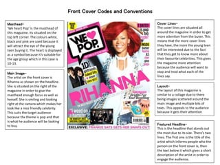
Masthead-
‘We heart Pop’ is the masthead of
this magazine. Its situated on the
top left corner. The colours white,
black and pink are used because it
will attract the eye of the young
teen buying it. The heart is displayed
as a symbol because it’s suitable for
the age group which in this case is
10-13.
Cover Lines-
The cover lines are situated all
around the magazine in order to get
more attention from the buyer. This
means that the more cover lines
they have, the more the young teen
will be interested due to the fact
that they get to know more about
their favourite celebrities. This gives
the magazine more attention
because the audience will want to
stop and read what each of the
lines say.
Layout-
The layout of this magazine is
similar to a collage due to there
being images scattered around the
main image and multiple bits of
texts. This appeals to the audience
because it gets their attention.
Featured Headline-
This is the headline that stands out
the most due to its size. There’s two
lines. The first one is the title of the
artist which informs people who the
person on the front cover is, then
the text below it which gives a short
description of the artist in order to
engage the audience.
Main Image-
The artist on the front cover is
Rihanna as shown on the headline.
She is situated on the right of the
magazine in order to give the
masthead enough focus as well as
herself. She is smiling and looking
right at the camera which makes her
look like a nice friendly celebrity.
This suits the target audience
because the theme is pop and that
is what he audience will be looking
to buy.
2. Contents Page Codes and Conventions
Contents-
The contents are positioned on the
left hand side of the magazine. For
each content there is a bold
subheading then a short description
below it. Although there is no lines
or anything in between to separate
each of these subheadings, there
are bigger subheading with larger
fronts categorising each contents.
Layout-
The layout of the magazine focuses
on the only picture. This was
accomplished by putting all the
smaller texts around the model. The
picture is placed in the middle of the
page near the bottom. In the upper
section we can see the V from ‘Vibe’
so that we are reminded of the tittle
of the magazine.
Credits-
The credits at the bottom of the
magazine shows who took the
pictures and edited the magazine.
It’s put in the smallest font since it’s
not as relevant but it’s still there for
the reader to see.
Image-
As shown on the contents page,
theirs is only one image which is
situated on the lower centre of the
magazine. In the picture, the chains
are the things that mostly stand out.
This is because they are covering up
most of the guy’s face. This will get
the audience’s attention since the
chains make the guy look like a
‘thug’ and for this target audience
which would be young adults, its
suitable.
Logo-
The logo for the magazine is added
on the top right corner in smaller
font. The colour is black and it
standouts to the audience because
no other font in this page is black.
Date-
The month and year is added
because this is a monthly issue so
this lets the audience know when it
was released.