Vip Hisar Call Girls #9907093804 Contact Number Escorts Service Hisar
Double page spread
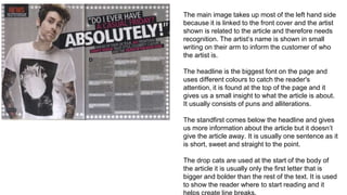
1. The main image takes up most of the left hand side
because it is linked to the front cover and the artist
shown is related to the article and therefore needs
recognition. The artist’s name is shown in small
writing on their arm to inform the customer of who
the artist is.
The headline is the biggest font on the page and
uses different colours to catch the reader's
attention, it is found at the top of the page and it
gives us a small insight to what the article is about.
It usually consists of puns and alliterations.
The standfirst comes below the headline and gives
us more information about the article but it doesn’t
give the article away. It is usually one sentence as it
is short, sweet and straight to the point.
The drop cats are used at the start of the body of
the article it is usually only the first letter that is
bigger and bolder than the rest of the text. It is used
to show the reader where to start reading and it
helps create line breaks.
2. The headline is shown towards the middle on the left hand
side as if it was across the top of the pages then it would
cover the artist’s faces which would make the magazine
unaesthetically pleasing.
The main image bleeds across the two pages which makes
the image stand out more and it is aesthetically pleasing.
The body is shown on the right hand side and is the smallest
font on both pages, it starts in the middle of the page after
the headline and the standfirst. The language and opinions
used are those of the journalist. The layout of the body is in
columns. Line breaks are used to separate paragraphs and
are usually shown by dropping a line.
The colour scheme is usually 3-4 colours and black writing is
usually used on a white background as this is the easiest
colour to read.