
Recommended
More Related Content
What's hot
What's hot (20)
Viewers also liked
Viewers also liked (14)
Similar to Research Task 3a: Front Cover Kerrang Analysis
Similar to Research Task 3a: Front Cover Kerrang Analysis (20)
Recently uploaded
Recently uploaded (20)
Research Task 3a: Front Cover Kerrang Analysis
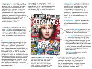
- 1. Underneath the masthead to the left, they’ve placed a puff talking about a popular rock band ‘Green Day’ with an image of their main singer. This is in the shape of a green circle with white bold font which makes it stand out a lot to the viewer because green doesn’t fit in with the colour scheme. The masthead is the main title on the page which is why it’s the biggest text and has bold white font. Also, the brand name ‘Kerrang’ is a popular magazine and well-known by their target audience so it will grab their attention. The fact that it is white placed against a red/black background makes it eye-catching. The exclamation mark at the end makes it seem more louder and dramatic (just like loud music). It also looks like its been cracked through some of the letters and smashed which could represent the loudness and type of music that this magazine genre is (rock). The strip above the masthead split in half to advertise 2 different bands. The main purpose of it being placed at the top is because these magazines will be sold in shops on shelves, so even when they’re stacked up on top of each other, you will still see the strip at the top. The colour scheme is mainly red, white and black suggesting that the target audience is mostly males because these are more masculine and serious colours. There are many coverlines placed on the side giving the viewer an insight into what’s inside the magazine. These include 2 different The main image is a Mid Shot starring a member of a popular band associated with rock music ‘Asking Alexandria’. This will be familiar for the target audience so it would catch their eye. The model is making eye contact so its directly addressing the reader which draws them in even more. The model is quite young and is covered in tattoos which both reflect the target audience because they are young too and tattoos are seen to be youthful. The main coverline is the name of a very popular rock band so once again its familiar to the target audience and will catch their eye if they see this name. This is in bold white font just like the masthead which helps them both stand out and show that they’re the 2 main pieces of text on the page. It also includes a drop cap in the letter ‘A’ which makes it stand out from the rest of the letters. It also includes the words ‘the naked truth’ and ‘Ben Bruce reveals all’. These both intrigue the target audience and make them want to know what ‘the truth’ is and therefore they would buy it and read the double page spread to find out. They’ve also directly named ‘Ben Bruce’ who is a popular band member from the band, so it seems more personal to the viewer especially because they will be familiar with who it is. They’ve placed a pull quote as part of the main coverline because its an indication that there’s going to be some sort of interview with this band inside the magazine. This can also encourage the reader to want to read the actual article inside and therefore buy it to read it. The target audience would be males aged 20-30 years old because. They’re lifestyle would evolve around rock music and going to those sort of gigs and concerts. Their hobbies would also include going to festivals as shown on the contents page when it talks about the download festival. This is all apparent because the bands ‘Young Guns’ and ‘Fall Out Boy’ are featured boldly at the top who are both listened to by young males. The barcode has been added to the right pug of the magazine. There has been another puff added right next to the main coverline. This is one of the only texts that is in bright yellow which would really stand out to the viewer. The text includes a tag (‘Exclusive’) which gives the reader even more of a reason to buy it and read it because its exclusive in the whole world, making it seem special and one of a kind.