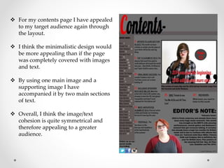
Question 5- How did you attract/address your audience?
 To appeal to my target audience of young
adults I made one of my main focuses the
layout of the pages.
 For my front page especially I wanted the
design aspect to be really effective and bold.
 This is why I converted the main cover
image of the featured artist to black and
white with the feature being the red lips as I
think this is really effective in drawing the
reader’s attention.
 I also think that the text on my front cover
would appeal to my target audience also
due to the fact that it is really bold but
some phrases are highlighted.
 This would make the text easy to read and
understand even if they are just scanning
the front cover.
 Also, for my front cover I think I appealed to the target audience through the
artists whose names I mentioned.
 Artists such as James Bay, The 1975 and All Time Low I think clearly indicate
what sort of magazine this is and which genres are the main focus of the
publication.
 As well as this I think that the price also is a fair amount to pay for the
audience I am aiming at. The price I went for was what I thought the
magazine was worth on top of what I think my audience of young
adults/teenagers would be willing to pay.
 I also thought carefully about which articles I would reference on the front
cover as from experience I think they are what actually draw people to a
magazine.
 By including references to interesting articles and things that teenagers
would want to read I think this would be more likely to make the publication
successful. When including text about a competition also I think this would
be quite effective. This is because the artists involved in the competition have
growing ‘fanbases ‘ many of which would be the target audience of my
publication.
 For my contents page I have appealed
to my target audience again through
the layout.
 I think the minimalistic design would
be more appealing than if the page
was completely covered with images
and text.
 By using one main image and a
supporting image I have
accompanied it by two main sections
of text.
 Overall, I think the image/text
cohesion is quite symmetrical and
therefore appealing to a greater
audience.
 For my double page spread again I have mainly followed the conventions of pre-
existing music magazines through the fact that one of the pages is filled up by an
image of the featured artist.
 Also, similar to Q Magazine I have adapted the idea to have the initial of my
featured artist bold yet faded below the text.
 I think the overall
layout would be
appealing to my target
audience as each
section is clearly
defined.
 I think the amount of
text in relation to the
images is also in
proportion with the
image and overall I
think it fits the page
nicely.
 Also, with my double page I have done something slightly different to the typical
conventions of music magazines.
 Instead of keeping the article as just an interview I added an extra section of text
titled ‘Skye Miller’s Top 5…’ with the musical preferences of the featured artist
included below it.
 I think this adds a new element to my double page and I think this subtle
difference would make the article overall more appealing to my target audience.
 I did this extra feature in order to allow the article to be more relevant to the reader
who can look at the feature and in turn relate to the artist.
 I think that overall the magazine appeals to my target audience on all three sections
as throughout I have adapted ideas from my sample publications and added them
to my own publication.
 By doing this I think that the reader would be able to recognise the publication as
an indie/pop/punk publication but I think my added different elements would
make the magazine unique.

Question 5- How did you attract/address your audience?

  • 1.
    Question 5- Howdid you attract/address your audience?  To appeal to my target audience of young adults I made one of my main focuses the layout of the pages.  For my front page especially I wanted the design aspect to be really effective and bold.  This is why I converted the main cover image of the featured artist to black and white with the feature being the red lips as I think this is really effective in drawing the reader’s attention.  I also think that the text on my front cover would appeal to my target audience also due to the fact that it is really bold but some phrases are highlighted.  This would make the text easy to read and understand even if they are just scanning the front cover.
  • 2.
     Also, formy front cover I think I appealed to the target audience through the artists whose names I mentioned.  Artists such as James Bay, The 1975 and All Time Low I think clearly indicate what sort of magazine this is and which genres are the main focus of the publication.  As well as this I think that the price also is a fair amount to pay for the audience I am aiming at. The price I went for was what I thought the magazine was worth on top of what I think my audience of young adults/teenagers would be willing to pay.  I also thought carefully about which articles I would reference on the front cover as from experience I think they are what actually draw people to a magazine.  By including references to interesting articles and things that teenagers would want to read I think this would be more likely to make the publication successful. When including text about a competition also I think this would be quite effective. This is because the artists involved in the competition have growing ‘fanbases ‘ many of which would be the target audience of my publication.
  • 3.
     For mycontents page I have appealed to my target audience again through the layout.  I think the minimalistic design would be more appealing than if the page was completely covered with images and text.  By using one main image and a supporting image I have accompanied it by two main sections of text.  Overall, I think the image/text cohesion is quite symmetrical and therefore appealing to a greater audience.
  • 4.
     For mydouble page spread again I have mainly followed the conventions of pre- existing music magazines through the fact that one of the pages is filled up by an image of the featured artist.  Also, similar to Q Magazine I have adapted the idea to have the initial of my featured artist bold yet faded below the text.  I think the overall layout would be appealing to my target audience as each section is clearly defined.  I think the amount of text in relation to the images is also in proportion with the image and overall I think it fits the page nicely.
  • 5.
     Also, withmy double page I have done something slightly different to the typical conventions of music magazines.  Instead of keeping the article as just an interview I added an extra section of text titled ‘Skye Miller’s Top 5…’ with the musical preferences of the featured artist included below it.  I think this adds a new element to my double page and I think this subtle difference would make the article overall more appealing to my target audience.  I did this extra feature in order to allow the article to be more relevant to the reader who can look at the feature and in turn relate to the artist.  I think that overall the magazine appeals to my target audience on all three sections as throughout I have adapted ideas from my sample publications and added them to my own publication.  By doing this I think that the reader would be able to recognise the publication as an indie/pop/punk publication but I think my added different elements would make the magazine unique.