3. Research
The strength of research is that I can find an existing product that relates to the
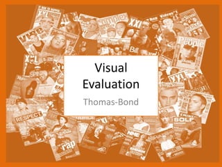
same subject as what I am doing. In the research, I looked at different film
magazines for teenagers between 15 – 24 years old. The products I looked at all
had a similar colour scheme, layouts, fonts and graphics. I mainly looked at the
front covers, but I also looked at some articles inside. I did this because I wanted
to know how other film magazines have their content laid out. I also learned
about what type of information goes on the front cover so that I can put similar
information and images on my own magazine.
I did primary research as well. I looked at the magazines that they have in the
library. This helped me to physically see what one looked like to see how big the
text and images really are then seeing them on screen.
One thing I could have done in my research is a survey to ask people about how
much they are willing to pay for a magazine and what images or what text would
get them to buy it. I could have shown them specific fonts to look at.
I found out from my research that film magazines like Empire have a good
reputation and is more in depth than a cheaper magazine. With this I decided to
make my magazine like Empire.
4. Planning
In the planning I did a good detailed mind map, style sheets to help me
visualise what my magazine will look like once it’s done. The mind map helps
me look at what my target audience and genre will be so that I can make my
magazine for a targeted audience.
The style sheet I looked at fonts, colour schemes, size of font and different
images. These help me more to visualise what I want my final product to be
like. Some of the colour schemes and text font which I have looked at in the
style sheet I will Include them in to my work.
I looked at different film magazines to help me do the planning because it
helped get the colour schemes, text, text font/size and what existing film
magazine have in them.
I could have had more planning on the colour schemes so that I can get more
people attracted to my magazine. I could have asked for feedback on which
colours people would of preferred.
5. Time Management
The planning and research time went well. I found good quality images with a
high resolution this did not take a long time. When I looked at existing products
this took a bit more time because I had to go to the library and look at film
magazines. I looked at a handful of fonts for my style sheets, but when I was
making the actual magazine I went through a medium range of fonts. It took
longer to find the font I wanted. I could have looked at more fonts on my style
sheet and tested them out in Photoshop because they look slightly different when
in Photoshop.
I drafted the content text in Microsoft Word so that I could use spell check and
also so that I had a back up in case Photoshop corrupted. After drafting it, I put it
into Photoshop and arranged it to fit in the guidelines. This took quite a long time
because I had to resize it and format it.
The main heading for the magazine, Justice League took a long time because I
created several layers and effects to get the shiny effect. I needed to test it out a
lot and this took time because it had to look right with the other elements on the
cover.
I also spent a long time getting the colour scheme right and to make it all look
professional. For example, the special offer shield shape needed the colours
adjusting, the size and the placement.
If I had more time I would have added more text about what is in the magazine I
would have got a simpler image so that I could have got more text on there.
10. Feedback 1
• What did you like about the product?
– I liked that it has a shade of red all the way thought the
cover and the double page, it keeps it all together and
there isn't to much of the red though out both of them. I
also liked the gold text of the “justice league” on the front
cover it makes it stand out well and makes it eye catching.
• What improvements could have been made to the
product?
– The offer on the cover I think could have been done in a
different way and not used a shield and I would of changed
the colour of the text of the offer as well. The black shape
behind the tile could be different in a way that so that its
not a block of black in front of the image and behind the
title.
11. Feedback 2
• What did you like about the product?
– I like that it has the main cast of the film on the
cover I and the name of the film because it tells
me what the film is and what the characters look
like.
• What improvements could have been made to
the product?
– Have the title text different like have so that it’s a
bit more clear to read, as such tacking the glow
off.
12. Feedback 3
• What did you like about the product?
– The contrast on the double page is good because
the red goes well with the grey and the images as
well contrast well with the red and grey.
• What improvements could have been made to
the product?
– The title and text are good but it doesn't over
power the image
13. Peer Feedback Summary
• What do you agree with from your peer
feedback?
I do agree that the contrast of colours on the double
page go well with each other. The front cover is eye
changing this is good because it will get the audience
to buy the product.
• What do you disagree with from your peer
feedback?
I disagree that the text colour of the offer doesn't
need to change.
14. Peer Feedback Summary
I would change the text style on the front cover so
that It stands out instead of the image because two
of the feedback said that the text on the front cover
doesn’t stand out enough.
I would change the justice league text to make it
easier to read so that the audience can see what it
says. I will do this because one person said it didn't
stand out well enough with the black background.
When I looked at, it I agreed, so I will change it.
Editor's Notes
What were the strengths of your research? How did your research help your product?
What were the weaknesses of your research? What could you have done better/improve? What effect would this have had on your product?
What were the strengths of your planning? How did your planning help your product?
What were the weaknesses of your planning? What could you have done better/improve? What effect would this have had on your product?
Did you manage your time well? Did you complete your project on time or would your products have improved with additional time?
What would you have done if you had more time to produce your work?
What changes would you make to your product based upon your peer feedback and why?