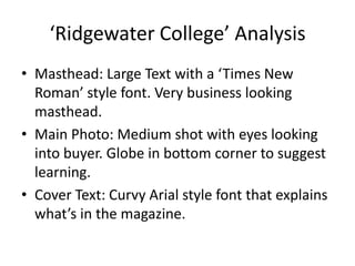
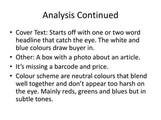
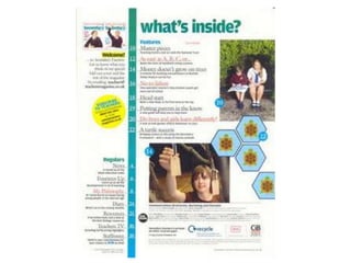
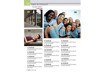
Preliminary Task Research

      College Magazines
‘Ridgewater College’ Analysis
• Masthead: Large Text with a ‘Times New
  Roman’ style font. Very business looking
  masthead.
• Main Photo: Medium shot with eyes looking
  into buyer. Globe in bottom corner to suggest
  learning.
• Cover Text: Curvy Arial style font that explains
  what’s in the magazine.
Analysis Continued
• Cover Text: Starts off with one or two word
  headline that catch the eye. The white and
  blue colours draw buyer in.
• Other: A box with a photo about an article.
• It’s missing a barcode and price.
• Colour scheme are neutral colours that blend
  well together and don’t appear too harsh on
  the eye. Mainly reds, greens and blues but in
  subtle tones.
Analysis Summary
•   Subtle colours
•   Professional and fun fonts.
•   Objects can be used to suggest meaning.
•   Shot type is a medium shot.
•   It’s missing a barcode.
•   Has a slogan.
‘College’ Analysis
• Position of the main shot is another medium
  shot. He is covering the title of the magazine
  suggesting he is more important than the
  magazine title.
• Colour scheme is yellow and black which
  suggests fun for the magazine which entices a
  teenager target audience, but is also harsh on
  the eye and could prevent sales.
Analysis continued
• Same curved style font for the entire magazine.
  Entices connotation of fun more.
• Has a bar code.
• The object used to suggest meaning is the study
  books. These show it’s aimed at student’s
  because the stereotype of a student is to carry
  study books like the person is carrying.
• Has a slogan and website.
• Barcode missing
Overall Analysis
• Fun fonts
• Subtle Colours work best
• Medium Shot
• Bar Codes missing on both
• Objects can suggest meaning.
• Text dotted around the person but do not
  cover the face.
• Slogan and website shown on front cover.
Contents 1- Analysis
• Photo’s have page numbers on them- they link
  to articles.
• Headlines are bold with a caption explaining
  what the article is about.
• Copyright Notices at bottom of page
• Colour scheme again not harsh on the eyes
  and look professional but still bright to appeal
  to teenage audience.
Analysis Continued
• There’s an introduction to the magazine with a
  special section about regular features to the
  magazine.
• There’s an advert enticing students to subscribe.
• There’s a smaller version of the front cover in the
  top left corner which again could be part of
  advertising.
• Easy, readable ‘Times New Roman’ style font
  suggests professionalism making the students
  who read it feel more professional.
Contents 2- Analysis
• Again photo’s have page numbers linking
  them to articles.
• Headers with information about the article.
• Business type header with business type font
  suggest the magazine is target at a business
  student market.
• Issue number given to help promote
  magazine.
Contents- Overall Analysis
• Headers to articles with information about article
  underneath.
• Copyright Notices seem important and more
  professional.
• Photo’s linked to articles through page numbers.
• Can advertise on the contents page.
• Introduction section seems clever with regular
  sections split too also seeming more professional
  to me.

Preliminary task research

  • 1.
    Preliminary Task Research College Magazines
  • 3.
    ‘Ridgewater College’ Analysis •Masthead: Large Text with a ‘Times New Roman’ style font. Very business looking masthead. • Main Photo: Medium shot with eyes looking into buyer. Globe in bottom corner to suggest learning. • Cover Text: Curvy Arial style font that explains what’s in the magazine.
  • 4.
    Analysis Continued • CoverText: Starts off with one or two word headline that catch the eye. The white and blue colours draw buyer in. • Other: A box with a photo about an article. • It’s missing a barcode and price. • Colour scheme are neutral colours that blend well together and don’t appear too harsh on the eye. Mainly reds, greens and blues but in subtle tones.
  • 5.
    Analysis Summary • Subtle colours • Professional and fun fonts. • Objects can be used to suggest meaning. • Shot type is a medium shot. • It’s missing a barcode. • Has a slogan.
  • 7.
    ‘College’ Analysis • Positionof the main shot is another medium shot. He is covering the title of the magazine suggesting he is more important than the magazine title. • Colour scheme is yellow and black which suggests fun for the magazine which entices a teenager target audience, but is also harsh on the eye and could prevent sales.
  • 8.
    Analysis continued • Samecurved style font for the entire magazine. Entices connotation of fun more. • Has a bar code. • The object used to suggest meaning is the study books. These show it’s aimed at student’s because the stereotype of a student is to carry study books like the person is carrying. • Has a slogan and website. • Barcode missing
  • 9.
    Overall Analysis • Funfonts • Subtle Colours work best • Medium Shot • Bar Codes missing on both • Objects can suggest meaning. • Text dotted around the person but do not cover the face. • Slogan and website shown on front cover.
  • 11.
    Contents 1- Analysis •Photo’s have page numbers on them- they link to articles. • Headlines are bold with a caption explaining what the article is about. • Copyright Notices at bottom of page • Colour scheme again not harsh on the eyes and look professional but still bright to appeal to teenage audience.
  • 12.
    Analysis Continued • There’san introduction to the magazine with a special section about regular features to the magazine. • There’s an advert enticing students to subscribe. • There’s a smaller version of the front cover in the top left corner which again could be part of advertising. • Easy, readable ‘Times New Roman’ style font suggests professionalism making the students who read it feel more professional.
  • 14.
    Contents 2- Analysis •Again photo’s have page numbers linking them to articles. • Headers with information about the article. • Business type header with business type font suggest the magazine is target at a business student market. • Issue number given to help promote magazine.
  • 15.
    Contents- Overall Analysis •Headers to articles with information about article underneath. • Copyright Notices seem important and more professional. • Photo’s linked to articles through page numbers. • Can advertise on the contents page. • Introduction section seems clever with regular sections split too also seeming more professional to me.