
Recommended
Recommended
More Related Content
What's hot
What's hot (17)
Similar to 2. research(3)
Similar to 2. research(3) (20)
More from ThomasBond14
More from ThomasBond14 (20)
Recently uploaded
Recently uploaded (20)
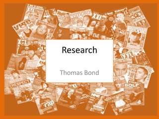
2. research(3)
- 2. Buzz words exclusive makes the audience fill like that they will get something that can be found out in this magazine out of buying the magazine. They have used the word precious in the selling line which is related to featured film. Master header I will use the same font style and colour which is use here, the colour which Is a gold style lettering and the text font is bold capital. The gold effect makes this magazine look like a high quality magazine, also it goes well with type of image is on the front cover. With this I think it makes it interesting and eye caching for my target audiences. Barcode is in a relative good place by on mine I will chose to put in a different locating to make it look more attractive to my own audience. Layout the layout of the magazine Is keeping with the film with the dark and having a light coming though the centre of the cover and the gold font is related to the film as well. With the colour scheme relating to the film it will appeal to the targeted audience who is interested in the film will see that its relating to the film. The colour on the mean character are worm type of colours compered to the other character and the cave where it is black and blue which makes it fell like its cold and damp in the cave Plug this is relating to another film which some people may be interested in who are interested in the hobbit or dark films or just interested in films Main image this is relating to the film “The Hobbit” the main character is to the right of the cover, whilst a secondary character who is in the film is in the re-left of the cover. The tile of the film is similar to the header but in a different font style which makes the viewer of the magazine informed in what the image and text on the front is relating to. The font makes it look like a its award Existing Product
- 3. Existing Product Master header is in white and in bold capital, compered to other text on the cover which is in a red capitals. Layout the layout of the magazine Is keeping with the film with the selective colours and the red font on “iron man3” is related to the film as well. With the colour scheme relating to the film and the mean character it will appeal to the target audience who is interested in the film, they will see that its relating to the film and know that the red is the main colour relating to the character in the film. The over all colour on the on the image are worm type of colours but the colour in the far back ground give it a feel of that its dark and cold. Main image The main image is relating to the film ”iron man3” by putting the main character in the center of the cover. To attract the audience to the magazine, people will buy the magazine because it has the main character of the movie and they like the movie. The lighting on the character is coming from the right of the cover. There is fire particles across the bottom half of the cover which means that there’s a fire of some sort of to the left of the cover. Sub heading is “Downey jr’s lethal weapon files solo” this shows the name of the actor who places the main role in the movie. Buzz word original avenger is that if you watch marvel movie you will know what this means.
- 4. Existing Product Master header is white bold capitals at the center top of the magazine. Main image is related to the headline “avengers infinity war” of the magazine which includes all the main cast of the films. The image is full of different vibrant colour’s to attract the audience. Headline is in two different fonts and colour’s which makes you know which avengers movie it’s Barcode is in a good location on the cover and the right size compered to the rest of the information on the magazine. Quote this is a quote form one of the main actors who was in the film giving a little taste of what the film will be like. Also for those who keep up with marvel movies will understand what the quote is informing.
- 5. Research Analysis • What common features do the researched products have? – They all have bold capital master headers at the top of the cover. They also have a part of the a characters head on covering up a small portion of the master header, which gives it a 3D touch to the cover. • What aspects of the research will you include within your on work? – I will use the same effect that they use with the master header and the character because I think that will make my audience look at the cover and want to buy it. I will also person the main character in the centre of the cover which makes the audience aware of that is the main character.
- 6. Audience
- 7. Audience Profile Category Demographic Content to appeal to this audience Age Range 15 – 24 • The asset and the information, content in the magazine will appeal to my focused age range. Gender Male & female • It will be targeting males more then females because there will be more assets aimed at the male audience then the female side. There will be some assets which will appeal to the female audience. Psychographic balanced • The text will be relatable to the topic of film. There will probably be quotes from people who spoke or went to the Oscars or other film awards. There will also be images from film awards or movies them self relating to the text content that will be on the magazine. Social Status Middle upper class • The content of the magazine will be aimed for the middle upper class. The reason is that it may have content that only middle and upper class can relate to.
Editor's Notes
- Choose a recent product similar to your own and annotate it Type of image- studio/location, angle, effects, post-production Use of lighting/composition/mise en scene/costume/props/location/colours/fonts etc. Audience appeal- how does it make its audience want to buy/watch/play it?
- Choose a recent product similar to your own and annotate it Type of image- studio/location, angle, effects, post-production Use of lighting/composition/mise en scene/costume/props/location/colours/fonts etc. Audience appeal- how does it make its audience want to buy/watch/play it?
- Choose a recent product similar to your own and annotate it Type of image- studio/location, angle, effects, post-production Use of lighting/composition/mise en scene/costume/props/location/colours/fonts etc. Audience appeal- how does it make its audience want to buy/watch/play it?