1. Double Page Spread Analysis
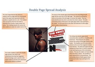
The main image features the artist at a The layout of the double page spread features the artist filling the left
medium close up range with the conventional page and the main text on the right page. The reason for putting the
look of the angry facial expression with the artist on the whole of the left page is to attract the reader. They can
jewellery to signify that he is rich. The medium easily identify who the artist is and what the article is about. The bold,
close up and the artist from the side on, contrasting colours of the text on the right page makes it eye catching to
showing off his muscles, implies power and the reader. It is the same font as the other text featured on other pages
status. He is looking towards the camera for which creates a brand identity.
direct address to make the readers look at him.
This follows key double page spread
conventions like a standfirst, a headline, and
boxed text. These features are used to
present the content of the page clearly to the
reader. The headline uses the same colour
scheme as the rest of the magazine to keep
brand identity. The white text against the red
background means that it is easy to read and
is eye catching because of the contrasting
colours. This way the reader can know exactly
The mode of address used in this double
what the article is about. The standfirst is
page spread is the same as all
quite long and this is unconventional. The
conventional hip-hop/rap magazines.
contrasting colours of white against black
The terminology used is specific to the
background make it eye catching for the
target audience and they will understand
reader.
these words without a problem.
2. This double page spread for XXL Magazine follows some layout conventions of the
hip-hop/rap magazine genre. It features the main artist(s) on the left page and the
main text on the right page. The main headline features a quote from the artist
and the body copy below it explaining the quote or following on from it. It also
features the page number at the bottom right of the page so readers can quickly
The large and bold display font of the flick through the magazine to find this double page spread.
headline makes it stand out and grab the
readers’ attention. These bold letters
keep the brand identity of XXL Magazine
as the bold lettering is used frequently
throughout each magazine and issue.
The contrasting colours of the black text
and the white background give the page
a formal but easy to read look. This look
is consistent because the same colours
are used in the main image on the left
page. The use of the plain colours
makes Soulja Boy’s golden jewellery
stand out. This is to show off what he
owns and to say that he is rich and
powerful.
The artists have the typical angry expression on their face to keep with conventions. A long two shot is used which is
unconventional of hip-hop/rap magazines. This is excused because there are two artists in the image. 50 Cent has his
hands in his pockets and Soulja Boy is leaning back to give an impression that they are relaxed. A low angle shot is
used to make the artists look big and strong. The creation of this effect is helped by the artists looking down and
directly at the camera, giving direct address to the reader. The golden jewellery on Soulja Boy stands out because of
the grey hoody he is wearing. 50 Cent’s silver jewellery stands out too because of the black t-shirt he is wearing.
Soulja Boy raises his arms to make himself look bigger. This is to show their strength and power.