This document discusses how the media product uses conventions of real music magazines. It summarizes:
1) The front cover uses images from a photo shoot and a plain background, following conventions. Coverlines are relevant to the genre and use buzzwords like "Exclusive."
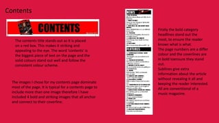
2) The contents page uses bold category headlines, images that anchor to coverlines, and sublines that provide extra information without revealing all.
3) The double page spread uses a title that bleeds across pages to link them, follows conventions by using a band's own font for their name, and includes a collage of images on one page like real magazines.