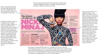
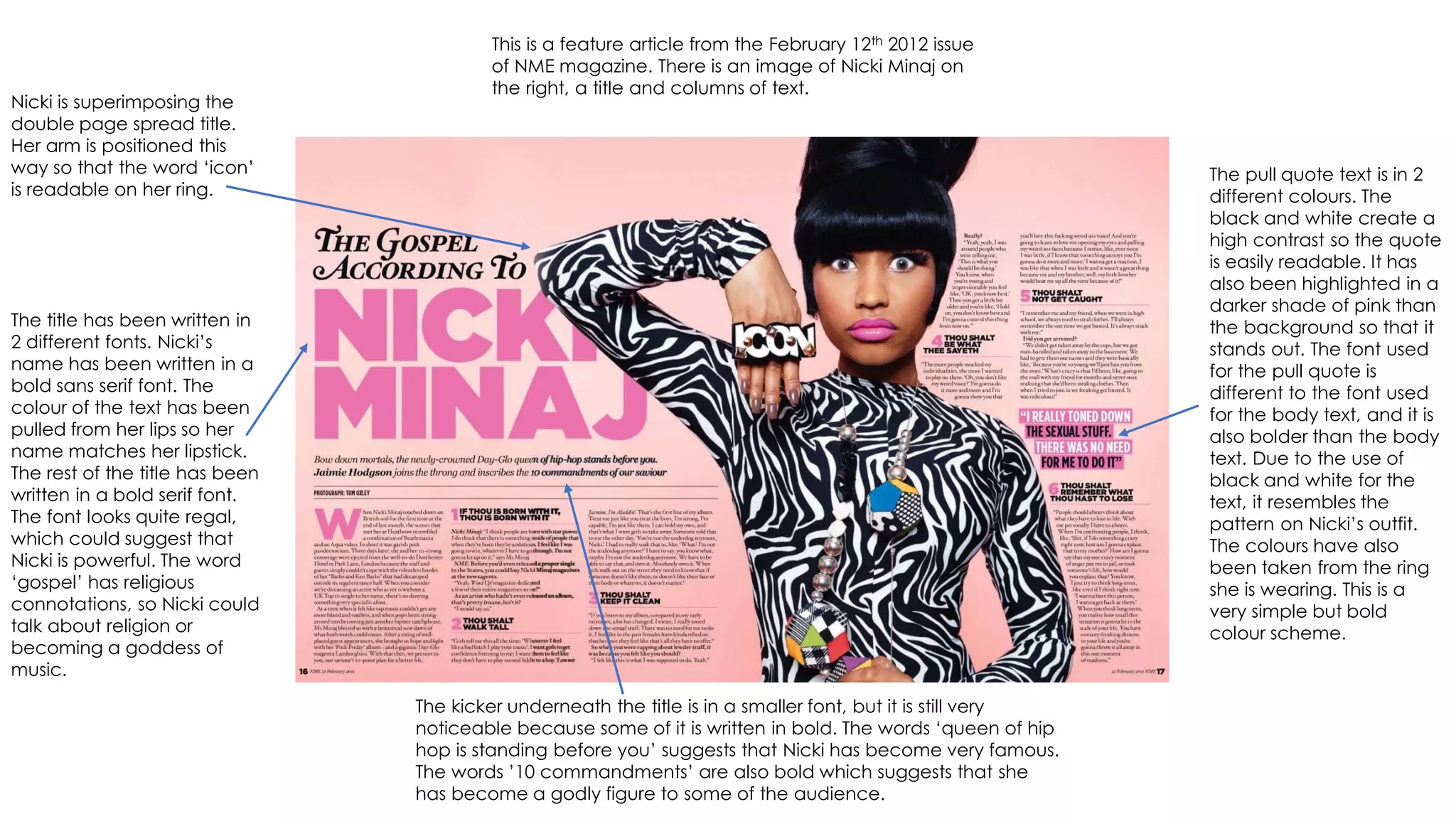
This is a feature article from the February 12th 2012 issue
of NME magazine. There is an image of Nicki Minaj on
the right, a title and columns of text.
Nicki is superimposing the
double page spread title.
Her arm is positioned this
way so that the word ‘icon’
is readable on her ring.
The title has been written in
2 different fonts. Nicki’s
name has been written in a
bold sans serif font. The
colour of the text has been
pulled from her lips so her
name matches her lipstick.
The rest of the title has been
written in a bold serif font.
The font looks quite regal,
which could suggest that
Nicki is powerful. The word
‘gospel’ has religious
connotations, so Nicki could
talk about religion or
becoming a goddess of
music.
The kicker underneath the title is in a smaller font, but it is still very
noticeable because some of it is written in bold. The words ‘queen of hip
hop is standing before you’ suggests that Nicki has become very famous.
The words ’10 commandments’ are also bold which suggests that she
has become a godly figure to some of the audience.
The pull quote text is in 2
different colours. The
black and white create a
high contrast so the quote
is easily readable. It has
also been highlighted in a
darker shade of pink than
the background so that it
stands out. The font used
for the pull quote is
different to the font used
for the body text, and it is
also bolder than the body
text. Due to the use of
black and white for the
text, it resembles the
pattern on Nicki’s outfit.
The colours have also
been taken from the ring
she is wearing. This is a
very simple but bold
colour scheme.
The main image is a medium shot of Nicki Minaj. It is a high key image in full colour. She is using a direct mode of address
in order to show equality between her and the reader. The image takes up almost a whole page so it is the main focus of
the article. Her outfit stands out a lot against the pink background, and the pattern is very bold so it attracts the eye.
There is a soft focus on the image in order to make it seem flawless, and her skin looks almost unrealistically perfect due
to airbrushing. There are a lot of colours on her necklace, but there is quite a contrast throughout the rest of the image.
The bold sections of the body texts are the 10 commandments, or guides to
becoming a music god like Nicki. This separates them from her advice. The
bold font used is the same as the title but black has been used instead of
pink so that it matches the rest of the body text. The article goes over more
than this double page because only 6 of the 10 commandments are shown.
The columns of body
text are framing the
image because it
wouldn’t be readable if
it superimposed the
image. This is due to the
pattern on Nicki’s outfit,
and there are a lot of
darker tones throughout
the image.
There is a gutter between
each column that
separates them and keeps
he body text aligned. The
gutters make the text
easier to read because the
body text is usually a small
font, and the reader could
easily get lost in it if there
isn’t any spacing such as
this.
The dropcap at the beginning
of the article is also the same
colour of Nicki’s lipstick. It takes
up 5 lines of the body text. This
font also matches the title. The
question numbers are also
dropcaps, but they are smaller
than the first letter of the body
text.

Textual analysis nicki minaj double page spread

  • 1.
    This is afeature article from the February 12th 2012 issue of NME magazine. There is an image of Nicki Minaj on the right, a title and columns of text. Nicki is superimposing the double page spread title. Her arm is positioned this way so that the word ‘icon’ is readable on her ring. The title has been written in 2 different fonts. Nicki’s name has been written in a bold sans serif font. The colour of the text has been pulled from her lips so her name matches her lipstick. The rest of the title has been written in a bold serif font. The font looks quite regal, which could suggest that Nicki is powerful. The word ‘gospel’ has religious connotations, so Nicki could talk about religion or becoming a goddess of music. The kicker underneath the title is in a smaller font, but it is still very noticeable because some of it is written in bold. The words ‘queen of hip hop is standing before you’ suggests that Nicki has become very famous. The words ’10 commandments’ are also bold which suggests that she has become a godly figure to some of the audience. The pull quote text is in 2 different colours. The black and white create a high contrast so the quote is easily readable. It has also been highlighted in a darker shade of pink than the background so that it stands out. The font used for the pull quote is different to the font used for the body text, and it is also bolder than the body text. Due to the use of black and white for the text, it resembles the pattern on Nicki’s outfit. The colours have also been taken from the ring she is wearing. This is a very simple but bold colour scheme.
  • 2.
    The main imageis a medium shot of Nicki Minaj. It is a high key image in full colour. She is using a direct mode of address in order to show equality between her and the reader. The image takes up almost a whole page so it is the main focus of the article. Her outfit stands out a lot against the pink background, and the pattern is very bold so it attracts the eye. There is a soft focus on the image in order to make it seem flawless, and her skin looks almost unrealistically perfect due to airbrushing. There are a lot of colours on her necklace, but there is quite a contrast throughout the rest of the image. The bold sections of the body texts are the 10 commandments, or guides to becoming a music god like Nicki. This separates them from her advice. The bold font used is the same as the title but black has been used instead of pink so that it matches the rest of the body text. The article goes over more than this double page because only 6 of the 10 commandments are shown. The columns of body text are framing the image because it wouldn’t be readable if it superimposed the image. This is due to the pattern on Nicki’s outfit, and there are a lot of darker tones throughout the image. There is a gutter between each column that separates them and keeps he body text aligned. The gutters make the text easier to read because the body text is usually a small font, and the reader could easily get lost in it if there isn’t any spacing such as this. The dropcap at the beginning of the article is also the same colour of Nicki’s lipstick. It takes up 5 lines of the body text. This font also matches the title. The question numbers are also dropcaps, but they are smaller than the first letter of the body text.