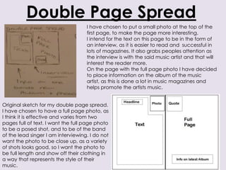
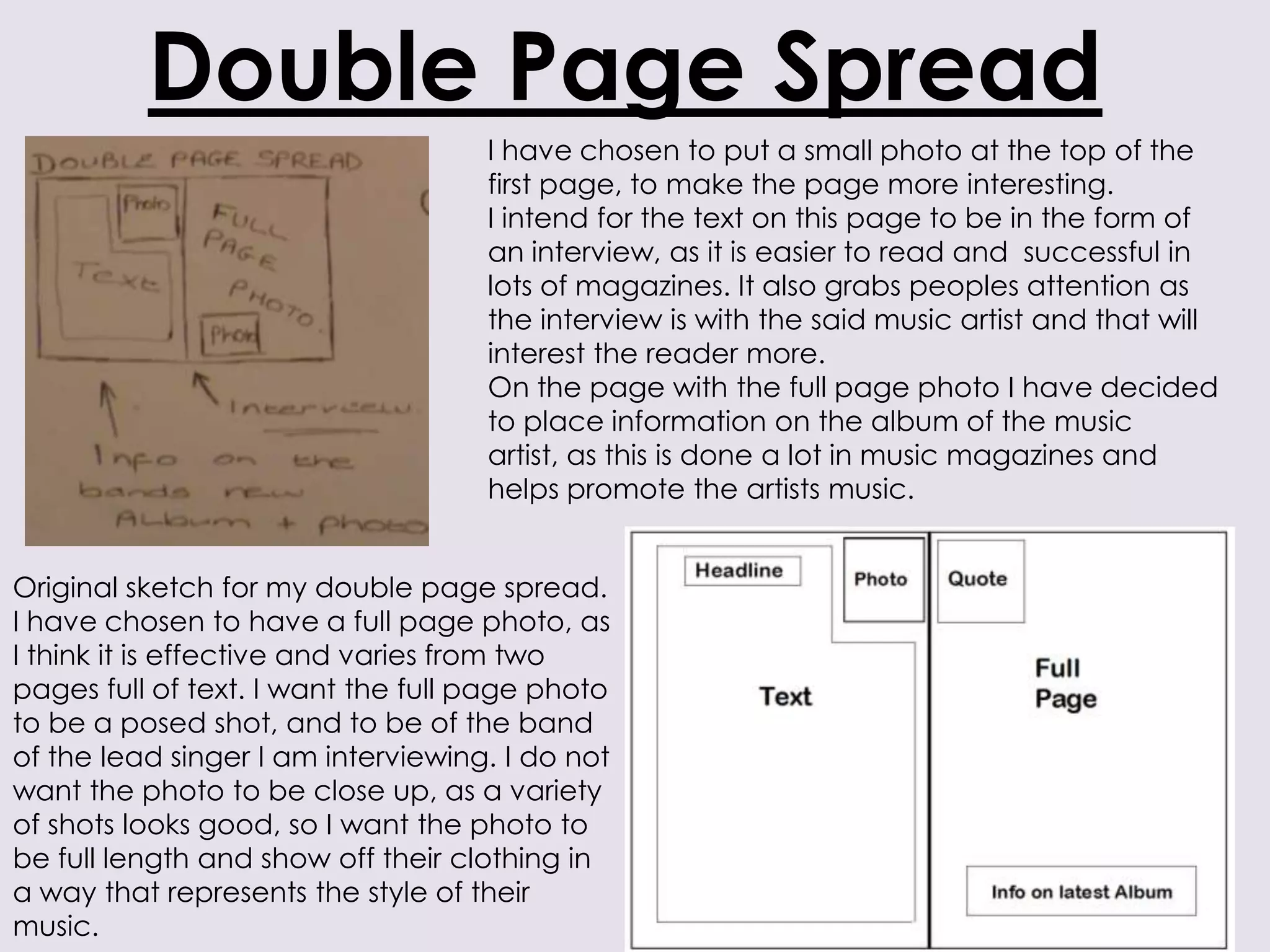
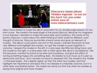
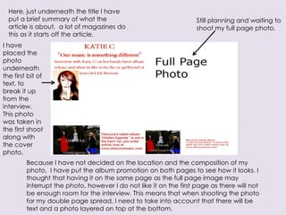
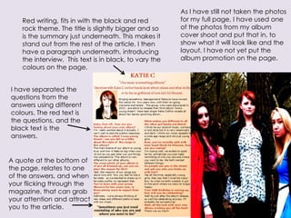
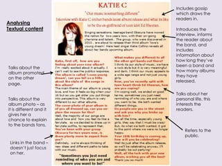
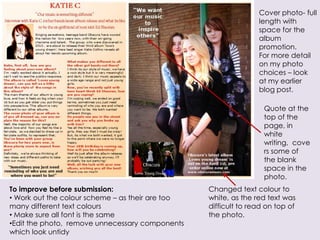
Double Page Spread
                                    I have chosen to put a small photo at the top of the
                                    first page, to make the page more interesting.
                                    I intend for the text on this page to be in the form of
                                    an interview, as it is easier to read and successful in
                                    lots of magazines. It also grabs peoples attention as
                                    the interview is with the said music artist and that will
                                    interest the reader more.
                                    On the page with the full page photo I have decided
                                    to place information on the album of the music
                                    artist, as this is done a lot in music magazines and
                                    helps promote the artists music.


Original sketch for my double page spread.
I have chosen to have a full page photo, as
I think it is effective and varies from two
pages full of text. I want the full page photo
to be a posed shot, and to be of the band
of the lead singer I am interviewing. I do not
want the photo to be close up, as a variety
of shots looks good, so I want the photo to
be full length and show off their clothing in
a way that represents the style of their
music.
Here I have started to make the album promotion for my double page spread. On the
front cover, the model is the lead singer of the band Obscura. Because my magazine
is rock themed, I decided to make the band dark and mysterious. The name of the
band is Obscura, I came about this whilst thinking of other words for different, and I
thought of obscure. Obscura sounds like a band name and gives an element of
mystery. The album cover photo was shot in the woods, I wanted the photo to look
very different and highlight the mystery, so I got the models to pose together in
costume. I dressed the model on the left, in a red cape, like little red riding hood, and
the model on the right, in a blue dress with a white apron like Alice in wonderland. I did
this because I wanted my band to be dark and mysterious, and give the effect of
turning something happy into something dark, this relates to rock music as it is seen as
destructive and loud, and I wanted my band to represent this. The model in the middle
– is the lead singer, she is slightly higher up than the other two models, and that
highlights her importance and lead. She is not dressed in a fairytale costume, but in a
white dress and leather jacket, this makes her stand out from the other too models as
being more original and more modern.
Here, just underneath the title I have
  put a brief summary of what the                                   Still planning and waiting to
  article is about, a lot of magazines do                           shoot my full page photo.
  this as it starts off the article.
I have
placed the
photo
underneath
the first bit of
text, to
break it up
from the
interview.
This photo
was taken in
the first shoot
along with
the cover
photo.
         Because I have not decided on the location and the composition of my
         photo, I have put the album promotion on both pages to see how it looks. I
         thought that having it on the same page as the full page image may
         interrupt the photo, however I do not like it on the first page as there will not
         be enough room for the interview. This means that when shooting the photo
         for my double page spread, I need to take into account that there will be
         text and a photo layered on top at the bottom.
As I have still not taken the photos
    Red writing, fits in with the black and red         for my full page, I have used one
    rock theme. The title is slightly bigger and so     of the photos from my album
    is the summary just underneath. This makes it       cover shoot and put that in, to
    stand out from the rest of the article. I then      show what it will look like and the
    have a paragraph underneath, introducing            layout. I have not yet put the
    the interview. This text is in black, to vary the   album promotion on the page.
    colours on the page.


I have separated the
questions from the
answers using different
colours. The red text is
the questions, and the
black text is the
answers.


A quote at the bottom of
the page, relates to one
of the answers, and when
your flicking through the
magazine, that can grab
your attention and attract
you to the article.
Includes gossip
                         which draws the
                         readers in.
Analysing
Textual content          Introduces the
                         interview, informs
                         the reader about
                         the band, and
                         includes
                         information about
                         how long they’ve
                         been a band and
Talks about the
                         how many albums
album promoted
                         they have
on the other
                         released.
page.

                         Talks about her
Talks about the          personal life, this
album photo – as         interests the
it is different and it   readers.
gives her a
chance to explain
to the bands fans.
                             Refers to the
                             public.
 Links in the band –
 doesn’t just focus
 on her.
Cover photo- full
                                                                 length with
                                                                 space for the
                                                                 album
                                                                 promotion.
                                                                 For more detail
                                                                 on my photo
                                                                 choices – look
                                                                 at my earlier
                                                                 blog post.

                                                                   Quote at the
                                                                   top of the
                                                                   page, in
                                                                   white
                                                                   writing, cove
                                                                   rs some of
                                                                   the blank
                                                                   space in the
                                                                   photo.
To improve before submission:                     Changed text colour to
• Work out the colour scheme – as their are too   white, as the red text was
many different text colours                       difficult to read on top of
• Make sure all font is the same                  the photo.
•Edit the photo, remove unnecessary components
which look untidy
My final designs for the front cover, contents page
and double-page spread will be posted on my blog
                        shortly.

Magazine double page spread planning

  • 1.
    Double Page Spread I have chosen to put a small photo at the top of the first page, to make the page more interesting. I intend for the text on this page to be in the form of an interview, as it is easier to read and successful in lots of magazines. It also grabs peoples attention as the interview is with the said music artist and that will interest the reader more. On the page with the full page photo I have decided to place information on the album of the music artist, as this is done a lot in music magazines and helps promote the artists music. Original sketch for my double page spread. I have chosen to have a full page photo, as I think it is effective and varies from two pages full of text. I want the full page photo to be a posed shot, and to be of the band of the lead singer I am interviewing. I do not want the photo to be close up, as a variety of shots looks good, so I want the photo to be full length and show off their clothing in a way that represents the style of their music.
  • 2.
    Here I havestarted to make the album promotion for my double page spread. On the front cover, the model is the lead singer of the band Obscura. Because my magazine is rock themed, I decided to make the band dark and mysterious. The name of the band is Obscura, I came about this whilst thinking of other words for different, and I thought of obscure. Obscura sounds like a band name and gives an element of mystery. The album cover photo was shot in the woods, I wanted the photo to look very different and highlight the mystery, so I got the models to pose together in costume. I dressed the model on the left, in a red cape, like little red riding hood, and the model on the right, in a blue dress with a white apron like Alice in wonderland. I did this because I wanted my band to be dark and mysterious, and give the effect of turning something happy into something dark, this relates to rock music as it is seen as destructive and loud, and I wanted my band to represent this. The model in the middle – is the lead singer, she is slightly higher up than the other two models, and that highlights her importance and lead. She is not dressed in a fairytale costume, but in a white dress and leather jacket, this makes her stand out from the other too models as being more original and more modern.
  • 3.
    Here, just underneaththe title I have put a brief summary of what the Still planning and waiting to article is about, a lot of magazines do shoot my full page photo. this as it starts off the article. I have placed the photo underneath the first bit of text, to break it up from the interview. This photo was taken in the first shoot along with the cover photo. Because I have not decided on the location and the composition of my photo, I have put the album promotion on both pages to see how it looks. I thought that having it on the same page as the full page image may interrupt the photo, however I do not like it on the first page as there will not be enough room for the interview. This means that when shooting the photo for my double page spread, I need to take into account that there will be text and a photo layered on top at the bottom.
  • 4.
    As I havestill not taken the photos Red writing, fits in with the black and red for my full page, I have used one rock theme. The title is slightly bigger and so of the photos from my album is the summary just underneath. This makes it cover shoot and put that in, to stand out from the rest of the article. I then show what it will look like and the have a paragraph underneath, introducing layout. I have not yet put the the interview. This text is in black, to vary the album promotion on the page. colours on the page. I have separated the questions from the answers using different colours. The red text is the questions, and the black text is the answers. A quote at the bottom of the page, relates to one of the answers, and when your flicking through the magazine, that can grab your attention and attract you to the article.
  • 5.
    Includes gossip which draws the readers in. Analysing Textual content Introduces the interview, informs the reader about the band, and includes information about how long they’ve been a band and Talks about the how many albums album promoted they have on the other released. page. Talks about her Talks about the personal life, this album photo – as interests the it is different and it readers. gives her a chance to explain to the bands fans. Refers to the public. Links in the band – doesn’t just focus on her.
  • 6.
    Cover photo- full length with space for the album promotion. For more detail on my photo choices – look at my earlier blog post. Quote at the top of the page, in white writing, cove rs some of the blank space in the photo. To improve before submission: Changed text colour to • Work out the colour scheme – as their are too white, as the red text was many different text colours difficult to read on top of • Make sure all font is the same the photo. •Edit the photo, remove unnecessary components which look untidy
  • 7.
    My final designsfor the front cover, contents page and double-page spread will be posted on my blog shortly.