1. LADY GAGA
Front Cover Analysis
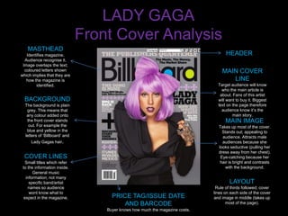
MASTHEAD
Identifies magazine. HEADER
Audience recognise it.
Image overlaps the text;
coloured letters shown MAIN COVER
which implies that they are
how the magazine is LINE
identified. Target audience will know
who the main article is
about. Fans of this artist
BACKGROUND will want to buy it. Biggest
The background is plain text on the page therefore
grey. This means that audience know it’s the
any colour added onto main story.
the front cover stands MAIN IMAGE
out. For example the Takes up most of the cover.
blue and yellow in the Stands out; appealing to
letters of ‘Billboard’ and audience. Attracts male
Lady Gagas hair. audiences because she
looks seductive (pulling her
dress away from her chest).
COVER LINES Eye-catching because her
Small titles which refer hair is bright and contrasts
to the information inside. with the background.
General music
information; not many
specific band/artist LAYOUT
names so audience Rule of thirds followed; cover
wont know what to lines on each side of the cover
expect in the magazine. PRICE TAG/ISSUE DATE and image in middle (takes up
AND BARCODE most of the page).
Buyer knows how much the magazine costs.
2. LADY GAGA
MASTHEAD
The masthead is at the top of
the page on the contents; this
reinforces the brand identity.
Contents Analysis
HOUSE STYLE IMAGES
The house style from the front cover is The images used on the contents
carried out through to the contents page. page represent what can be found
The colour scheme the magazine is throughout the magazine. It shows
following uses blue, yellow and grey. The that there are a range of artists
magazine is organised and not too busy. No and genres of music throughout.
copy or images are particularly overlapping The three images at the top of the
and everything is very clear. Article names page are smaller than the one in
are in blue whilst the other copy is in black. the middle which suggests that
The whole left column of the page is shaded the artist in the middle image is
grey which shows that it should be seen as a going to be involved in the issue
different section of the contents rather than more.
anything to do with page numbers etc./
FONT LAYOUT
The magazines layout varies on
• The font is small on page numbers etc. the contents page. The middle
however it is larger on the article titles; section follows the rule of thirds,
the larger text is more important and will however the bottom is cut into four
interest the audience more. sections and the whole left side of
• Different coloured fonts separate the the page is treated as a
sections; yellow font is used where completely different part.
songs and albums are listed and blue font
is used where information about what can
be found in the magazine is shown.
• ‘CONTENTS’ is at the top of the page in a ISSUE DATE
big, bold font so that the reader knows
that this is the page they can find out
about articles etc.
3. LADY GAGA
Double Page Spread Analysis
TEXT/FONT BY-LINE
The article headline is Shows who has written
larger and stands out. ‘The the article. (Top left hand
Lady Is A Champ’ makes it side).
easy for the audience to
recognise the article as
being positive.
IMAGE
The image takes up the
There is stand first; this
whole of the left side of
introduces the article and
the double page spread;
gives the audience a small
this shows that it is just
idea about what the article
as important as the text.
may include.
The audience will
The front is very plain
automatically look
which shows the
straight at it. She is
seriousness of the
wearing seductive
magazine.
clothing which will
attract male audiences.
The image is very dark,
EDITORIAL however she stands out
The article is quite chatty which which connotes that she
LAYOUT goes against the layout which is is the most important
The image takes up the whole of the left hand side of the double serious. The writer is quite and she should be the
page spread; this could be used as a poster after the reader has sarcastic and talks about Lady person you look at. This
finished with the article. Gaga as though they are friends; is similar to the front
The heading takes up a lot of the right page ; shows Lady Gaga ‘the 23-year-old has famously worn cover which is also dark
as being a ‘Champ’; positive. everything from Kermit the Frog to and she is brighter.
The article is in small font and overlaps the image in the a hat made to resemble the solar The image carries on to
background which has been taken whilst Lady Gaga was system’, the tone is set as being the right hand side of
performing at one of her concerts. humorous. the double page spread.
4. TARGET AUDIENCE
BILLBOARD MAGAZINE
TARGET AUDIENCE:
MALE/FEMALE: 73%/27%
Magazine is mainly brought by men HOW DOES
aged 17-30; the average aged being
25. Target audiences social class BILLBOARD APPEAL
varies through ABC1; 73%. TO IT’S TARGET
AUDIENCE?
•The artists on the covers (in this
KEY FACTS: case Lady Gaga) attract different
PRICE: £5.50 audiences.
FREQUENCY: Every week •Many genres/artists/bands are
LAUNCH DATE: 1894 shown in the magazine therefore
there’s a wider target audience.
More people can get
entertainment out of it.
•The magazine looks generally
MUSICAL quite serious; the cover is plain
INTERESTS: and to the point. It is clear and not
Many billboard readers are crowded; this appeals to
interested in a variety of different Billboards older target audience.
music; the magazine includes
many genres and artists who all
have there own individual taste.
5. BACKGROUND INFO
TYPICAL CONTENT:
•Reviews
•Interviews
•Posters
•Advertisements
•Album countdowns
•Music charts
STARTED:
1894. First issues shown on website
start at the year 1940. Was originally
used for billposting and advertising
but it expanded over decades and
eventually began to produce motion
pictures, radio, recorded music etc.
OTHER INFORMATION:
Billboard is an American magazine
but is also published in the UK.
Readers must be of a higher c lass
(A/B/C1) as the magazine cost a lot
for each issue.