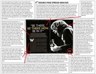
The colour palette used includes 2 main colours black and
white, which goes along with the house style of the magazine            3RD DOUBLE PAGE SPREAD ANALYSIS                                                                At the very top of the
                                                                                                                                                                       double page spread, in
and also gives a sense of sophistication. The fact that it looks          The title/heading on this double page spread is the biggest font of all. It stands out       very small, capital letters
sophisticated makes it look of higher quality compared to other           above everything else, thus catching the reader’s eye and drawing them in to read            is a sub-heading about
magazines and this persuades the readers to buy it. A hint of             more. A quote is used for the heading. Quotes are reliable, and direct quotes from           what this spread is all
orange is also used, to contrast with the black and white                 the band/artist will attract the audience because people generally prefer to hear            about. It is smaller than
bringing it to stand out. Also orange is a vibrant, exciting,             about what the band/artist has got to say rather than what other people have got             the main heading, so that
energetic colour. Black is very dark, which can slightly relate to        to say about them. The first line is in white font, the second in orange and the third       it does not take attention
the genre of music which is also slightly dark. The background is         also in white. The second line says ‘BE THERE NOW’ which will grab the reader’s              away from what is most
black and the font is orange/white. The orange/white stands               attention because people who read this magazine are really into their music and              important.
out on the black background and is very noticeable, attracting            may feel part of it. That’s why it is in a different colour so that it stands out.
the readers.
                                                                                                                                                           The main image on this double page
Above the main text (copy) there is a                                                                                                                      spread dominates the whole of the
description of what the article may contain,                                                                                                               right page. The image is a side view
which includes a quote and also uses genre                                                                                                                 mid shot of the artist. This means that
specific language, which will draw the                                                                                                                     the audience can see most of the
reader in because they will understand                                                                                                                     body language of this artist, and also
what it means if they are a fan of this                                                                                                                    sense more of his personality because
music. The font is in white, which contrasts                                                                                                               they feel part of him. The artists pose
with the black background, bringing it to                                                                                                                  and body language is very effective in
stand out. However, when people’s names                                                                                                                    representing the genre of music as
are mentioned the font is in orange, this is                                                                                                               most of the songs in this genre
done to set it apart from the rest of the                                                                                                                  contain live, rock music. It is a live
text, so the readers can see it is important.                                                                                                              image. The live image will relate to
The font is also slightly larger than the main                                                                                                             the audience because they will feel as
article itself. This is because the editor                                                                                                                 though they are there with him when
wants the reader to see this first, so that                                                                                                                he is performing. His facial
they can have an insight to the article they                                                                                                               expressions are very lively and
are about to read.                                                                                                                                         energetic which relates to the lively,
                                                                                                                                                           energetic title of the article. It’s in
                                                                                                                                                           black and white which gives it a
At the bottom of the page, next to each
                                                                                                                                                           vintage look which will relate to the
page number is the name of the magazine.
                                                                                                                                                           audience because it is generally the
It is almost unnoticeable, and yet every
                                                                                                                                                           older generation which buy this
time the reader goes to turn the page, they
                                                                                                                                                           magazine.
will see it. The reason it is there is so that      The layout of this double page spread, is very organized, everything is placed in
the name of the magazine will stick in              order. It looks very sophisticated which relates to the colour scheme, which also
people’s head and therefore, they will                                                                                                           At the bottom right of the image, there is a
                                                    looks very sophisticated. The reader’s will feel as if they are reading a better quality     small bit of text. This text is informing the
remember it and be persuaded to buy it              magazine than everybody else. It is not cluttered at all and also the font is very neat
again.                                                                                                                                           reader where the image was taken and what
                                                    and aligned straight and not scattered everywhere, like some magazines are.                  the image is about. This is there to make sure
                                                                                                                                                 that the reader doesn’t feel confused or lost. A
The main text (copy) is the smallest font on the double page spread. It is in tiny, white font,. The white font makes it noticeable for          quote has also been included from the artist,
the readers to see because it is placed on a black background. The first letter of this main article is the biggest and boldest font on the      just to draw the readers in. The font is very
page, this means it will grab the reader’s attention and draw them in, leading them to read the rest of the article. It is the boldest,          small, and barely even noticeable. Considering
most noticeable thing on the page, and because ‘W’ doesn’t make sense by itself, the reader’s will be persuaded to find out the rest.            it is in the bottom, left corner also means that it
The first line of the article is in capital letters. This is done, because it seems as if the person who wrote this article is shouting at the   will probably be the last thing the reader will
reader, which will draw the reader in and bring them to want to find out more and also feel as if they are a part of it.                         see.

3rd double page spread

  • 1.
    The colour paletteused includes 2 main colours black and white, which goes along with the house style of the magazine 3RD DOUBLE PAGE SPREAD ANALYSIS At the very top of the double page spread, in and also gives a sense of sophistication. The fact that it looks The title/heading on this double page spread is the biggest font of all. It stands out very small, capital letters sophisticated makes it look of higher quality compared to other above everything else, thus catching the reader’s eye and drawing them in to read is a sub-heading about magazines and this persuades the readers to buy it. A hint of more. A quote is used for the heading. Quotes are reliable, and direct quotes from what this spread is all orange is also used, to contrast with the black and white the band/artist will attract the audience because people generally prefer to hear about. It is smaller than bringing it to stand out. Also orange is a vibrant, exciting, about what the band/artist has got to say rather than what other people have got the main heading, so that energetic colour. Black is very dark, which can slightly relate to to say about them. The first line is in white font, the second in orange and the third it does not take attention the genre of music which is also slightly dark. The background is also in white. The second line says ‘BE THERE NOW’ which will grab the reader’s away from what is most black and the font is orange/white. The orange/white stands attention because people who read this magazine are really into their music and important. out on the black background and is very noticeable, attracting may feel part of it. That’s why it is in a different colour so that it stands out. the readers. The main image on this double page Above the main text (copy) there is a spread dominates the whole of the description of what the article may contain, right page. The image is a side view which includes a quote and also uses genre mid shot of the artist. This means that specific language, which will draw the the audience can see most of the reader in because they will understand body language of this artist, and also what it means if they are a fan of this sense more of his personality because music. The font is in white, which contrasts they feel part of him. The artists pose with the black background, bringing it to and body language is very effective in stand out. However, when people’s names representing the genre of music as are mentioned the font is in orange, this is most of the songs in this genre done to set it apart from the rest of the contain live, rock music. It is a live text, so the readers can see it is important. image. The live image will relate to The font is also slightly larger than the main the audience because they will feel as article itself. This is because the editor though they are there with him when wants the reader to see this first, so that he is performing. His facial they can have an insight to the article they expressions are very lively and are about to read. energetic which relates to the lively, energetic title of the article. It’s in black and white which gives it a At the bottom of the page, next to each vintage look which will relate to the page number is the name of the magazine. audience because it is generally the It is almost unnoticeable, and yet every older generation which buy this time the reader goes to turn the page, they magazine. will see it. The reason it is there is so that The layout of this double page spread, is very organized, everything is placed in the name of the magazine will stick in order. It looks very sophisticated which relates to the colour scheme, which also people’s head and therefore, they will At the bottom right of the image, there is a looks very sophisticated. The reader’s will feel as if they are reading a better quality small bit of text. This text is informing the remember it and be persuaded to buy it magazine than everybody else. It is not cluttered at all and also the font is very neat again. reader where the image was taken and what and aligned straight and not scattered everywhere, like some magazines are. the image is about. This is there to make sure that the reader doesn’t feel confused or lost. A The main text (copy) is the smallest font on the double page spread. It is in tiny, white font,. The white font makes it noticeable for quote has also been included from the artist, the readers to see because it is placed on a black background. The first letter of this main article is the biggest and boldest font on the just to draw the readers in. The font is very page, this means it will grab the reader’s attention and draw them in, leading them to read the rest of the article. It is the boldest, small, and barely even noticeable. Considering most noticeable thing on the page, and because ‘W’ doesn’t make sense by itself, the reader’s will be persuaded to find out the rest. it is in the bottom, left corner also means that it The first line of the article is in capital letters. This is done, because it seems as if the person who wrote this article is shouting at the will probably be the last thing the reader will reader, which will draw the reader in and bring them to want to find out more and also feel as if they are a part of it. see.