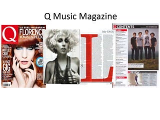
2. Mast head – The mast head
is very recognisable to
Front Cover Main image – The main
image is a close up shot. The
model, Florence, is making
direct eye contact with the
customers. It takes up the
camera which makes her
top left corner of the front
appear fierce. The model
magazine; this is because
used gives the readers an
the left third is the part of
idea of what style of music
the magazine which the
the magazine has to offer.
customer sees on the
The colour of her make up
shelves. ‘Q’ is a simple one
matches with the bright blue
letter name for the
cover line.
magazine which makes it
easier to stick in the
readers head. Main cover line – ‘I feel
so alone’ FLORENCE
woman on the
Cover lines – The cover lines edge’, the main cover
are all written in white and line is located at the
also in the same font which top of the front cover
makes them look consistent. and takes up all of the
Certain words or phrases are space which shows its
written in a larger font so importance. The
that importance is added to headline is almost a
them. This magazine sticks cliff-hanger and will
to a simple colour scheme in draw a lot of readers
which the cover lines fit in into buying the
with. There are quite a lot of magazine as they might
cover lines so that there is like to read more about
no white space that needs to
be filled. this particular story.
3. Contents Page
Mast head – The
mast head is
located in the top
left hand corner, it
is a lot smaller in
size compared to it Main image – The
on the front cover. main image is of a
band that features
in the magazine.
Title – The title of the The image is quite
page ‘contents’ is large and takes
located in the top left over a large
hand corner in a section of the
black banner, it is in contents page.
white writing to make
it easier to read.
Sub headings – Sub
headings are written in
Colour scheme
white just like the main
– The colour
heading however they
scheme is very
are in a different font,
simple, sticks
the page numbers are
to basic colours
in red and are easy to
like red, black
understand.
and white
Secondary image – The
second image is the
Headings – The headings image at the bottom of
of the sections are the contents page of a
written in a bright red woman leaning on a
with white text, this pillar, the pose the
draws attention to them woman is doing reflects
so we can see what they indie music as she look
are. layed back and relaxed.
4. Double page spread Letter L – A large letter
L is used in the
background of the
text; this L stands for
Main image - The main Lady GaGa and is in
image on the double red to match with the
page spread takes over colour scheme and the
a whole page. In the mast head which is ‘Q’.
image the well-known
artist, Lady GaGa, poses
wearing just necklaces
and nothing else which
some readers may find
attractive. She is making
Drop caps –
direct eye contact with
There are 2
the camera which
drop caps
implies she is confident,
used in the
this may reflect on her
right hand
music. It is also in black
side with
and white the letters I
and S
Text- This page is full of text, it’s an article about
Lady GaGa. The rule of third is used on this page
as it is divided into 3 columns so that the reader
is able to follow the article with no confusion.