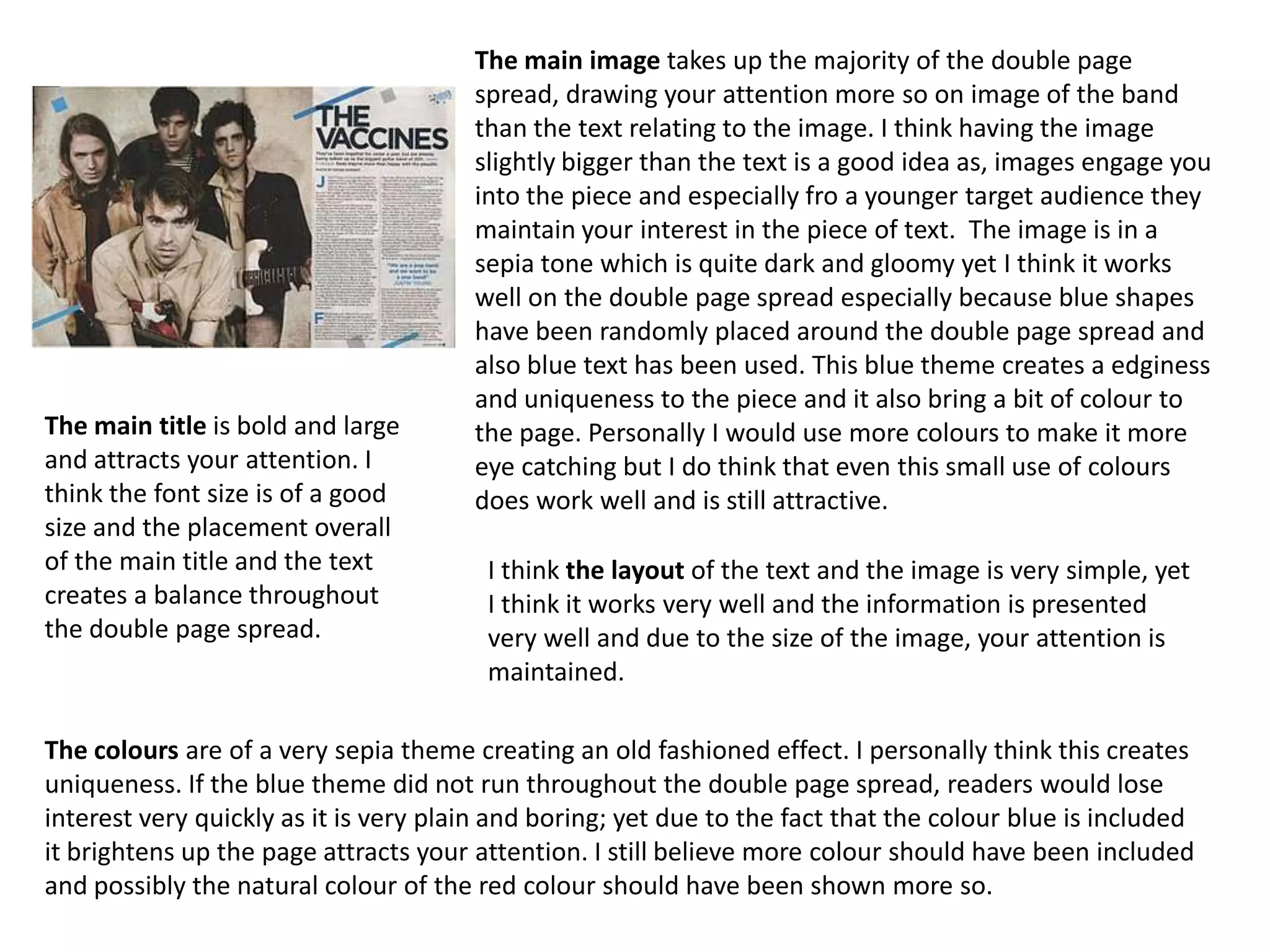
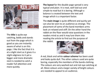
The layout of the double page spread is simple yet effective. It draws the reader's attention to the large main image while also presenting the text in a balanced way. A consistent color theme of blue, black, and sepia tones is used throughout, helping to tie the design together while also making strategic use of color to highlight key elements like the text. Overall, the simple yet cohesive design successfully engages the reader with the image while also communicating the accompanying information in an accessible manner.