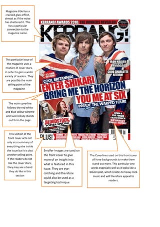
Magazine title has a
cracked glass effect,
almost as if the noise
has shattered it. This
             =

   has a particular
  connection to the
   magazine name.


 This particular issue of
  the magazine uses a
 mixture of cover stars,
in order to gain a wider
variety of readers. They
 are possibly the main
   selling point of the
         magazine


  The main coverline
 follows the red white
and blue colour scheme
and successfully stands
  out from the page.


    This section of the
   front cover acts not
 only as a summary of
 everything else inside
 the issue but it is also   Smaller images are used on
 another selling point.     the front cover to give      The Coverlines used on this front cover
  If the readers do not     more of an insight into        all have backgrounds to make them
   like the cover stars,    what is featured in this       stand out more. This particular one
  they may see a band                                     works especially well as it looks like a
                            issue. They are eye-
    they do like in this                                 blood splat, which relates to heavy rock
                            catching and therefore
          section                                           music and will therefore appeal to
                            could also be used as a
                                                                         readers.
                            targeting technique
Issue information
is kept at the top
left of the page.
The word                                                                  The main feature
‘contents’ follows                                                        is placed on the
the house style of                                                        top half of the
Kerrang by having                                                         page with the
a yellow font                                                             page number and
which almost                                                              band name in the
connotes danger.                                                          bottom right
                                                                          corner. The image
                                                                          will captivate the
                                                                          reader and they
  Small inserts from                                                      may also use it as
 inside the magazine                                                      an alternative to
are displayed here to                                                     the list of text
  entice the reader.                                                      below.


  The editorial is
  presented in a
  narrow column
  down the left
  hand side of the
  page with a
  photo of the
  editor. It does
  not interrupt the
  rest of the page
  but it gives the
  reader the
  option of reading
  it.
                        The list of features is
                        split into seven           Subscription information is
                        different sections all     placed in the bottom right
                        with clear headings,       hand corner of the page and
                        making it easier for the   is there to try and persuade
                        reader to find what        readers to subscribe. It does
                        they are looking for.      this by using pictures of
                                                   previous issues and bold
                                                   font.
The bands logo is put next to a
quote from the lead singer,
making it more personal to them
and their fans.


                   The text is written in three columns with   The colour scheme of the article
                   a large image of the singer Gerard Way      uses two very contrasting colours.
                   in the middle. The placing of the image     The background is black which
                   has been purposely done to break up the     makes the singer stand out more
                   text.                                       due to his red hair, vibrant t-shirt
                                                               and white skin. The red colour
                                                               scheme is also used for the quote at
                                                               the top of the page and for the first
                                                               couple of words in each section of
                                                               text.
Magazine analysis

Magazine analysis

  • 1.
    Magazine title hasa cracked glass effect, almost as if the noise has shattered it. This = has a particular connection to the magazine name. This particular issue of the magazine uses a mixture of cover stars, in order to gain a wider variety of readers. They are possibly the main selling point of the magazine The main coverline follows the red white and blue colour scheme and successfully stands out from the page. This section of the front cover acts not only as a summary of everything else inside the issue but it is also Smaller images are used on another selling point. the front cover to give The Coverlines used on this front cover If the readers do not more of an insight into all have backgrounds to make them like the cover stars, what is featured in this stand out more. This particular one they may see a band works especially well as it looks like a issue. They are eye- they do like in this blood splat, which relates to heavy rock catching and therefore section music and will therefore appeal to could also be used as a readers. targeting technique
  • 2.
    Issue information is keptat the top left of the page. The word The main feature ‘contents’ follows is placed on the the house style of top half of the Kerrang by having page with the a yellow font page number and which almost band name in the connotes danger. bottom right corner. The image will captivate the reader and they Small inserts from may also use it as inside the magazine an alternative to are displayed here to the list of text entice the reader. below. The editorial is presented in a narrow column down the left hand side of the page with a photo of the editor. It does not interrupt the rest of the page but it gives the reader the option of reading it. The list of features is split into seven Subscription information is different sections all placed in the bottom right with clear headings, hand corner of the page and making it easier for the is there to try and persuade reader to find what readers to subscribe. It does they are looking for. this by using pictures of previous issues and bold font.
  • 3.
    The bands logois put next to a quote from the lead singer, making it more personal to them and their fans. The text is written in three columns with The colour scheme of the article a large image of the singer Gerard Way uses two very contrasting colours. in the middle. The placing of the image The background is black which has been purposely done to break up the makes the singer stand out more text. due to his red hair, vibrant t-shirt and white skin. The red colour scheme is also used for the quote at the top of the page and for the first couple of words in each section of text.