
Recommended
More Related Content
What's hot
What's hot (17)
Viewers also liked
Similar to Overview of Hip-Hop Magazine Contents Page Conventions
Similar to Overview of Hip-Hop Magazine Contents Page Conventions (20)
Overview of Hip-Hop Magazine Contents Page Conventions
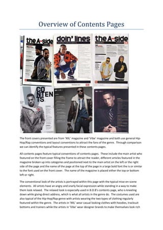
- 1. Overview of Contents Pages The front covers presented are from ‘XXL’ magazine and ‘Vibe’ magazine and both use general Hip- Hop/Rap conventions and layout conventions to attract the fans of the genre. Through comparison we can identify the typical features presented in these contents pages. All contents pages feature typical conventions of contents pages. These include the main artist who featured on the front cover filling the frame to attract the reader, different articles featured in the magazine broken up into categories and positioned next to the main artist on the left or the right side of the page and the name of the page at the top of the page in a large bold font the is or similar to the font used on the front cover. The name of the magazine is placed either the top or bottom left or right. The conventional look of the artists is portrayed within this page with the typical mise-en-scene elements. All artists have an angry and snarly facial expression while standing in a way to make them look relaxed. The relaxed look is especially used in B.O.B’s contents page, who is kneeling down while giving direct address, which is what all artists in the genre do. The costumes used are also typical of the Hip-Hop/Rap genre with artists wearing the two types of clothing regularly featured within the genre. The artists in ‘XXL’ wear casual looking clothes with hoodies, tracksuit bottoms and trainers while the artists in ‘Vibe’ wear designer brands to make themselves look rich
- 2. and successful. The three main pieces of clothing that is regularly used in the Hip-Hop/Rap genre are the Snapback, sunglasses and expensive jewellery. All three appear in the contents pages and this is to attract the fans of Hip-Hop/Rap. The main artists are all male. Males dominate the Hip-Hop/Rap genre and they are portrayed as powerful, strong and successful. Females are under represented in the genre and are normally portrayed as sex objects. This gender stereotype is one main reason why male artists usually feature. The fonts used in the contents pages are used throughout the rest of the magazine including the front cover and double page spreads. The name of the page “Contents” or “the A-side” is the same font as used in the front cover. This is to create brand identity for the magazine so readers can easily identify what magazine they are reading. It is also in a large bold font to make it very eye- catching and because it is placed at the top of the page the name of the page will be the first thing that the reader will look at when turning to this page. The colours used are typically used in the genre with the use of black, red and white. There are some exceptions where both Usher and B.O.B are wearing blue items of clothing. There is usually a white background with black text, but this can change as seen by Usher’s ‘Vibe’ contents page. The colour red is used to give some variety of colour to the page and to make things in the colour or nearby the colour stand out on the page to attract the reader’s attention. The camera angles used are typical of Hip-Hop/Rap magazine contents pages. These angles include medium/close up shots, medium shots and even long shots as shown by B.O.B’s contents page in ‘Vibe’ magazine. These shots are used to make sure that the artist fills the frame and to attract the reader to the page. Having carried out this overview, it is very clear that both ‘XXL’ and ‘Vibe’ have their own brand identity through the use of costume, font and colours to create a certain look that is easily recognisable to readers and fans of the genre. This is maintained through the use of repeated general and layout conventions and this helps the magazines sell and grow as a company.