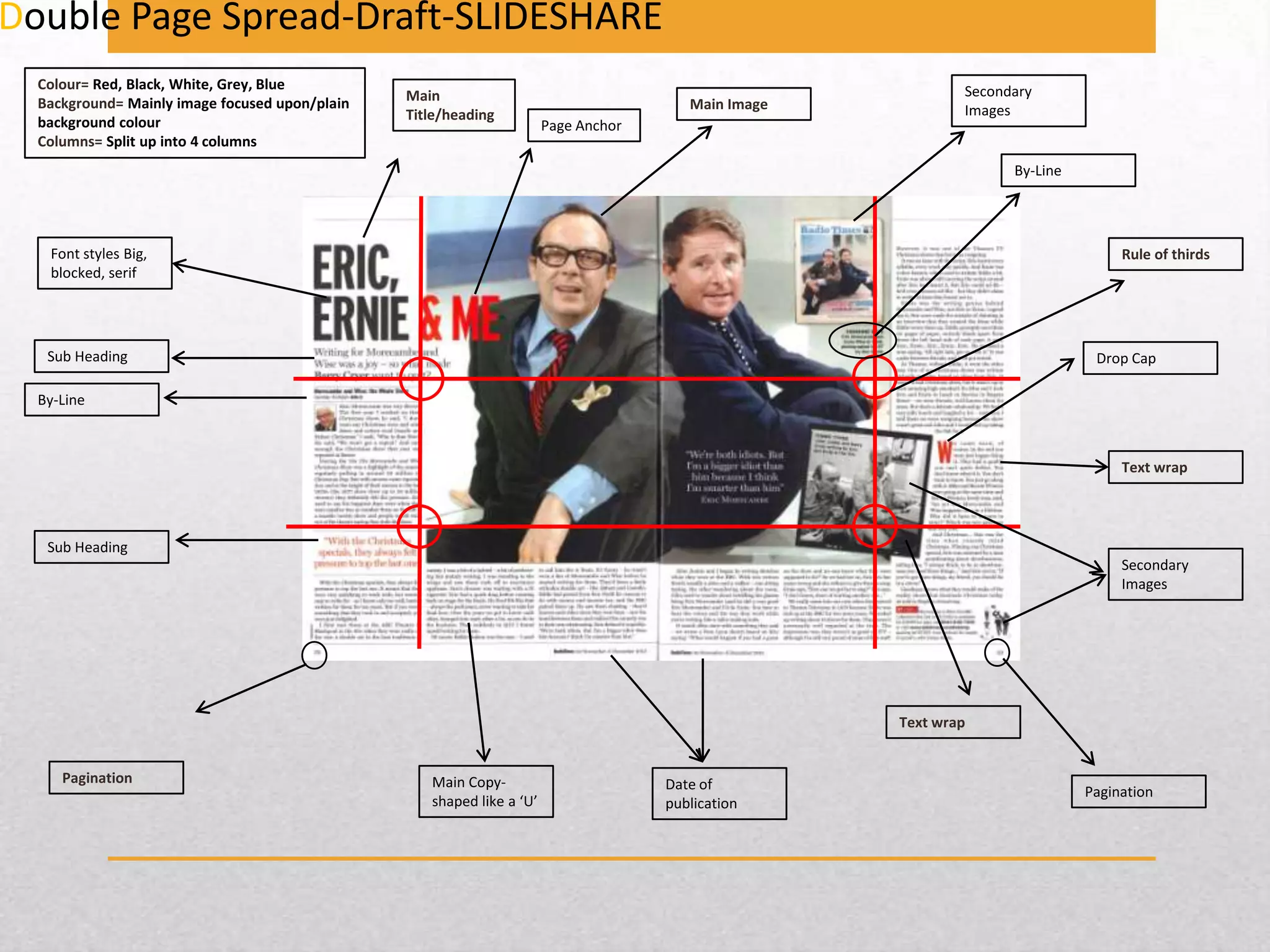
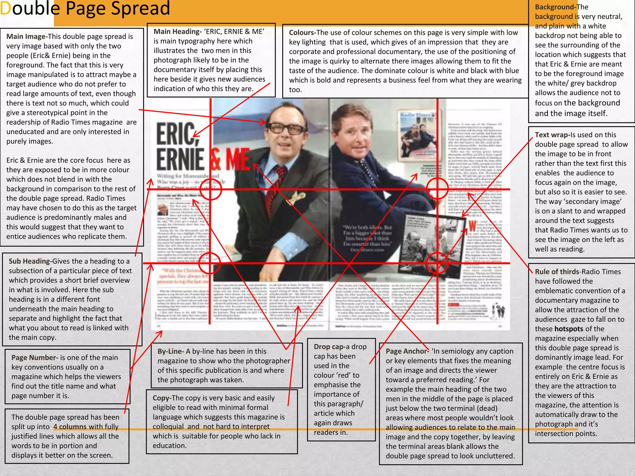
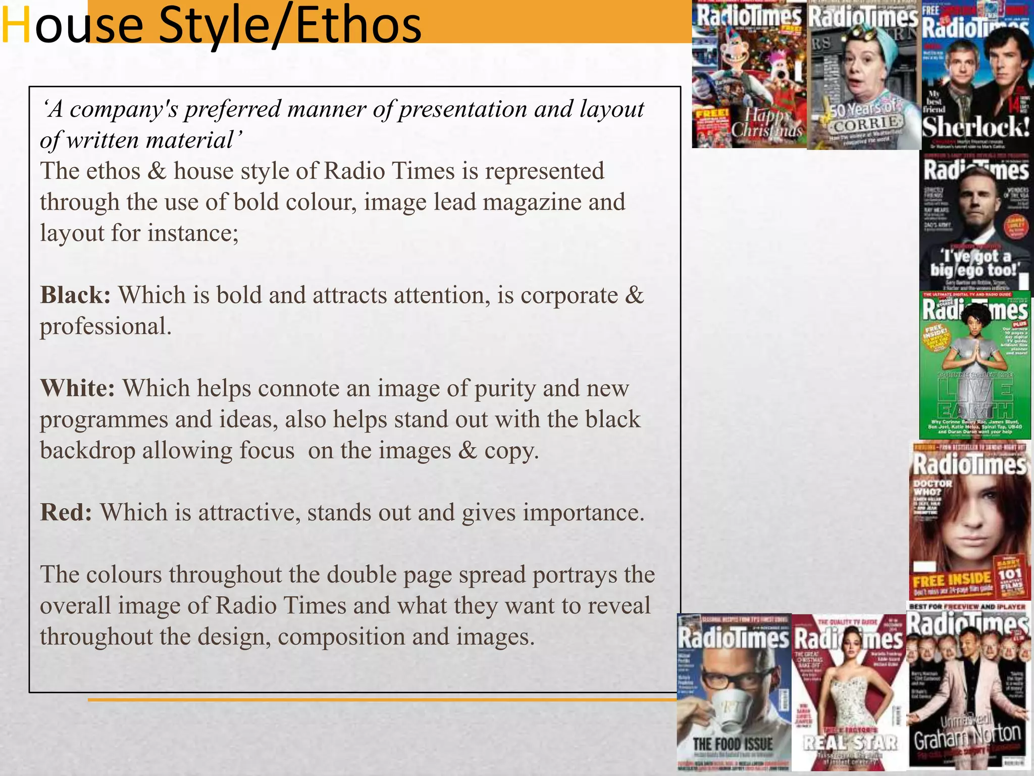
The document summarizes a double page spread from the magazine Radio Times. It is split into four columns with the main focus on images, including a large central image of Eric and Ernie. The colors used are red, black, white, and grey to create a simple yet bold design. Text is kept concise to appeal to readers who prefer images over large blocks of text. Key elements like headings, bylines, and page numbers follow standard magazine conventions.