SlideShare a Scribd company logo
1 of 4
Masthead: The masthead for the contents page is in a
                           simple sans serif font which is yellow, the colour
                           of this could be because that is the colour for the        Kerrang!
                           features and elements they want to stand out from
                           others. The ‘Contents’ is situated at the top
                           right of the in a black box which makes the yellow
                           writing stand out more and makes the audiences and
                           readers eye automatically look to it.
                                                                            Editors Note: This is an editors
                                                                            note, it tells the audience what this
Image: There are many images on                                             issue is about or this one which
this contents page, there is a                                              looks as if it is promoting the next
main image which it in the middle                                           edition of Kerrang!. This is a useful
left of the page. This is bigger                                            tool for the magazine as it entices
than the others because this                                                the reader to think about buying the
artist is the main article that                                             next issue before its even out.
will be featured on the double
page spread. The other slightly
                                                                            Page Number: These page numbers are
smaller images indicate and show
                                                                            highlighted in yellow to make them
the audience what other artists
                                                                            stand out from the other numbers,
will be featured along with a page
                                                                            this is because they are main
number and description.
                                                                            articles and the most interesting for
                                                                            the audience in comparison form the
  Colour Scheme: The colour                                                 other articles.
  scheme of the contents page
  follows that of the masthead as
  it’s main colours are yellow,
  white and black and on the                     Features: There is a line or a divider to
  front cover, these colours seem                separate the images and the text that is listed.
  to be a concurrent theme for                   The images are being separated from the listed
  this magazine.                                 articles and each other to break up the page and
                                                 give the magazine depth through making it look
                                                 spaced out but at the same time cramped.
Image: There are two images on this contents page but they      Masthead: The masthead for NME contents page is
 become one if put together. This image is of a band plating     simple just like the masthead on the front cover,
 on a stage and you can tell this because if the deep red        this is bold text in a black box with white and
 lighting in the back ground. The image is situated under the    red writing. The NME is in red as this is the
 masthead of the contents page to the left slightly. The image   colour scheme for NME and it is normally in red
 is eye catching as it is a deep red background and also         to make it ‘pop of the page and become the eye
 because its not a ‘normal’ rectangle or square shape that       catching point. Being on the black background
 you normally see, it had a jagged edge to it where the          helps the title to stand out from all the other
 heading of the article overview is.                             text on the page.

                                                                               Text: The text on this contents
                                                                               page is either black or red
Features: The arrow on the page                                                except on the subheading with the
entices the reader to read on as its                                           black boxes as it looks as if the
in the direction of the next page.                                             text has been cut form the box.
It could be to help sublilminary                                               There is also a drop capital,
tell the reader to turn the page and                                           this is also eye catching and
read on. There are also smaller                                                shows the reader where the start
arrows pointing to the key articles                                            of the article is.
within the magazine to help the
reader to choose what article to                                               Colour Scheme: The colour scheme
start on.                                                                      for NME is the same (house style)
Page Number: NME pages numbers are                                             throughout most if not all the
in either red or black, if the text                                            magazines. This helps make the
is red then the page number is red,                                            magazine recognisable to the
however if the text is black the                                               audience instantly.
number will be red. This is in order
for it to stand out from the rest of
                                                          Advertisements/Promotions: This content s page
its text.
                                                          contains a advertisement/promotion for the next
                                                          issue of the magazine. This allows the reader
                                                          to see how to sign up to get magazines sent to
                                                          them for a fee.

NME (New Musical Express)
Image: The image on Classic Rock’s contents page takes up
most of the page as it is of all members of the Rolling     Classic Rock
Stones and is a long shot. The colour is that of a
saturated one thus making the image look old and
‘classic’ it is also a ‘dusty brown’ colour. This
suits the genre well as rock is known for being ‘dark’
and non-colourful sticking to the dark browns, greys and
blacks with hints of red that represent danger, anger and
rebellious behaviour.
                                                            Colour Scheme: The colour scheme for
                                                            Classic Rock’s magazine is dark
                                                            dull colours with hints of red in
                                                            paces. As this contents page has red
                                                            for the sticker and other features
                                                            including the main articles page
Page Number: Classic Rock’s page                            number.
numbers are next to the article
heading in a red colour, this is part
of the colour scheme. The numbers are
quite small however.


                                                            Text: The text is very simple and is
                                                            in a simple black, which again suits
                                                            the generic colours of a rock
                                                            magazine. The article heading is
                                                            bigger than the description to
                                                            overview. The heading of the main
Masthead: The masthead for Classic Rock is                  article is wrote in a smart font
different to the others as it is smaller than the           that is instantly eye catching as it
subheading. The masthead is in line to the boarder          is the biggest piece of text on the
and the masthead doesn’t stand out as much as the           page.
others at it is in black along with most the other
text.
Text: The text on this contents page is along the            Masthead: Q’s magazine contents page is simple as
left side, it shows what will be featured in the             it is the Q logo contents wrote next to it. This is
magazine. The key pieces of text is in the red               because the red square with the Q in is Q’s most
rectangles as this highlights the articles and               recognisable feature of Q magazine and thus this
helps with navigation. There is also a                       logo is seen on all pages of the magazine. This is
coverline/subheading over the main image, this               in a black borer along the top to make the heading
gives a brief summery of the article and engages             stand out form the rest of the page.
the reader.


Image: This image is of a
group, they look of an                                                      Colour Scheme: The colour scheme
‘indie’ genre as they are                                                   for Q is red, white and black,
dressed casually and look                                                   this is a concurrent theme
slightly rebellish. The image                                               throughout Q magazine, the red
takes up most of the page and                                               captures the audiences eye as it
is surrounded with text thus                                                is the brightest colour on the
makes this image very eye                                                   page and contrasts the other
catching.                                                                   colours. The colours scheme could
                                                                            be this because it doesn’t
                                                                            represent no specific genre as
Features: This magazine contains
                                                                            all genres use this colour as it
the issues number and date on the
                                                                            is a popular colour and doesn't
contents page instead of the front
                                                                            represent just one thing.
like a generic magazine.

                                             Box Out: This is when the ‘box’ is a
                                             different colour to the background it is
                                             on, such as this one. This highlights
                                             the key feature of this magazine
                                             ‘review’ and attracting the eye of the
                                             audience at the same time.

Q

More Related Content

What's hot

My Music Magazine - Plan
My Music Magazine - PlanMy Music Magazine - Plan
My Music Magazine - Planhhunjan07
 
Conventions of a double page spread
Conventions of a double page spreadConventions of a double page spread
Conventions of a double page spreadLaura-G
 
Media as evaluation
Media as evaluationMedia as evaluation
Media as evaluationyahong24
 
Media as evaluation
Media as evaluationMedia as evaluation
Media as evaluationyahong24
 
Media as evaluation
Media as evaluationMedia as evaluation
Media as evaluationyahong24
 
AS Media Presentation - Rae Vasconcelos
AS Media Presentation - Rae VasconcelosAS Media Presentation - Rae Vasconcelos
AS Media Presentation - Rae VasconcelosSFX
 
Analysing Magazine Contents Pages
Analysing Magazine Contents PagesAnalysing Magazine Contents Pages
Analysing Magazine Contents PagesMattHartup
 
Constructing my music magazine
Constructing my music magazineConstructing my music magazine
Constructing my music magazineGBarco20
 
Contents Analysis
Contents AnalysisContents Analysis
Contents Analysisjeevstar
 
Media as evaluation
Media as evaluationMedia as evaluation
Media as evaluationyahong24
 
Front Cover Research-Indie
Front Cover Research-Indie Front Cover Research-Indie
Front Cover Research-Indie Rayrayy
 
Magazine Contents Page Analysis
Magazine Contents Page AnalysisMagazine Contents Page Analysis
Magazine Contents Page Analysisnathansimmons11
 
Evaluation question 1
Evaluation  question 1Evaluation  question 1
Evaluation question 1ChloeHicks
 
Analysing 3 contents pages
Analysing 3 contents pagesAnalysing 3 contents pages
Analysing 3 contents pagesoksanatorhan
 

What's hot (17)

My Music Magazine - Plan
My Music Magazine - PlanMy Music Magazine - Plan
My Music Magazine - Plan
 
Textual analysis
Textual analysisTextual analysis
Textual analysis
 
Conventions of a double page spread
Conventions of a double page spreadConventions of a double page spread
Conventions of a double page spread
 
Media as evaluation
Media as evaluationMedia as evaluation
Media as evaluation
 
Media as evaluation
Media as evaluationMedia as evaluation
Media as evaluation
 
Media as evaluation
Media as evaluationMedia as evaluation
Media as evaluation
 
AS Media Presentation - Rae Vasconcelos
AS Media Presentation - Rae VasconcelosAS Media Presentation - Rae Vasconcelos
AS Media Presentation - Rae Vasconcelos
 
Analysing Magazine Contents Pages
Analysing Magazine Contents PagesAnalysing Magazine Contents Pages
Analysing Magazine Contents Pages
 
Constructing my music magazine
Constructing my music magazineConstructing my music magazine
Constructing my music magazine
 
Contents Analysis
Contents AnalysisContents Analysis
Contents Analysis
 
Media as evaluation
Media as evaluationMedia as evaluation
Media as evaluation
 
Front Cover Research-Indie
Front Cover Research-Indie Front Cover Research-Indie
Front Cover Research-Indie
 
Magazine Contents Page Analysis
Magazine Contents Page AnalysisMagazine Contents Page Analysis
Magazine Contents Page Analysis
 
Evaluation question 1
Evaluation  question 1Evaluation  question 1
Evaluation question 1
 
Analysing 3 contents pages
Analysing 3 contents pagesAnalysing 3 contents pages
Analysing 3 contents pages
 
Lady gaga
Lady gagaLady gaga
Lady gaga
 
Grime music slide
Grime music slideGrime music slide
Grime music slide
 

Viewers also liked

Double page spread
Double page spreadDouble page spread
Double page spreadperri_94
 
Front Cover Analysis
Front Cover Analysis Front Cover Analysis
Front Cover Analysis perri_94
 
Double page spread
Double page spreadDouble page spread
Double page spreadperri_94
 
Wikiportfolio assignment
Wikiportfolio assignmentWikiportfolio assignment
Wikiportfolio assignmentMaryHr
 
Magazine template
Magazine templateMagazine template
Magazine templateperri_94
 
Mongolian War Machine
Mongolian War MachineMongolian War Machine
Mongolian War MachineDylan Price
 
America latina y sus banderas
America latina y sus banderasAmerica latina y sus banderas
America latina y sus banderaselebolanos
 
Sistema de informacao juridica - Infojur
Sistema de informacao juridica  - InfojurSistema de informacao juridica  - Infojur
Sistema de informacao juridica - InfojurGilson Martins
 

Viewers also liked (14)

Double page spread
Double page spreadDouble page spread
Double page spread
 
Natural remedies
Natural remediesNatural remedies
Natural remedies
 
Front Cover Analysis
Front Cover Analysis Front Cover Analysis
Front Cover Analysis
 
Double page spread
Double page spreadDouble page spread
Double page spread
 
R&p
R&pR&p
R&p
 
Wikiportfolio assignment
Wikiportfolio assignmentWikiportfolio assignment
Wikiportfolio assignment
 
English
EnglishEnglish
English
 
Magazine template
Magazine templateMagazine template
Magazine template
 
Mongolian War Machine
Mongolian War MachineMongolian War Machine
Mongolian War Machine
 
Maroon 5- Blogger
Maroon 5- BloggerMaroon 5- Blogger
Maroon 5- Blogger
 
America latina y sus banderas
America latina y sus banderasAmerica latina y sus banderas
America latina y sus banderas
 
Marron 5
Marron 5Marron 5
Marron 5
 
Tese anderson
Tese andersonTese anderson
Tese anderson
 
Sistema de informacao juridica - Infojur
Sistema de informacao juridica  - InfojurSistema de informacao juridica  - Infojur
Sistema de informacao juridica - Infojur
 

Similar to Music Magazine Contents Page Analysis

Contents analysis
Contents analysisContents analysis
Contents analysisLongmark12
 
My music magazine evaluation
My music magazine evaluationMy music magazine evaluation
My music magazine evaluationMKTK12
 
Dizzee rascal evaluation
Dizzee rascal evaluationDizzee rascal evaluation
Dizzee rascal evaluationsophiex
 
Double page spread: Working Progress
Double page spread: Working ProgressDouble page spread: Working Progress
Double page spread: Working ProgressSatinaLOL
 
Analyzing Contents Pages
Analyzing Contents PagesAnalyzing Contents Pages
Analyzing Contents Pagesahsatanstapes
 
Radial analysis
Radial analysisRadial analysis
Radial analysisnash001g
 
Zac mediai
Zac mediaiZac mediai
Zac mediaiZaCk321
 
Music Magazine Research
Music Magazine ResearchMusic Magazine Research
Music Magazine ResearchSamChittock
 
Double page spreads for analysis
Double page spreads for analysisDouble page spreads for analysis
Double page spreads for analysisamybrackenridge
 
Case study magazine art rocker
Case study magazine art rockerCase study magazine art rocker
Case study magazine art rockerElisaNarborough
 

Similar to Music Magazine Contents Page Analysis (20)

Contents analysis
Contents analysisContents analysis
Contents analysis
 
My music magazine evaluation
My music magazine evaluationMy music magazine evaluation
My music magazine evaluation
 
Dizzee rascal evaluation
Dizzee rascal evaluationDizzee rascal evaluation
Dizzee rascal evaluation
 
Radial Analysis
Radial AnalysisRadial Analysis
Radial Analysis
 
Double page spread: Working Progress
Double page spread: Working ProgressDouble page spread: Working Progress
Double page spread: Working Progress
 
Ali (1)
Ali (1)Ali (1)
Ali (1)
 
Task 3
Task 3Task 3
Task 3
 
The fly
The flyThe fly
The fly
 
Analyzing Contents Pages
Analyzing Contents PagesAnalyzing Contents Pages
Analyzing Contents Pages
 
Magazine analysis
Magazine analysisMagazine analysis
Magazine analysis
 
Radial analysis
Radial analysisRadial analysis
Radial analysis
 
Zac mediai
Zac mediaiZac mediai
Zac mediai
 
Content pages
Content pagesContent pages
Content pages
 
Content pages
Content pagesContent pages
Content pages
 
Content analysed1
Content analysed1Content analysed1
Content analysed1
 
Music Magazine Research
Music Magazine ResearchMusic Magazine Research
Music Magazine Research
 
Textual Analysis
Textual AnalysisTextual Analysis
Textual Analysis
 
Double page spreads for analysis
Double page spreads for analysisDouble page spreads for analysis
Double page spreads for analysis
 
Case study magazine art rocker
Case study magazine art rockerCase study magazine art rocker
Case study magazine art rocker
 
Content pages
Content pagesContent pages
Content pages
 

More from perri_94

Primary comparison
Primary comparisonPrimary comparison
Primary comparisonperri_94
 
Double page spread
Double page spreadDouble page spread
Double page spreadperri_94
 
Results primary and secondary
Results primary and secondaryResults primary and secondary
Results primary and secondaryperri_94
 
School magazine plan! better
School magazine plan! betterSchool magazine plan! better
School magazine plan! betterperri_94
 
Pop magazines
Pop magazinesPop magazines
Pop magazinesperri_94
 

More from perri_94 (7)

Primary comparison
Primary comparisonPrimary comparison
Primary comparison
 
Risk ass
Risk assRisk ass
Risk ass
 
R&p
R&pR&p
R&p
 
Double page spread
Double page spreadDouble page spread
Double page spread
 
Results primary and secondary
Results primary and secondaryResults primary and secondary
Results primary and secondary
 
School magazine plan! better
School magazine plan! betterSchool magazine plan! better
School magazine plan! better
 
Pop magazines
Pop magazinesPop magazines
Pop magazines
 

Music Magazine Contents Page Analysis

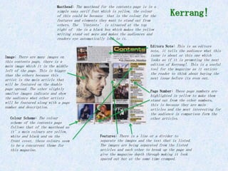
  • 1. Masthead: The masthead for the contents page is in a simple sans serif font which is yellow, the colour of this could be because that is the colour for the Kerrang! features and elements they want to stand out from others. The ‘Contents’ is situated at the top right of the in a black box which makes the yellow writing stand out more and makes the audiences and readers eye automatically look to it. Editors Note: This is an editors note, it tells the audience what this Image: There are many images on issue is about or this one which this contents page, there is a looks as if it is promoting the next main image which it in the middle edition of Kerrang!. This is a useful left of the page. This is bigger tool for the magazine as it entices than the others because this the reader to think about buying the artist is the main article that next issue before its even out. will be featured on the double page spread. The other slightly Page Number: These page numbers are smaller images indicate and show highlighted in yellow to make them the audience what other artists stand out from the other numbers, will be featured along with a page this is because they are main number and description. articles and the most interesting for the audience in comparison form the Colour Scheme: The colour other articles. scheme of the contents page follows that of the masthead as it’s main colours are yellow, white and black and on the Features: There is a line or a divider to front cover, these colours seem separate the images and the text that is listed. to be a concurrent theme for The images are being separated from the listed this magazine. articles and each other to break up the page and give the magazine depth through making it look spaced out but at the same time cramped.
  • 2. Image: There are two images on this contents page but they Masthead: The masthead for NME contents page is become one if put together. This image is of a band plating simple just like the masthead on the front cover, on a stage and you can tell this because if the deep red this is bold text in a black box with white and lighting in the back ground. The image is situated under the red writing. The NME is in red as this is the masthead of the contents page to the left slightly. The image colour scheme for NME and it is normally in red is eye catching as it is a deep red background and also to make it ‘pop of the page and become the eye because its not a ‘normal’ rectangle or square shape that catching point. Being on the black background you normally see, it had a jagged edge to it where the helps the title to stand out from all the other heading of the article overview is. text on the page. Text: The text on this contents page is either black or red Features: The arrow on the page except on the subheading with the entices the reader to read on as its black boxes as it looks as if the in the direction of the next page. text has been cut form the box. It could be to help sublilminary There is also a drop capital, tell the reader to turn the page and this is also eye catching and read on. There are also smaller shows the reader where the start arrows pointing to the key articles of the article is. within the magazine to help the reader to choose what article to Colour Scheme: The colour scheme start on. for NME is the same (house style) Page Number: NME pages numbers are throughout most if not all the in either red or black, if the text magazines. This helps make the is red then the page number is red, magazine recognisable to the however if the text is black the audience instantly. number will be red. This is in order for it to stand out from the rest of Advertisements/Promotions: This content s page its text. contains a advertisement/promotion for the next issue of the magazine. This allows the reader to see how to sign up to get magazines sent to them for a fee. NME (New Musical Express)
  • 3. Image: The image on Classic Rock’s contents page takes up most of the page as it is of all members of the Rolling Classic Rock Stones and is a long shot. The colour is that of a saturated one thus making the image look old and ‘classic’ it is also a ‘dusty brown’ colour. This suits the genre well as rock is known for being ‘dark’ and non-colourful sticking to the dark browns, greys and blacks with hints of red that represent danger, anger and rebellious behaviour. Colour Scheme: The colour scheme for Classic Rock’s magazine is dark dull colours with hints of red in paces. As this contents page has red for the sticker and other features including the main articles page Page Number: Classic Rock’s page number. numbers are next to the article heading in a red colour, this is part of the colour scheme. The numbers are quite small however. Text: The text is very simple and is in a simple black, which again suits the generic colours of a rock magazine. The article heading is bigger than the description to overview. The heading of the main Masthead: The masthead for Classic Rock is article is wrote in a smart font different to the others as it is smaller than the that is instantly eye catching as it subheading. The masthead is in line to the boarder is the biggest piece of text on the and the masthead doesn’t stand out as much as the page. others at it is in black along with most the other text.
  • 4. Text: The text on this contents page is along the Masthead: Q’s magazine contents page is simple as left side, it shows what will be featured in the it is the Q logo contents wrote next to it. This is magazine. The key pieces of text is in the red because the red square with the Q in is Q’s most rectangles as this highlights the articles and recognisable feature of Q magazine and thus this helps with navigation. There is also a logo is seen on all pages of the magazine. This is coverline/subheading over the main image, this in a black borer along the top to make the heading gives a brief summery of the article and engages stand out form the rest of the page. the reader. Image: This image is of a group, they look of an Colour Scheme: The colour scheme ‘indie’ genre as they are for Q is red, white and black, dressed casually and look this is a concurrent theme slightly rebellish. The image throughout Q magazine, the red takes up most of the page and captures the audiences eye as it is surrounded with text thus is the brightest colour on the makes this image very eye page and contrasts the other catching. colours. The colours scheme could be this because it doesn’t represent no specific genre as Features: This magazine contains all genres use this colour as it the issues number and date on the is a popular colour and doesn't contents page instead of the front represent just one thing. like a generic magazine. Box Out: This is when the ‘box’ is a different colour to the background it is on, such as this one. This highlights the key feature of this magazine ‘review’ and attracting the eye of the audience at the same time. Q