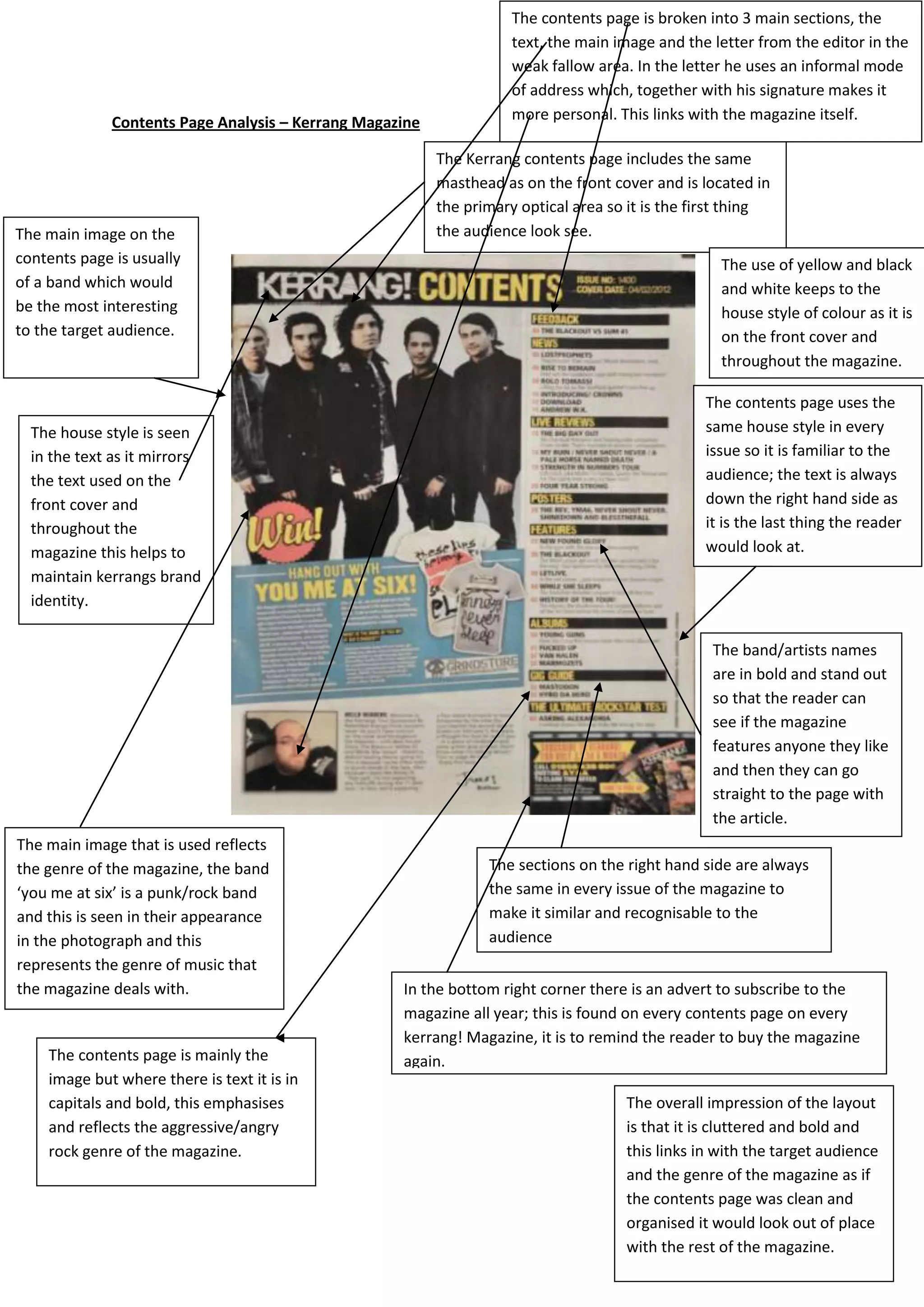
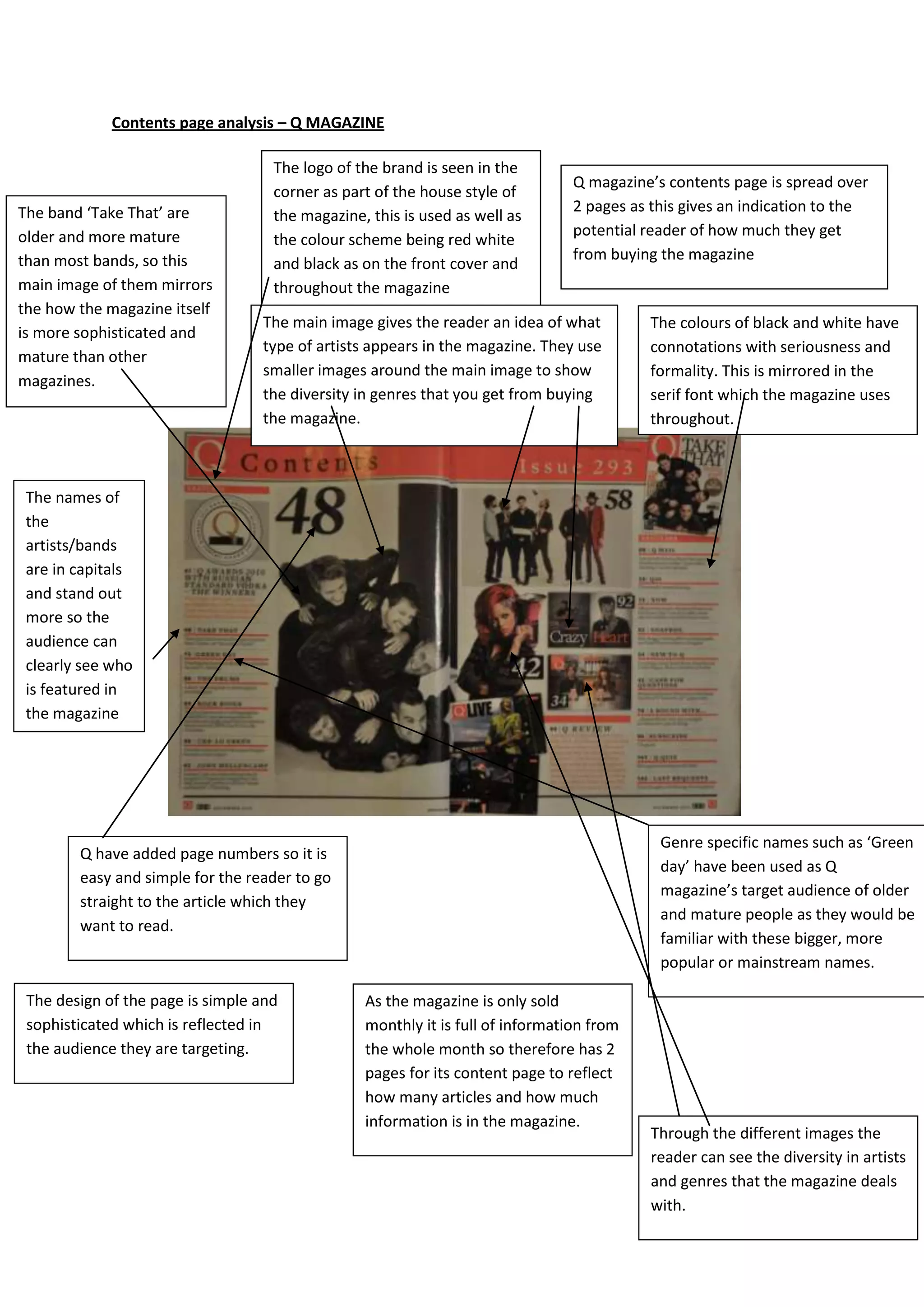
The document analyzes and compares the contents pages of two music magazines - Kerrang! and Q Magazine. Both magazines use their mastheads, continuous color schemes, and teasers to attract readers. However, Kerrang!'s contents page has a more cluttered layout while Q's is neatly structured. Kerrang! also uses a informal sans serif font compared to Q's more formal serif font. The main images on both pages reflect the magazines' genres by featuring popular bands, though Kerrang!'s image has a punk/rock style and Q's portrays its more sophisticated audience.