
Recommended
More Related Content
What's hot
What's hot (18)
Viewers also liked
Viewers also liked (16)
Similar to Nme evaluation
Similar to Nme evaluation (20)
Recently uploaded
Recently uploaded (20)
Nme evaluation
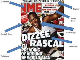
- 1. Masthead Skyline Cover Lines Main Image The Left Third Lead Article Pull Quote
- 2. NME Front Cover Analysis The general forms and conventions are similar to most magazines for example the mast head is at the top left so it can been seen easily on a magazine shelf in a shop and also to help it to be clear its is in bold font, uses capital letters and is in a strong red colour which contrasts with the white background to make it really stand out. The left third which is showing all the important information that NME want potential buyers to see such as the masthead, the pull quote and Dizzee Rascals face as he is the main feature of this issue, this is good that people can see the best and most important parts about the magazine before they even pick it up as on the magazine shelf only the left third will be showing so it is vital if they want to entice different and new buyers. Other general forms and conventions such as the skyline and cover lines suggest how packed this magazine is in a bid to entice new readers for example the skyline mentions how it is a autumn special and when the public see something's special they are more likely to buy it as it’s a one off, also the cover lines feature some big names in the music industry such as Muse and Kasabian which fans would definitely buy the magazine to read and as they have a lot of fans this would be quite a few people. The main Image on the front cover is a medium close up of Dizzee Rascal’s whole body as he is crouched down, his facial expression is a big laughing smile and his body positioning and what he is doing with his arms up in the airs which connotes that he is happy and all about having fun which is also what feeling you get from his up beat modern rap music, From this image you can gather that the article inside this magazine on Dizzee will be a fast paced up beat interview probably not about anything serious. The pull quote in the left third that reads ‘“I’M SPREADING JOY AROUND THE WORLD, MAN”’ denotes that he wants to spread joy which links up with the connotation from the main image as they are both saying and implying the same thing which is he is happy, having fun and wants to spread his joy around, this shows that NME have got Dizzee to do this pose for a reason and it is relevant to his article. The language used throughout the front cover of NME is modern but at the same time not really applying much slang so they keep it casual and young and modern and this connotes the same vibe and feeling you get from this images of graffiti in the background and the way Dizzee is posing, you would expect teenagers and young adults to be the majority of the readers of this type of magazine just from looking at the front cover.
- 3. The picture on the contents The Contents page has kept to page which is a mid shot of the house style using the red the performer Little Boots bold NME title. Also using the and what looks to be her tour bold writing which NME is known bus, this is there as it is for. relevant to the head article on the contents page which is called ‘TOURING SPECIAL’ and this was also listed as the skyline piece of information on the front cover. Also I think that the fact that this is the only image is a good thing as NME don’t want to give away to much so having one picture s enough and it is The index of the magazine is good to have a different main very clear and put into feature on the contents page different category's and they to the front cover so its not are clearly shown in white on boring and repetitive. black bold text which is a regularly used feature in NME. Most of the contents page is text and this is what it should be as you can find everything quicker which are the best As this is a touring special contents pages. They have also they have incorporated divided the index into explaining what's included different categories which are in the touring special with denoted in bold, black on the page numbers I like this white writing this connotes as its quite unique because that they are important and not many magazine do this they draw attention so the they usually just have block reader can navigate through lists as they are clearer, so it the index with more ease. would have been clearer to use if they have stuck lists but its more interesting this way.
- 4. The Stand first which Denotes Double Page Spread. Pages 1 and 2 ‘FROM TAGS TO RICHES’ and is in capital letters also it is in an informal This lead image of Dizzee font which is all rascal which denotes a mid wonky. The actual shot of him spray painting a content of the wall which is the first side of stand first connotes the double page spread and again to the fact looking behind his back that Dizzee Rascal whilst he is spraying the was at some point paint, this connotes that he getting into trouble was a law breaker and was i.e. the tag meaning maybe getting into trouble police tag or tag as quite a lot of the time hence in spraying paint why he is looking over his either way without shoulders. This I mage reading the article would appeal strongly to his it connotes he has target audience and people been naughty in who enjoy his music which the past but has is generally people who now become rich have the same background and successful. The to what he would have had style which is the before he found fame and stand first is wealth and in other cases written in gives an people would like this image informal casual as it represents what his look to the style of music is which is magazine which outspoken, rude and mirrors the front modern. page writing. Due These other images of beer bottles to the actual The drop cap at the and a stereo combine the image that content of the beginning of the article adds Dizzee likes to promote himself as stand first and the a bit of style and is a common which is a musical person which the bold writing of it occurrence in most NME stereo connotes and a fun person people would be magazines. having a good time which is drawn in to read connoted by the beer bottles. the whole article.
- 5. Double Page Spread. Page 3 The pull quote denotes how Dizzee rascal can’t walk down the street because of his celebrity status and is in a significantly larger and bolder font size than the rest of the article . The larger font size and bold font is there to make it stand out so when the reader scans across the page they see it and get drawn into reading the rest. The pull quote which ends in ‘”I’m a celebrity, aren’t I ?”’ this could connote that he is relating with the image he had before he was a music star living in London being a nobody and this shows he still feels a normal person.