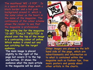
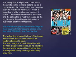
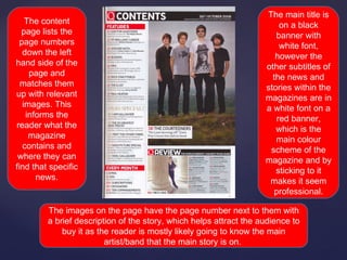
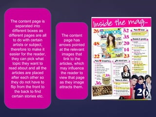
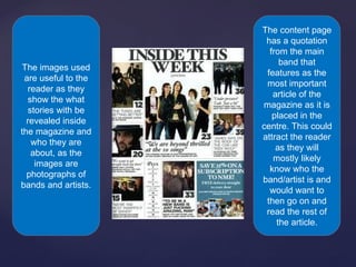
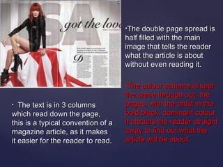
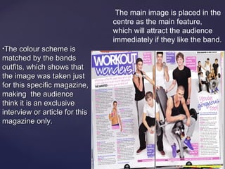
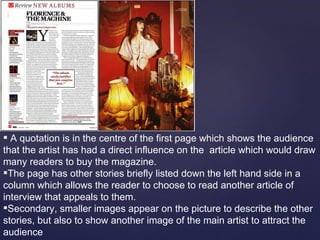
The document provides an analysis of music magazine front covers, contents pages, and article spreads, highlighting design elements such as mastheads, color schemes, and layout conventions that target different audiences. It emphasizes how visual aspects, like bold images and contrasting colors, are strategically used to attract readers and convey professionalism. The analysis also outlines typical conventions for magazine design, including the positioning of titles, article headings, and use of quotations to enhance reader engagement.