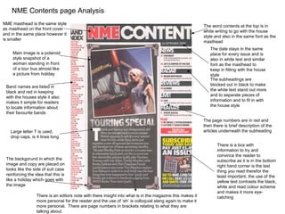
NME Contents page Analysis
NME masthead is the same style
                                                                                                           The word contents at the top is in
as masthead on the front cover
                                                                                                           white writing to go with the house
and in the same place however it
                                                                                                           style and also in the same font as the
is smaller
                                                                                                           masthead
                                                                                                              The date stays in the same
     Main image is a polaroid                                                                                 place for every issue and is
     style snapshot of a                                                                                      also in white text and similar
     woman standing in front                                                                                  font as the masthead to
     of a tour bus almost like                                                                                keep in fitting with the house
     a picture from holiday                                                                                   style
                                                                                                              The subheadings are
 Band names are listed in                                                                                     blocked out in black to make
 black and red in keeping                                                                                     the white text stand out more
 with the houses style it also                                                                                and to separate pieces of
 makes it simple for readers                                                                                  information and to fit in with
 to locate information about                                                                                  the house style
 their favourite bands
                                                                                                           The page numbers are in red and
                                                                                                           then there is brief description of the
   Large letter T is used,                                                                                 articles underneath the subheading
   drop caps, is 4 lines long
                                                                                                                  There is a box with
                                                                                                                  information to try and
                                                                                                                  convince the reader to
 The backgorund in which the                                                                                      subscribe as it is in the bottom
 image and copy are placed on                                                                                     right hand corner is the last
 looks like the side of suit case                                                                                 thing you read therefor the
 reinforcing the idea that this is                                                                                least important, the use of the
 like a holiday which goes with                                                                                   yellow text contrasts the black,
 the image                                                                                                        white and read colour scheme
                                                                                                                  and makes it more eye-
                  There is an editors note with there insight into what is in the magazine this makes it          catching
                  more personal for the reader and the use of ‘eh’ is colloquial slang again to make it
                  more personal. There are page numbers in brackets relating to what they are
                  talking about.
NME Contents Page Analysis


                             The contents page is effective and has all
                             the stock features of a normal contents
                             page. There is little white space and a fair
                             amount of text. The colour scheme keeps
                             in fitting with the house style of the
                             magazine and the use of the colours
                             black, white and red is effective. These
                             colours although basic are bold and fairly
                             gender although the magazine is mostly
                             aimed at men aged between 16-19.
NME Front Cover Analysis
                                                       The front cover is very busy and has next to no white space, it uses
                                                       a variety of text types but the main colors stay the same. It is
                                                       engaging and draws you in. It uses the rule of thirds and splits its
                                                       information up accordingly.

                                                                Mast Head
                                                                The masthead is in red text with a white space and then a black outline
                                                                and is in the top left hand corner, in the left third, making it the first thing
                                                                you read and clearly visible, also with the way magazines are stacked in
                                                                shops it makes it easier to see. The text is sans serif making it quite
                                                                simple and bold, the colours used are also generic, bold but simplistic.
                                                                The masthead is very eye-catching and naturally attracts the eye.


                                                               Main Image

                                                              The image of Dizzee Rascal covers most of the page however it is not
                                                              straight and looks like it almost been ‘thrown on the page’ however this is
                                                              effective as it almost represents the artist ‘Dizzee Rascal’. His direct eye
                                                              contact entices the reader and also shows his confidence also he looks
                                                              almost mad and happy and this is in keeping with the theme of the cover,
                                                              his shoes also match the colour scheme of the magazine and are quite
                                                              bold. His clothes are that of a stereotypical urban artist and they
                                                              represent the style of his music. Also the background of the image is
                                                              street art again to represent his music. His open arm show that he is
                                                              almost reaching out to everyone and reflect the pull quote. The main
 Cover Lines                                                  image overlaps the masthead to show its importance.

The pull quote ‘I’m spreading joy around the world, man!’ is almost evangelic which is in contrast to the style of music. The use of man is
colloquial, informal slang and adds more personality. All the cover line are in red, white or black text to in keep with the house style, white
has connotations with being fresh and new and this matches the purpose of the magazine. They are all also sans serif except ‘autumn
tour special’ the use of serif text shows its importance. The main cover line is not straight and this, like the main image, represents the
artist. The flash is red with white and black text the use of news is quite formal and shows that the magazine is serious about music,
however the ‘wowee zowee’ juxtaposes this and adds personality to the magazine.
NME Front Double Page Spread Analysis
                                                                               The caption in the top corner
                                                                               says Dizzee it is in small text
                                                                               to show its insugnificance
Mise en scene created by                                                       however it adds more
graffiti wall background                                                       personality about the artist o
this represents the style of                                                   the pages
his music and street art
often has connotations                                                            The byline gives credit
with urban artists.                                                               to the author and
                                                                                  photographer

                                                                              The main headline and sub-
                                                                              headline give information about
                                                                              the article and entice the reader
In the main image his                                                         to want to read on
clothes look expensive
showing his wealth. He is
spraying on the wall and                                                       There are 3 columns of
looking at somebody with                                                       roughly 75 – 100 words
confidence that he will not                                                    each and the copy wraps
get it trouble                                                                 around the image of the
                                                                               radio


                                                                           There is an image of empty beer
The page number,                                                           bottles and an old radio the
magazine title and date are                                                empty beer bottles represent his
in the bottom left hand                                                    life style and this idea of a ‘rock
third and are in small text                                                and roll lifestyle’ they show he
to show there                     The copy begins with a large drop caps   likes to party and have fun this
insignificance                    letter Y which is 6 lines long           theme is reflected throughout
Analysis of written article

The article itself is basically about the journalist
explaining Dizzee’s life over the last year and
setting the scene before the article and giving some
basic information and also about how Dizzee was
when they met his to conduct the interview this
gives the reader an almost personal perspective of
the artist.
The main headline is a play on words to represent
his style of music it is very large and in black text
and looks informal and eye catching. The letters
are placed differently and of different sizes to reflect
the theme of the magzine The articles itself is 4
columns of roughly 75 – 100 words each.
NME Background Research


•Target audience 16 – 19
•Mostly read by males
•The first edition was released on the 7th of March 1952
•NME first began as a newspaper to release the singles chart however in 1998 it
became a magazine
•In the 1980’s it was in serious danger of closing
•The editor is Mike Williams and it is published by ICP
•Sells around 30,000 issues a week

Nme analysis

  • 1.
    NME Contents pageAnalysis NME masthead is the same style The word contents at the top is in as masthead on the front cover white writing to go with the house and in the same place however it style and also in the same font as the is smaller masthead The date stays in the same Main image is a polaroid place for every issue and is style snapshot of a also in white text and similar woman standing in front font as the masthead to of a tour bus almost like keep in fitting with the house a picture from holiday style The subheadings are Band names are listed in blocked out in black to make black and red in keeping the white text stand out more with the houses style it also and to separate pieces of makes it simple for readers information and to fit in with to locate information about the house style their favourite bands The page numbers are in red and then there is brief description of the Large letter T is used, articles underneath the subheading drop caps, is 4 lines long There is a box with information to try and convince the reader to The backgorund in which the subscribe as it is in the bottom image and copy are placed on right hand corner is the last looks like the side of suit case thing you read therefor the reinforcing the idea that this is least important, the use of the like a holiday which goes with yellow text contrasts the black, the image white and read colour scheme and makes it more eye- There is an editors note with there insight into what is in the magazine this makes it catching more personal for the reader and the use of ‘eh’ is colloquial slang again to make it more personal. There are page numbers in brackets relating to what they are talking about.
  • 2.
    NME Contents PageAnalysis The contents page is effective and has all the stock features of a normal contents page. There is little white space and a fair amount of text. The colour scheme keeps in fitting with the house style of the magazine and the use of the colours black, white and red is effective. These colours although basic are bold and fairly gender although the magazine is mostly aimed at men aged between 16-19.
  • 3.
    NME Front CoverAnalysis The front cover is very busy and has next to no white space, it uses a variety of text types but the main colors stay the same. It is engaging and draws you in. It uses the rule of thirds and splits its information up accordingly. Mast Head The masthead is in red text with a white space and then a black outline and is in the top left hand corner, in the left third, making it the first thing you read and clearly visible, also with the way magazines are stacked in shops it makes it easier to see. The text is sans serif making it quite simple and bold, the colours used are also generic, bold but simplistic. The masthead is very eye-catching and naturally attracts the eye. Main Image The image of Dizzee Rascal covers most of the page however it is not straight and looks like it almost been ‘thrown on the page’ however this is effective as it almost represents the artist ‘Dizzee Rascal’. His direct eye contact entices the reader and also shows his confidence also he looks almost mad and happy and this is in keeping with the theme of the cover, his shoes also match the colour scheme of the magazine and are quite bold. His clothes are that of a stereotypical urban artist and they represent the style of his music. Also the background of the image is street art again to represent his music. His open arm show that he is almost reaching out to everyone and reflect the pull quote. The main Cover Lines image overlaps the masthead to show its importance. The pull quote ‘I’m spreading joy around the world, man!’ is almost evangelic which is in contrast to the style of music. The use of man is colloquial, informal slang and adds more personality. All the cover line are in red, white or black text to in keep with the house style, white has connotations with being fresh and new and this matches the purpose of the magazine. They are all also sans serif except ‘autumn tour special’ the use of serif text shows its importance. The main cover line is not straight and this, like the main image, represents the artist. The flash is red with white and black text the use of news is quite formal and shows that the magazine is serious about music, however the ‘wowee zowee’ juxtaposes this and adds personality to the magazine.
  • 4.
    NME Front DoublePage Spread Analysis The caption in the top corner says Dizzee it is in small text to show its insugnificance Mise en scene created by however it adds more graffiti wall background personality about the artist o this represents the style of the pages his music and street art often has connotations The byline gives credit with urban artists. to the author and photographer The main headline and sub- headline give information about the article and entice the reader In the main image his to want to read on clothes look expensive showing his wealth. He is spraying on the wall and There are 3 columns of looking at somebody with roughly 75 – 100 words confidence that he will not each and the copy wraps get it trouble around the image of the radio There is an image of empty beer The page number, bottles and an old radio the magazine title and date are empty beer bottles represent his in the bottom left hand life style and this idea of a ‘rock third and are in small text and roll lifestyle’ they show he to show there The copy begins with a large drop caps likes to party and have fun this insignificance letter Y which is 6 lines long theme is reflected throughout
  • 5.
    Analysis of writtenarticle The article itself is basically about the journalist explaining Dizzee’s life over the last year and setting the scene before the article and giving some basic information and also about how Dizzee was when they met his to conduct the interview this gives the reader an almost personal perspective of the artist. The main headline is a play on words to represent his style of music it is very large and in black text and looks informal and eye catching. The letters are placed differently and of different sizes to reflect the theme of the magzine The articles itself is 4 columns of roughly 75 – 100 words each.
  • 6.
    NME Background Research •Targetaudience 16 – 19 •Mostly read by males •The first edition was released on the 7th of March 1952 •NME first began as a newspaper to release the singles chart however in 1998 it became a magazine •In the 1980’s it was in serious danger of closing •The editor is Mike Williams and it is published by ICP •Sells around 30,000 issues a week