1. Contents Page Analysis
Key layout conventions of contents pages are visible
here including the categorised pages, the logo of
The main article has enlarged text and page
the magazine, the contents page title (in this case,
number. This is to make it more eye catching
‘the A-side’), the date the magazine was released
to the reader. After each sub heading for
and the small print at the bottom (including the
each article, there is a description or small
website for the magazine). There is also a line to
introduction to the article.
separate the different categories of the articles.
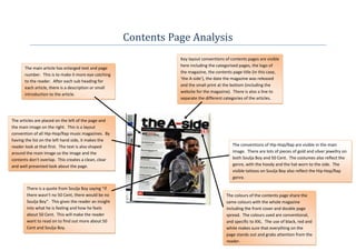
The articles are placed on the left of the page and
the main image on the right. This is a layout
convention of all Hip-Hop/Rap music magazines. By
having the list on the left hand side, it makes the
reader look at that first. The text is also shaped The conventions of Hip-Hop/Rap are visible in the main
around the main image so the image and the image. There are lots of pieces of gold and silver jewellry on
contents don’t overlap. This creates a clean, clear both Soulja Boy and 50 Cent. The costumes also reflect the
and well presented look about the page. genre, with the hoody and the hat worn to the side. The
visible tattoos on Soulja Boy also reflect the Hip-Hop/Rap
genre.
There is a quote from Soulja Boy saying “if
there wasn’t no 50 Cent, there would be no The colours of the contents page share the
Soulja Boy”. This gives the reader an insight same colours with the whole magazine
into what he is feeling and how he feels including the front cover and double page
about 50 Cent. This will make the reader spread. The colours used are conventional,
want to read on to find out more about 50 and specific to XXL. The use of black, red and
Cent and Soulja Boy. white makes sure that everything on the
page stands out and grabs attention from the
reader.
2. Featured and returning articles are at the top of the
contents. The top is the first thing readers will see The name of the page, Contents, is in a big
so they will gain an understanding of what the display font which makes it stand out to
magazine usually writes about. This creates a brand the reader. The white text against a red There are key layout conventions used including the name of
identity for the magazine. background also makes sure that the the magazine, when the issue was published, the title of the
reader pays attention to it and knows page (Contents), categorised articles and small print at the
There is a ‘V’ in the background that is exactly what the page is. bottom (including the website of the magazine).
very large and is a darker red than the
background itself. The ‘V’ is the first
letter of ‘VIBE’. This creates brand
identity and will grab attention from the The colours of the contents page share the
reader to make sure that they are reading same colours with the whole magazine
‘VIBE’. including the front cover and double page
spread. The colours used are conventional,
and specific to Vibe. The use of red and
The category names for each type of article
white makes sure that everything on the
are in san-serif font. This is unconventional
page stands out and grabs attention from the
of Hip-Hop/Rap magazines because display
reader.
font is normally used. This will draw
attention from the reader so the categories
will be easily seen and read. The article The rapper featured on this page is very
names and descriptions are in display font conventional. He has a lot of tattoos,
however. gold and silver jewellery (chains, rings
and bracelets) and a hat that is worn
backwards. By looking at this image, the
reader can easily identify the genre that
this magazine represents the Hip-
Hop/Rap genre.
The articles are placed in the left hand side of the page. There is not a line separating the different
categories of articles, but the artist’s arm is there instead. This is unconventional and will interest the
reader and will make them more attracted to the different articles. The artist is in the centre of the page
so they stand out and dominate the page.