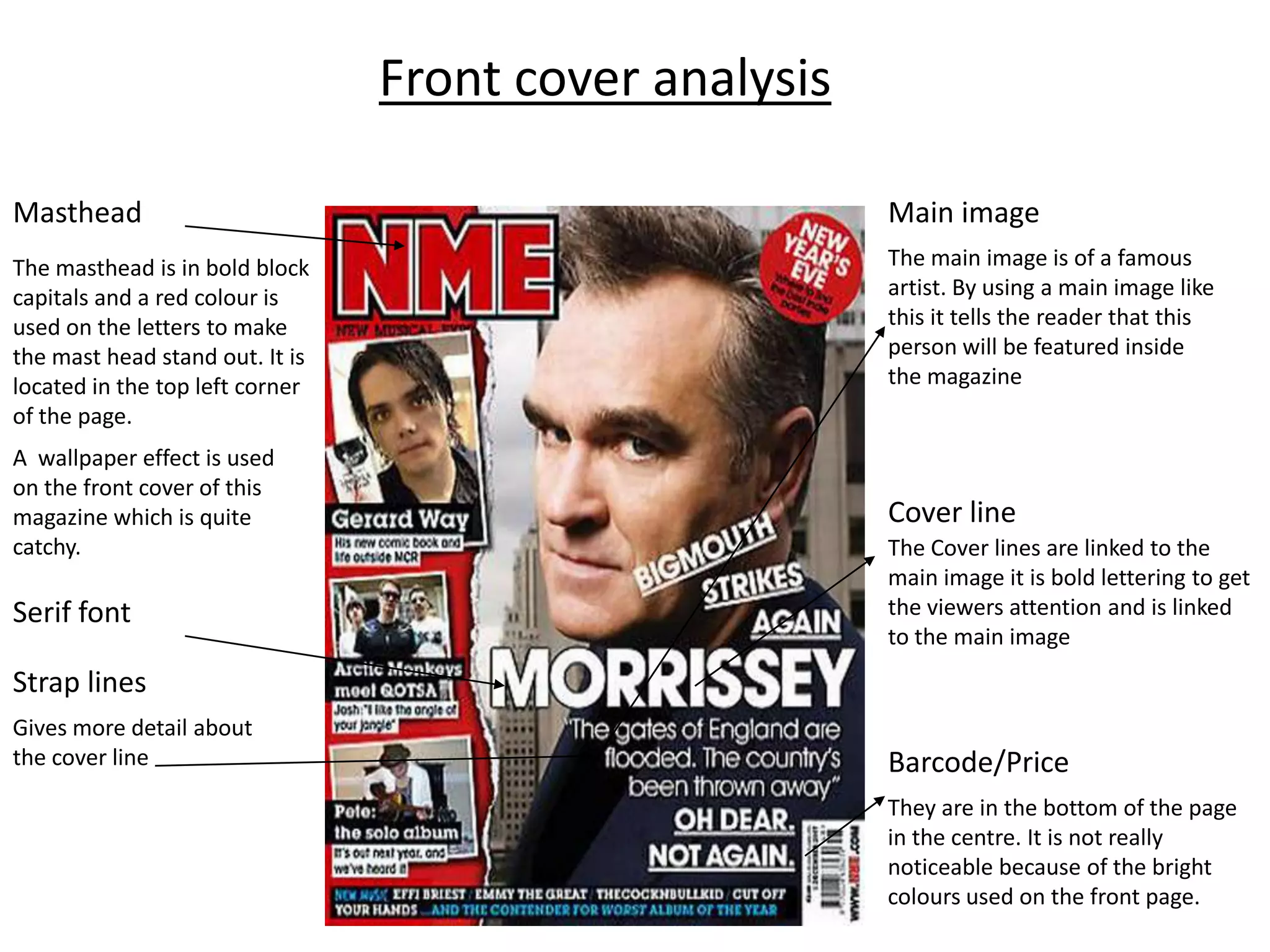
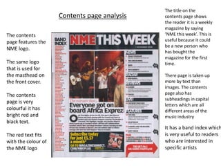
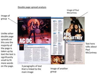
Gen AI in Business - Global Trends Report 2024.pdf
Front cover analysis of magazine design elements
1. Front cover analysis
Masthead Main image
The masthead is in bold block The main image is of a famous
capitals and a red colour is artist. By using a main image like
used on the letters to make this it tells the reader that this
the mast head stand out. It is person will be featured inside
located in the top left corner the magazine
of the page.
A wallpaper effect is used
on the front cover of this
magazine which is quite Cover line
catchy. The Cover lines are linked to the
main image it is bold lettering to get
Serif font the viewers attention and is linked
to the main image
Strap lines
Gives more detail about
the cover line Barcode/Price
They are in the bottom of the page
in the centre. It is not really
noticeable because of the bright
colours used on the front page.
2. The title on the
Contents page analysis contents page shows
the reader it is a weekly
magazine by saying
The contents ‘NME this week’. This is
page features the useful because it could
be a new person who
NME logo.
has bought the
magazine for the first
The same logo time.
that is used for
the masthead on There page is taken up
the front cover. more by text than
images. The contents
The contents page also has
subheadings in capital
page is very
letters which are all
colourful it has different areas of the
bright red and music industry
black text.
It has a band index which
The red text fits is very useful to readers
with the colour of who are interested in
the NME logo specific artists
3. Double page spread analysis
Image of Paul
McCartney
Image of
group
Unlike other
double page
spreads on
this one the
Text here
majority of
talks about
the page is
Paul
taken up by
McCartney
text the text is
significantly
small to fit
more words
on the page. 3 paragraphs of text
that is linked to the Image of another
main image group