Downloaded 412 times
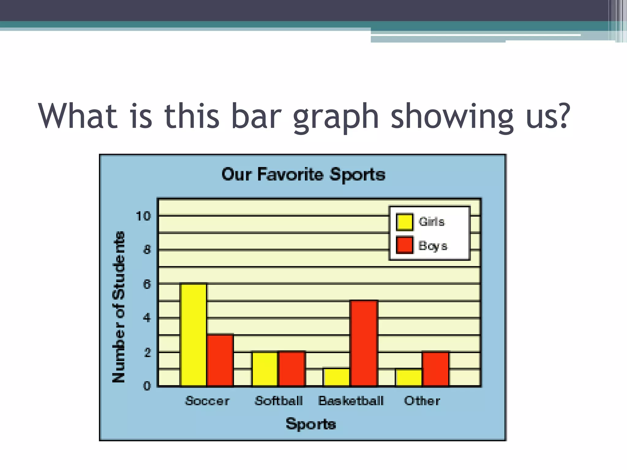
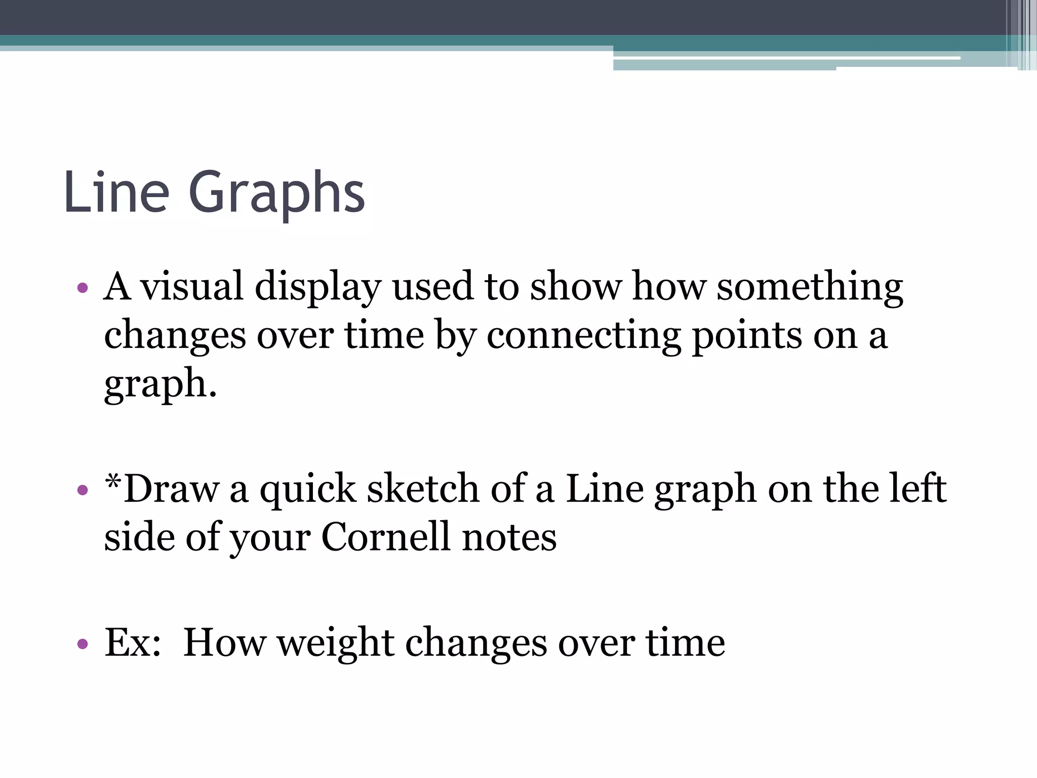
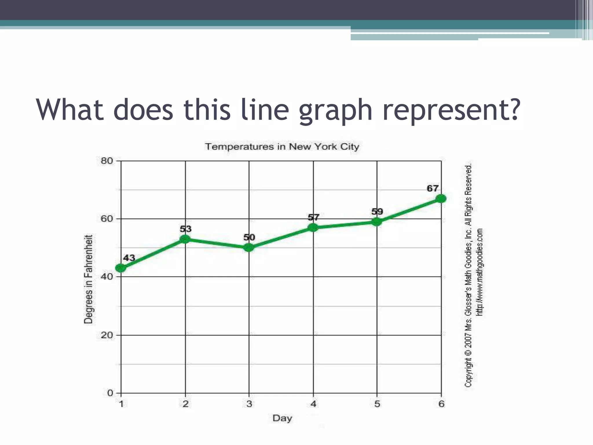
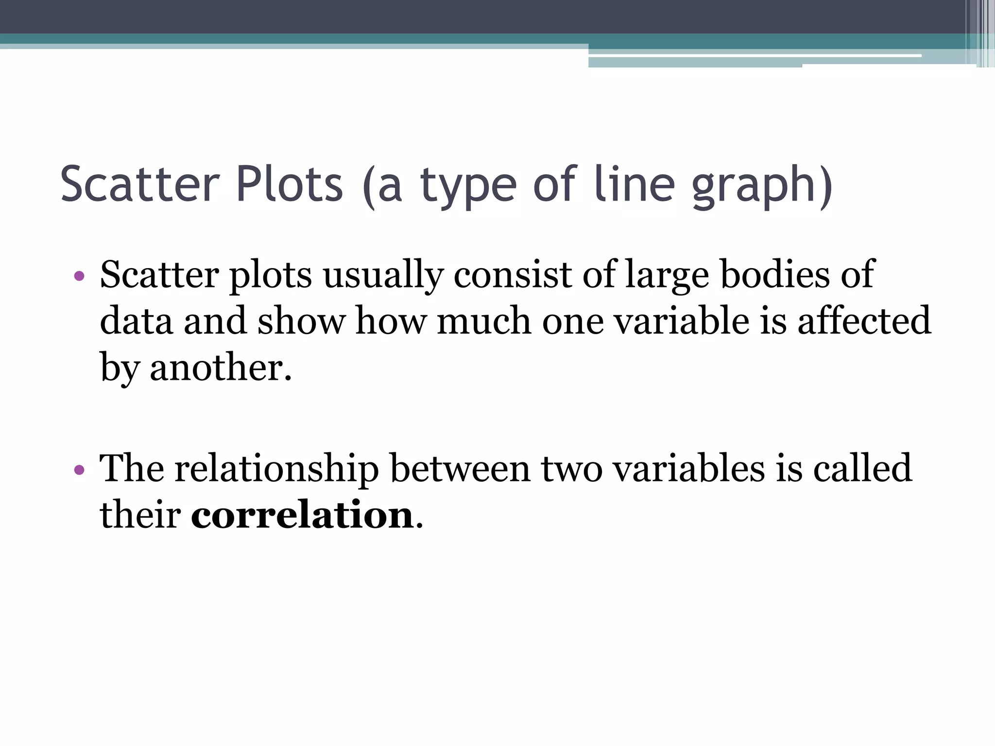
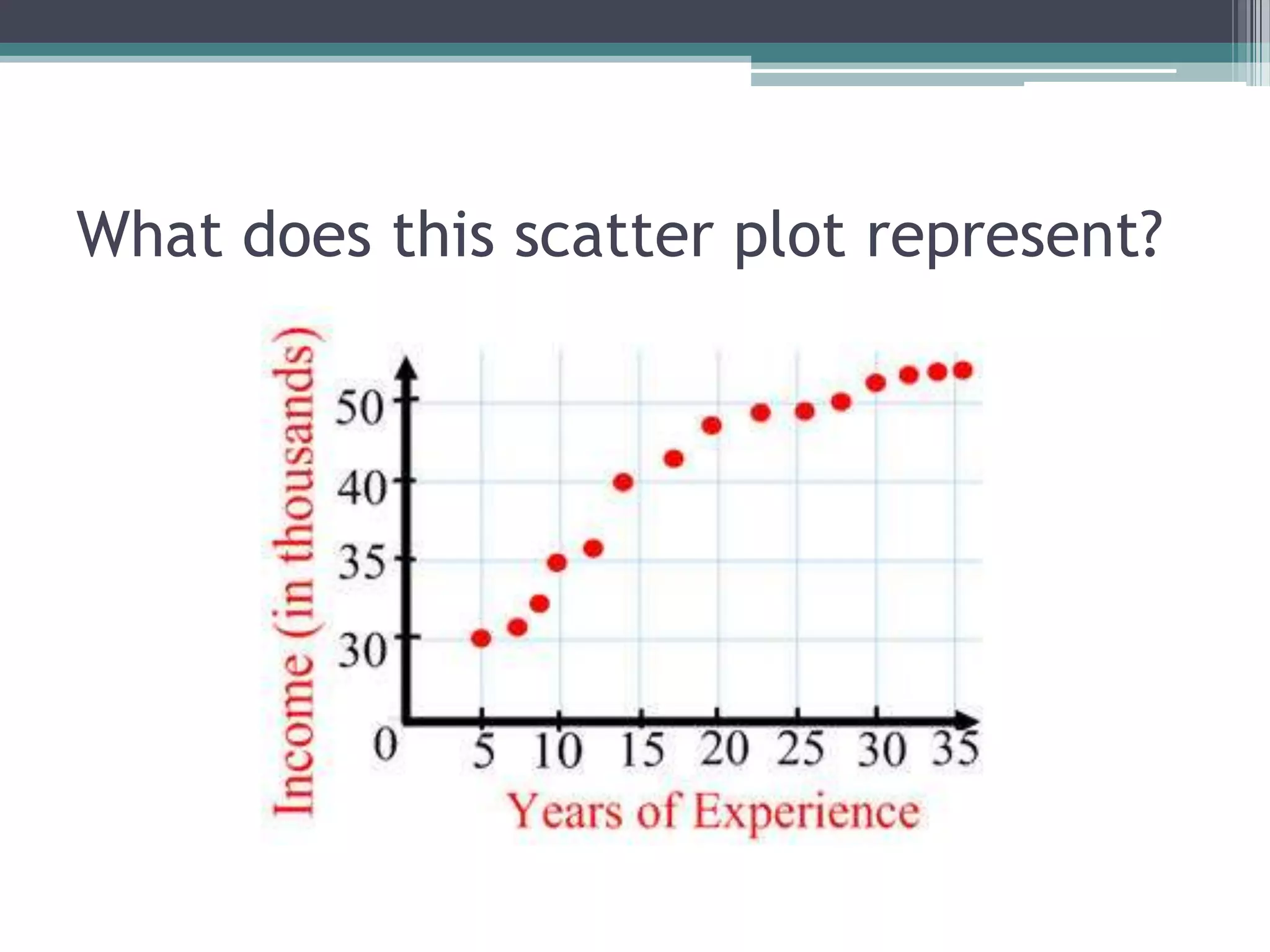
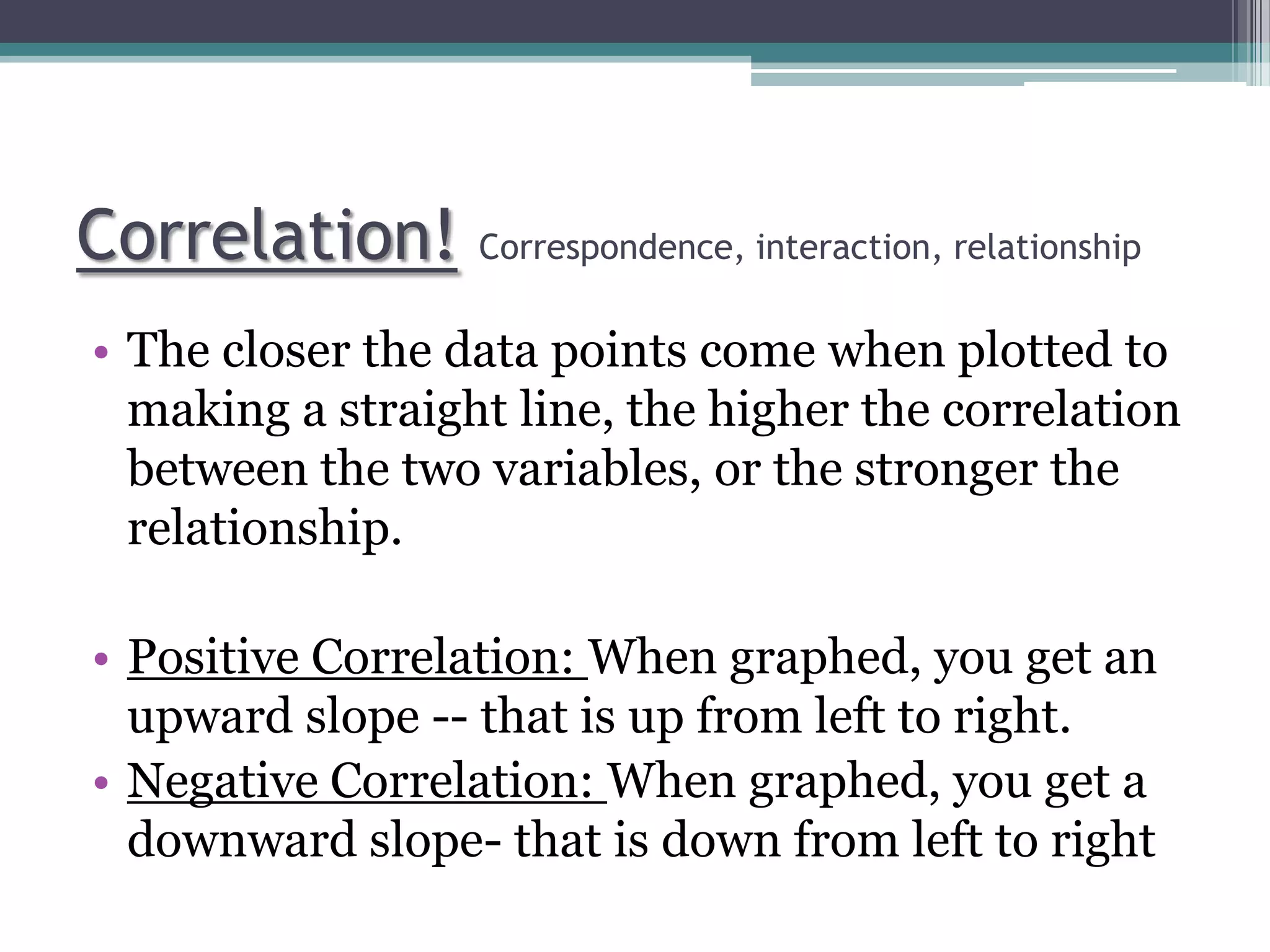
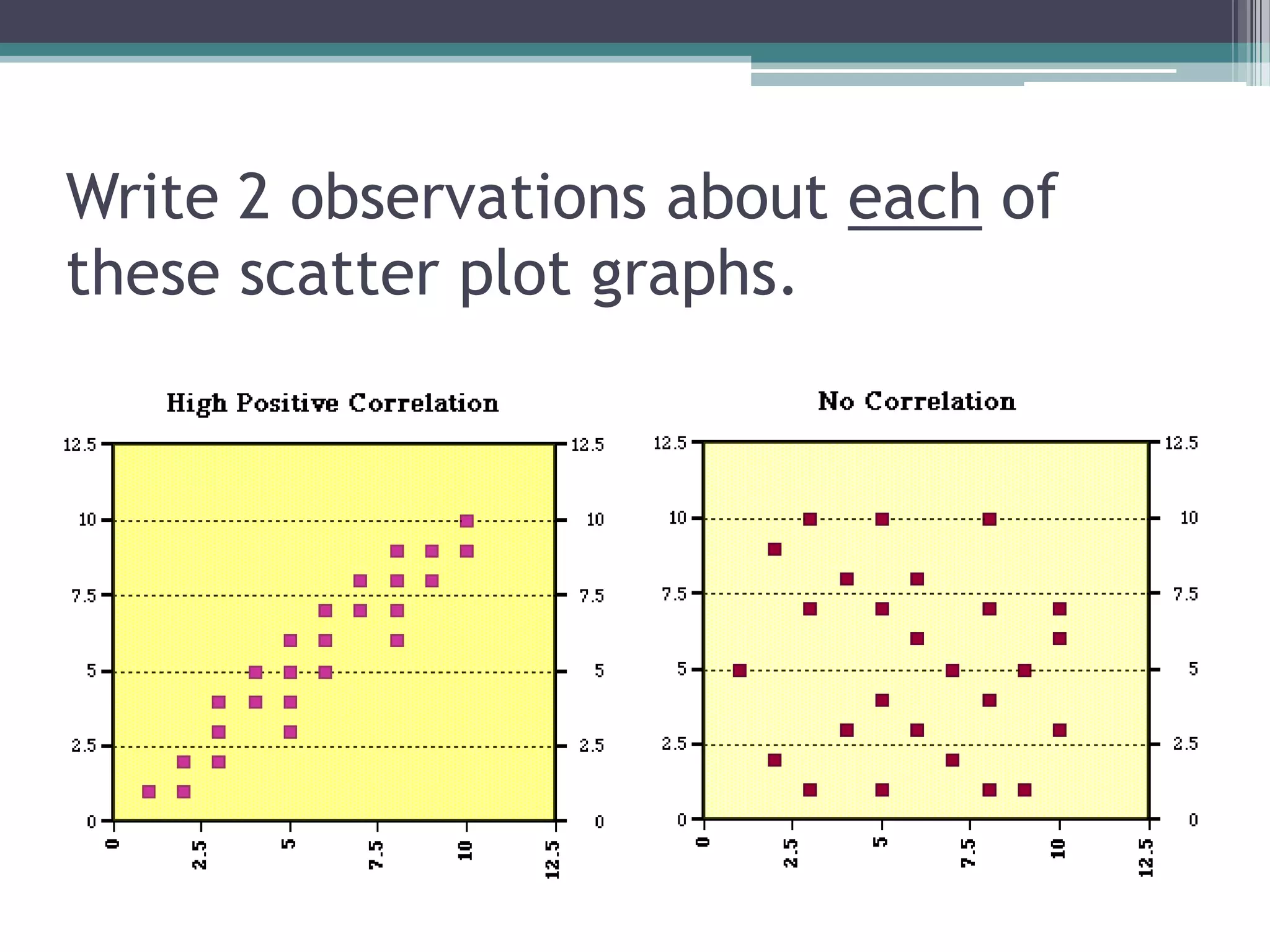
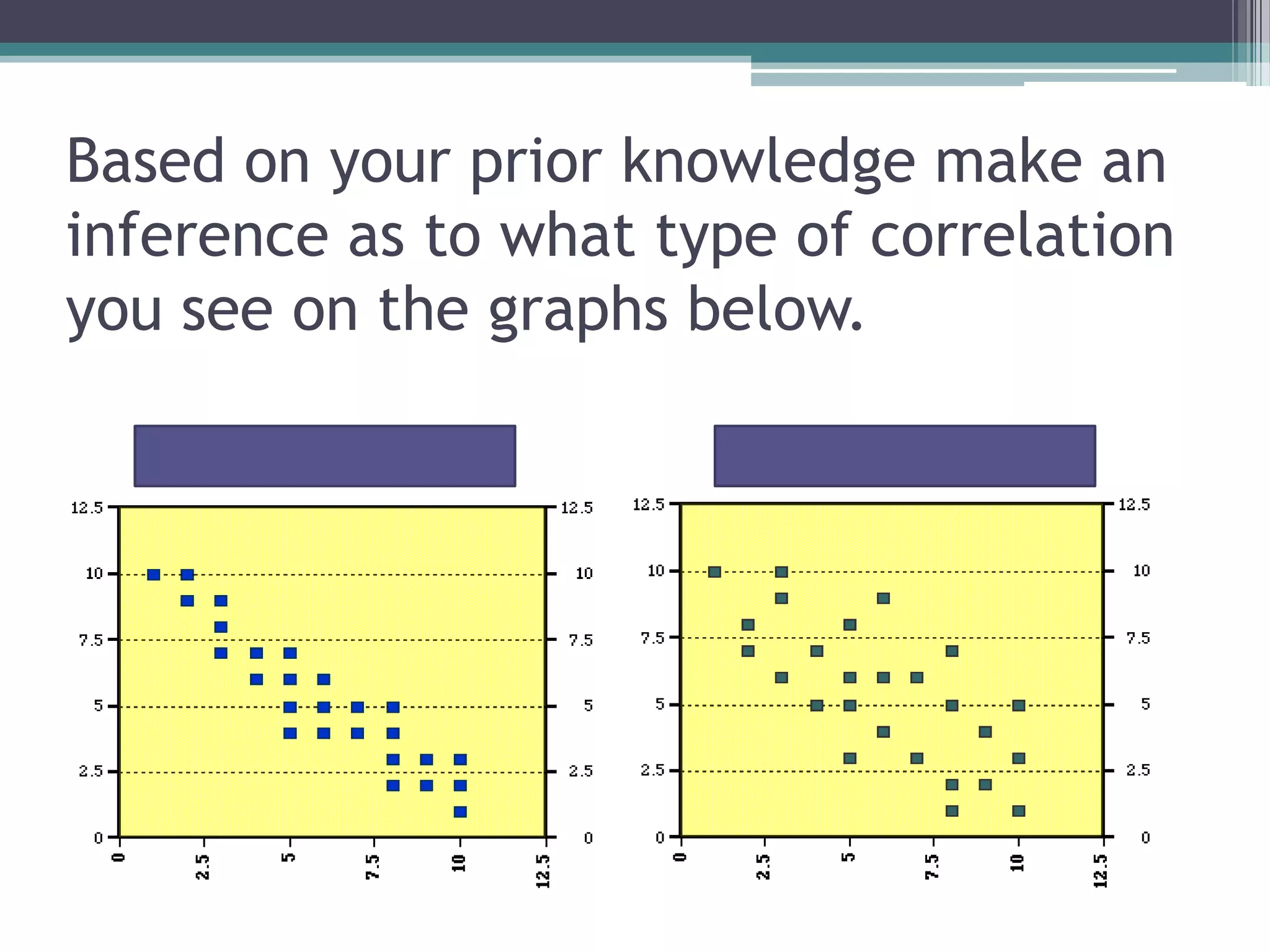
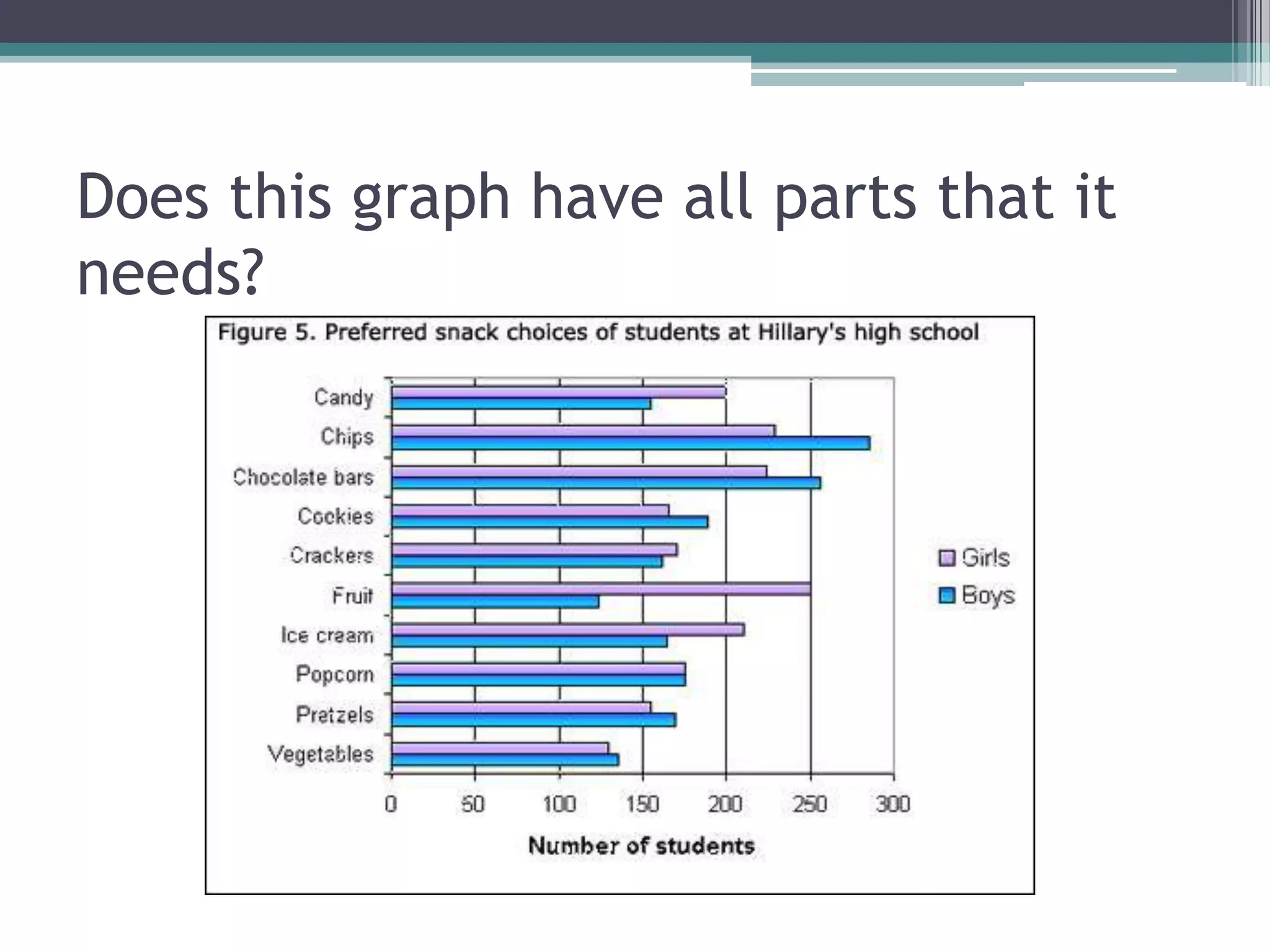
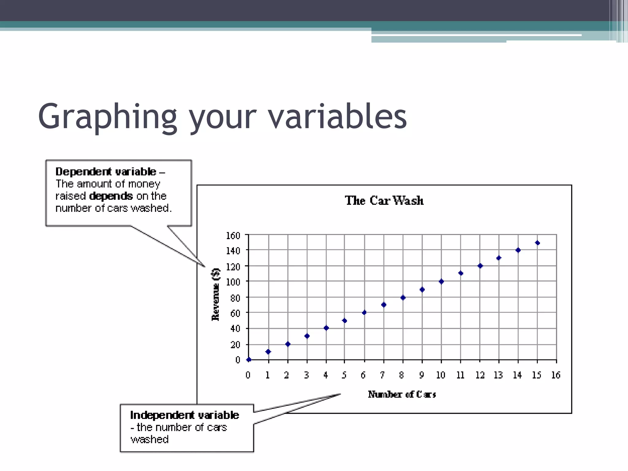
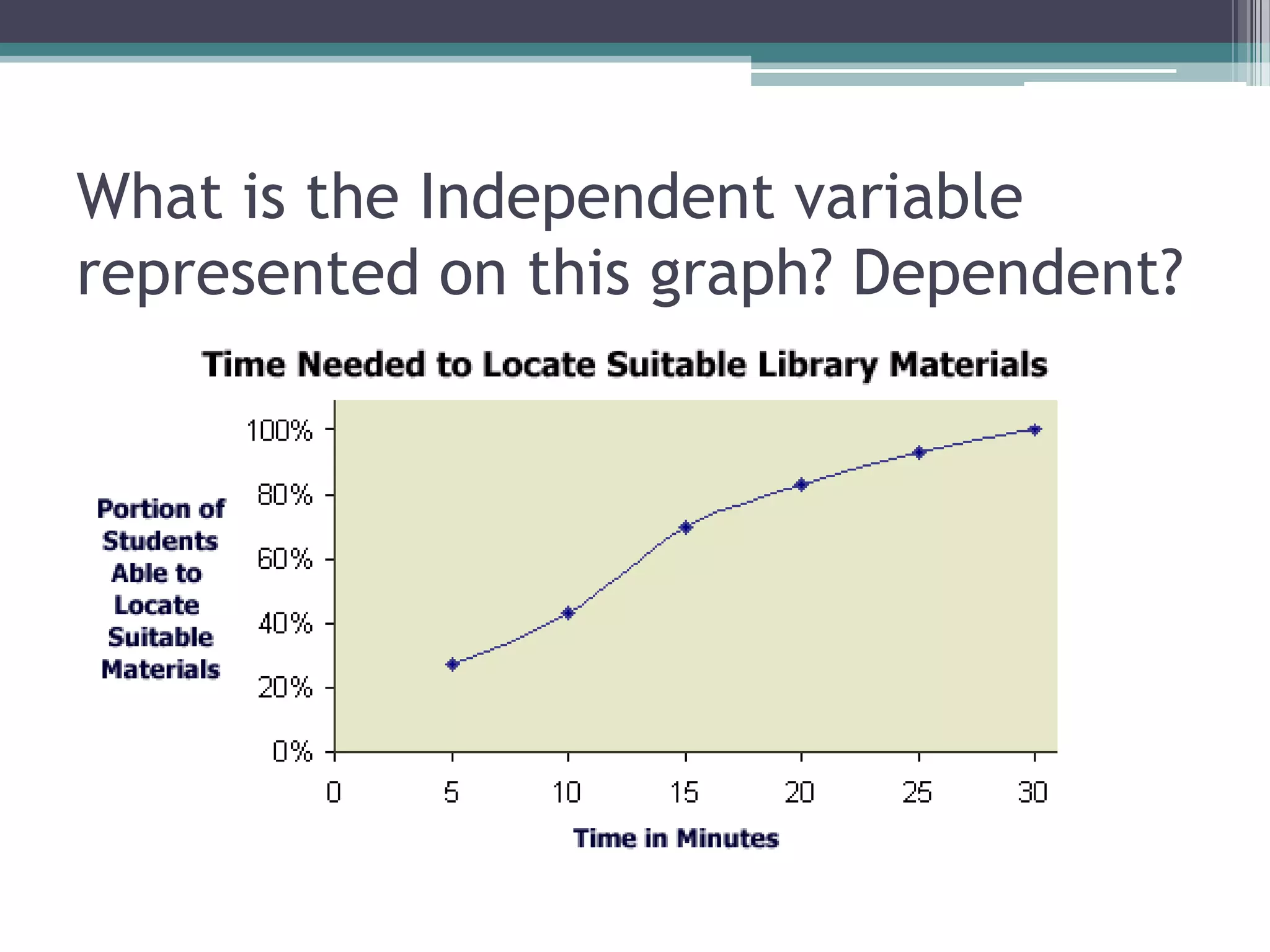

This document provides instruction on different types of graphs (bar graphs, line graphs, scatter plots) and how to analyze correlations in data represented in graphs. It discusses key features of graphs like titles, labeled axes starting at zero, and using 75% of the axes. Students are prompted to identify independent and dependent variables, observe characteristics of sample scatter plots, and evaluate if a sample graph includes all necessary components. The goal is for students to understand how to choose the best graph type to represent their data and interpret correlations.