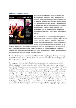
1. Contents Page Analysis
This contents page from the December 2009 issue of
Mixmag follows general and layout conventions of a
standard contents page through various elements such
as the mode of address, the mixture of text and images,
use of repetitive layout, and the way it reflects the style
of the magazine that would go towards in attracting its
target audience. For this contents page, the issue
number and date are listed next to the contents title,
with the music magazine’s logo in white, positioned on
the left.
The list of contents has been placed on the right hand
side, looking quite spacious and organized. It has a list of
various ‘features’ and above it there is a ‘VIP’ section
(linking directly to the VIP section of a club) which has a
special article listed. Below the main image and list of
contents, the audience can see a horizontal column which has information about the cover mount, a
free CD, therefore it has track listings.The puff for the free CD down on the bottom hand of the
contents page grabs the reader’s attention as it isn’t in the main column and also the reader would
like to know more about the free gift they have received.
The title, ‘Contents’, can be seen to be in a different font to everything else. The large main image
on the left will link to the cover feature. As for each feature mentioned on the contents page, the
first bit of sentence is in bold.
The background is a stylish shade of black which makes the colourful images stand out which is
effective as it grabs the reader’s attention. It only consists of one column and the page numbers
down the side of the column are in yellow so that it stands out next to the subheadings, which are in
white. The black and white colour scheme is very much essential as it reflects the target audience’s
hobbies and the genre it promotes. It reminds the audience of the night time, which is when they
would go out to a club or a rave and listen to dance music. The colours are also very basic colours
and so it emphasises Mixmag’s simplistic layout whilst also reflecting the serious side of the target
audience and that it is not aimed at a young audience. The fact the background is black and the text
is white also suggests that Mixmag isn’t afraid to break boundaries and twist conventions as usually
the background of the contents page is white and the text is black, whilst the black also sets a
masculine tone to the contents page, with the music magazine further engaging its target audience.
2. For this contents page, the issue number and date are
listed next to the contents title to the right, however
there seems to be no visible appearance of the specific
music magazine’s logo anywhere on the contents page.
The layout also follows Mixmag’s own conventions; it has
a main image on the left hand side and a column on the
right hand side going down, with a horizontal column
going across the bottom. It maintains brand identity as it
has the same layout every issue, and the main image also
shows a girl in the midst of a rave environment – this is a
common image to have being featured on the contents
page. It follows the front cover in its sophisticated yet
simple layout; the reader knows where to look to find
what they want. It is spacious looking, and easy and clear
to read, even though the font is little. As there aren’t
many images featured the layout doesn’t look very tacky
or complex, and so in ways it the layout helps to maintain
Mixmag’s brand identity and theme.
Her blonde hair has been caught flying around in mid-air and looks slightly rough and wild, and it is
clear to the audience it is not a model posing as the image feels as if it was shot randomly and in the
moment, making the reader feel as if they too are in a raving atmosphere. The girl who is seen to be
dancing also looks really caught up in the moment, and this makes the magazine feel much more
edgy and urban. Although the girl is in provocative clothing, she isn’t presented in a sexual manner,
which is unlike Mixmag as they tend to present women in a more seductive manner. The male
reader may still find her attractive, however, she isn’t simply there to be something the male
audience can look at and be taken hold of. She is only there to make the magazine feel more fun and
to remind the reader of raves and clubs they have been to and why they love dance music so much.
The main image of the contents page will draw in the reader as, they create a sense of eagerness
and unknown, like the sell-lines depicted on a front cover, and the reader will want to know the
story behind the image to help gather up an idea of what is happening. This may also remind the
reader of their favourite artists and memories on nights out.
The title can be seen to be in a different font to everything else. The large main image on the left will
link to the cover feature. As for each feature mentioned on the contents page, the first bit of
sentence is in bold.
The background is a stylish shade of white which makes the colourful images stand out which is
effective as it grabs the reader’s attention. It only consists of one column and the page numbers
down the side of the column are in black so that it stands out next to the subheadings, which are in
white. However, the contents page is nowhere near as colourful as the front cover usually is and
looks much more basic and dull compared to it. It features mostly white, black and yellow as a colour
scheme and it doesn’t seem very vibrant. However, the colour scheme reflects the male readership
and makes the magazine seem much more serious than it would with a bright colour scheme for the
contents page. Although it looks slightly bland, it also helps to make the contents page look more
3. spacious therefore the information is easier to digest for the reader. As stated before, these colours
reflect the serious side to the reader’s love of dance music, showing that although they like to go out
and have fun they are passionate about dance music and take this passion seriously.
The puff for the free CD down on the bottom hand of the contents page grabs the reader’s attention
as it isn’t in the main column and also the reader would like to know more about the free gift they
have received.