
Recommended
More Related Content
What's hot
What's hot (20)
Viewers also liked
Similar to Mojo magazine analysis
Similar to Mojo magazine analysis (20)
Recently uploaded
Recently uploaded (20)
Mojo magazine analysis
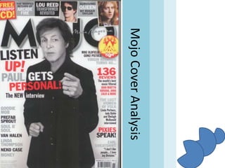
- 2. The title of the ‘MOJO’ magazine is slightly obscured, displaying a sense of recognition, as people know the title even when obscured. This also allows for the model to be unobscured and retain his goal as focal point of the cover. We are also shown the model to be looking at the camera directly, as well as pointing, so as to show that he is engaging directly with the reader and so presents a feeling of selfdirection with the title/heading or pull quotes. The skyline features a grey banner, fitting in with the colour palette used across the page, and harbours several images of artists accompanied by intriguing quotes with stressed or important words highlighted in the opposite colour to the background, with normal parts of the text a soft grey; this draws our attention to the important areas of text. In the top left corner, we are shown a red square, displaying yellow text (a complimentary colour) telling of a free CD, ensuring to highlight the words ‘free’ and ‘CD’ to quickly convey the message. It is also important to notice that it is placed in that region of the magazine so that when stacked on shelves, it is completely visible to attract customers.
- 3. The main heading is coloured so that the text is always visible against the colour it rests in front of so that the reader can receive the message with ease, as well as the colours contrasting the normal greys and blacks of the rest of the magazine for more eye-catching ability. The heading is also worded in a way that is directed directly at the reader, “Listen up!”. The instruction used makes the reader intrigued as to what they have to listen to and engages them directly, as well as the model pointing at the reader with one hand, while the other is clenched, showing a strong opinion or emotion. The heading also uses the word “new” in full capitals and larger text, conveying a feeling of freshness and something of interest. Artist’s names are mentioned along the side to spark some kind of recognition in the reader or potential customer, so that they know who is included in the magazine, and to attract those interested in the people mentioned.
- 4. Phrases such as “This month’s best” attract and pull the audience in, and makes them question why it is ‘the best’, leading some to seek the answer. Unlike the metal magazines, the housestyle of this magazine possesses calmness and formality, using soft colours and shapes opposed to scratched text with red and black, dirty colours. This magazine comes across as ‘cleaner’ compared to the metal magazines I analysed. The same red accent colour is used to highlight the number ‘136’ to show that the magazine contains a lot of information. The pull quote a the bottom arises interest, much like the other quotes used, and gives no details content, leaving us with a need to know the full story.
- 6. The same ‘accent colour’ of red is used where headings are present to clearly separate sections, as the vibrant colour easily splits apart the areas of grey and black. The red colour is also used to attract our attention to the page references and numbers, and allow for easy visibility and assistance in locating articles. This page (the left) is fairly basic, and has carried across the minimalistic, clean, plain house style from the contents page. Only one column is featured on this page, though it is of an exclusive section for the bigger features, as well as the cover story. The model to the right is wearing clothes of an older era, and displaying a hairstyle that could be considered outdated, presenting us with some mystery, being enhanced with the fact that we can’t see his eyes through the black glasses, making it impossible to tell if he is looking at us. He also has no expression on his face, and no objects around the room, leaving him completely focal on this page. He also possesses a pose that isn’t quite explained, as there is no obvious indication as to if he has a story, who he is or why he’s dressed in this way. The quote at the bottom of the page could be associated, but we do not know for sure. So far the genre appears to be pop and early 90s possibly 80s styled music, though it doesn’t display the genre as obviously as the metal magazines did.
- 7. The 2nd part of the contents section carries across the same house style, colour palette and image style, displaying many images of performances and photographs of slighly older styled artists and styles of photography and fashion. We are also not made aware of any definite columns, something of which was obvious in the metal magazines, though this page only has one column of text and so wouldn’t need to hold much of an exact position, as the images fill most of the page opposed to text. The images also feature page numbers to allow for easier navigation, though they are not red like the normal page references, as they are placed and coloured in the corners as white so as not to disrupt the photographs too much.
- 8. Mojo Double Page Spread Analysis
- 9. The whole page consists of black and white colours, including the photograph of the man, the text, and the title. However, as usual, this theme has sparks of colour, usually the red colours highlighting areas of importance, but this time it is the photographs that accompany each artist and their song. The pages both consist of 4 columns each (8 total), and fill these with the songs numbered 1-15, each with their related summaries below the images representing them. The images are also equally spaced apart from the ones below, creating an almost grid-like formation on the page, allowing for a neat layout that the magazine so strives to create. The image at the top is relevant to the page, as the freebie with the magazine was a compilation of Paul McCartney inspired pop songs, listed promptly below. The images is black and white, like the cover image, to capture the essence of the time it was inspired by, and to uphold the colour theme used throughout. The photograph features Paul staring at the camera, though his mouth is absent and leaves us not knowing his thoughts, feelings and emotions, though he is making contact with us, the reader, which instils a feeling of inclusion with the music and magazine, possibly convincing the reader that by owning the CD, they own something directly from McCartney, or just showing us that he is the main inspiration for the product, making fans of his desire the magazine, as well as the content on this page.
- 10. The CD case is shown in the expected black and white colours to remind us of the appearance of it, and reminding us of the actual product being in our possession, and how ‘generous’ the magazine is, as well as tempting us further into using the CD. In the bottom right corner, we are shown a tear in the page, as if the offer presented is so amazing that it literally tore through the content on this page to show it’s message, as well as adding some ‘movement’ to the fairly dull and orderly page. The writing of the offer in the corner is of a darker, larger text to boom out and make itself seen more than the other text on the page, as well as changing colour for anything to do with Paul to emphasise the focus on him and his music, heavily appealing to fans of his. The use of direct contacting words such as “your listening pleasure” gives the feeling that it was specifically designed for the reader, making them feel special and more inclined to follow the link mentioned. Furthermore, the fact that there has been music ready and compiled means that we won’t have to do anything but listen, which appeals to us as it is very convenient and allows us to be lazy and relaxed, something that many people enjoy. We are also told of how it is a “pleasure”, ensuring we know that it is worth the time, and promising enjoyment.