Hybridoma Technology ( Production , Purification , and Application )
Music magazine front cover analysis
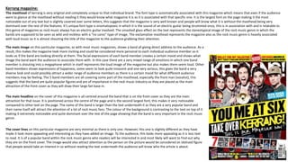
1. Kerrang magazine:
The masthead of kerrang is very original and completely unique to that individual brand. The font type is automatically associated with this magazine which means that even if the audience
were to glance at the masthead without reading it they would know what magazine it is as it is associated with that specific one. It is the largest font on the page making it the most
noticeable out of any text but is slightly covered over some letters, this suggests that the magazine is very well known and people will know what it is without the masthead being very
dominant over the rest of the features. It’s unique font type is onomatopoeic in which it is the sound of an electric guitar being strummed once, this is in association with and is relatable to
this genre of magazine as rock music always has an electric guitar involved. The smashed glass effect on the text represents the stereotypical image of the rock music genre in which the
bands are supposed to be seen as wild and reckless with a “no cares” type of image. The exclamative masthead represents the magazine also as the rock music genre is heavily associated
with loud music so it is almost shouting the title of the magazine to the audience grabbing their attention.
The main image on this particular magazine, as with most music magazines, shows a band all giving direct address to the audience. As a
result, this makes the magazine look more inviting and could be considered more personal to each individual audience member as it
looks as if the band are looking directly at them. The facial expressions of each band member creates a certain mood and shows what
image the band want the audience to associate them with. In this case there are a very mixed range of emotions in which one band
member is shouting into a megaphone which in itself represents the loud image of the magazine but also makes them seem loud. Other
band members shows expressions of happiness, some seem to look quite innocent and one very serious, this gives the band a very
diverse look and could possibly attract a wider range of audience members as there is a certain mood for what different audience
members may be feeling. The 5 band members are all covering some part of the masthead, especially the front man (vocalist), this
suggests that the band are quite popular figures and are of importance in the rock music industry so they are placed as the main
attraction of the front cover as they will draw their large fan base in.
The main headline on the cover of this magazine is all centred around the band that is on the front cover as they are the main
attraction for that issue. It is positioned across the centre of the page and is the second largest font, this makes it very noticeable
compared to other text on the page. The name of the band is larger than the text underneath it as they are a very popular band and
their name itself will attract the attention of a lot of rock music fans. The colour of the background is contrasting to the text on top of it
making it extremely noticeable and quite dominant over the rest of the page showing that the band is very important in the rock music
genre.
The cover lines on this particular magazine are very minimal as there is only one. However, this one is slightly different as they have
made it look more appealing and interesting as they have added an image. To the audience, this looks more appealing as it is less text
to read. It is of a popular band within the rock music genre who readers will be interested in and most likely will want to find out why
they are on the front cover. The image would also attract attention as the person on the picture would be considered an idolised figure
that people would take an interest in so without reading the text underneath the audience will know who the article is about.
2. Kerrang magazine:
The positioning statement on this individual magazine is placed at the very top of the magazine and is extremely easily noticeable due to its yellow background. It
spreads across the entire top and is split into two sections, one offering the audience something they would most likely be interested in and the other of a very
popular and well known band within the rock music industry. This creates an incentive to buy the magazine as the audience are promised something extra inside
that is of interest to them. The yellow background of the positioning statement makes most text colours that are on top of it very noticeable as it is a contrasting
colour to most other colours, this is shown with the vibrant red of the two well known bands names attracting attention in their own way, then the black stands
out well on the background making it very easy to see for the audience. This one also has another image on it which makes the audience believe that it is much
less boring due to it requiring less effort to read.
The skyline of this kerrang magazine is slightly less noticeable as it is in a darker colour and at the bottom of the
page. It again has different images on it in order for the reader to believe it is less boring and offers a more
appealing look. The white text on the black background is contrasting and makes it easier to read, the yellow text is
of the band names which would draw the audience in more as they may be a fan of that particular band.
The splash on this magazine is different to that of a common splash in which it is spread across the entire page
making it very easily noticeable. This is done this way on this magazine as it is meant to create a huge incentive to
buy it as it is offering 7 different posters which a lot of the fan base for this magazine would want. Small images of
the posters are used which again, makes the magazine look less boring as it does not have as much text to read.
The barcode on kerrang magazine is not easily noticed so it does not take any attention away from the important
features of the magazine that fans want to see. On this particular one it almost blends is with the splash as it is
white on white. It is positioned at the bottom right of the page which is the same for almost every professional
magazine so it does not differ.
The issue date and price are both also found within the small barcode as they are seen as features that are not as
important as the main features that make the audience want to buy the magazine.